

The 5 Steps of the Digital Customer Journey
Customer Experience Leveling UpA customer’s journey with a business can make all the difference, whether it’s physical or digital. Read on to learn more about a digital...
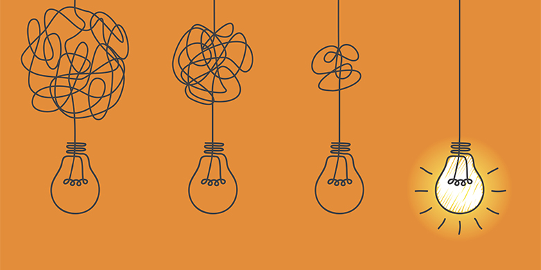
Have you ever been in a building that’s had several additions to it and the whole layout just seems confusing? Sure, all the types of rooms you need are there, but the flow is way off, and the door labeled “restroom” leads to a closet? It feels wrong and leads you to places you least expect.
That’s your app with a healthy dose of design debt. The look and feel are off and the provided information doesn’t quite line up with what’s expected. But don’t fret, we’re here to help.
We’ll take a look at the two major components of the UI and UX of your app—Visual Language and Information Architecture—and then walk through how to best dig out of that nasty debt. Finally, we’ll take a look at some steps to best avoid design debt in the future.
The very first thing a user notices about your app is the look and feel of it. Now, we can talk all day about User Experience (UX) and how vitally important it is (and, it is!), but the visual identity, or language, is the first impression.
Visual language describes all the things a user sees when they first open your app. So, not just your color scheme and font choice, but the size of your navbar and how rounded your buttons are. Having a consistent visual language is vital for an app, not just because it looks great, but because it helps the user navigate. If all the buttons to submit information are the same then the expectation for what those buttons do is clear at a glance.
Often, a lack of visual consistency is the first sign of design debt. Maybe buttons don’t match a style or font sizes are all over the place and vary by 1-2pts. Basically, it looks like a cobbled together app with several styles thrown together.
But having a clear visual language isn’t always enough. In fact, a strong visual consistency can actually mask some more deep-rooted UX Design Debt issues like poor information architecture.
In essence, Information Architecture (IA) is the practice of organizing, structuring, and labeling content in a way that allows your user to know where they’ve been, where they are, and where they are going in your app. So, it’s not just that your buttons are located where they should be, it’s that the text on them is clear and expected as well.
When IA is done well, your users have a clear sense of the path they should take to achieve their goals. For example, if someone is ordering food through an app, they would rightly expect the menu button to take them to the menu.
If the menu button instead takes them to the location address, that’s a problem. Poor Information Architecture can unintentionally hide important features, confuse your users, and, ultimately, lead those same users to abandon your app altogether.
So now that we’ve talked about all the things that can go wrong, how do we fix it all?
To best work yourself out of debt, you first have to find all the issues you can and then begin solving them.
A design audit looks at both the visual elements of your app and how the information is presented. The end result is an analysis of the overall user experience that identifies visual inconsistencies and pain points while offering suggestions for a way forward.
In practice, an audit will help you further define your app’s experience so that your users get the most out of their interactions. That means you’ll get guidance for visual style, color, and typography to ensure that the look and feel of your app is consistent throughout. You also get a list of critical usability flaws, the type that can be actual blockers to your app’s success.
Finally, a design audit will take a hard look at your IA and determine what’s clear and what needs some help. Is all your labeling accurate? When you click a button that says “Contact Us” are you taken to a form or another, random page?
Now that we’ve got the list, it’s time to start the clean-up.
The good news about cleaning up design debt is that we rarely have to start all over. In fact, one of the best ways to pay down design debt is by recycling previously used content, components, and visuals, a concept best illustrated through Cradle-to-Cradle Design. In a nutshell, Cradle-to-Cradle Design is the concept of taking a product that is no longer useful or wanted, breaking it down into its essential parts and using those parts to build something new.
This is most often seen in physical products, like an electric toothbrush. We can take all the individual parts of the toothbrush—the tiny wires, springs, and motor—and break them down, reconfigure them, and then repurpose them in a new toothbrush. But how do we do that in a digital product?
For this example, let’s consider an app designed to create and submit forms while also allowing team members to collaborate using that shared information. We’ll start with our main navigation bar—the same navbar that you’ve been iterating on, adding content to, and implementing new features in for the past three years. Now, your navigation bar is bloated.
Let’s start by breaking down our navbar into its individual components, both from a visual and content standpoint. It’s an easy lift to get our color scheme set and make sure our fonts are consistent, so let’s move to the content.
In looking at our ‘reports’ and ‘teams’ tabs, we can take a step back and try to find new connections that allow us to reorganize and restructure. Maybe we now understand that the most important feature to know about our team is how their reports are connected to one another. So let’s merge teams and reports together and see what that looks like.
Now it’s clear where your users should go to both create and share reports with one another. We’ve eliminated a step and cleared up any possible confusion with our IA.
Unfortunately, there’s no way to completely avoid acquiring any debt, but there are things you can do that will ensure you and your team avoid the vast majority. Put simply, it comes down to planning.
Start by making sure your project team is set up for success by creating a single source of truth for all things visual—things like button styles and font usage. It’s important the entire team has access to the style guide and usage documentation so that everyone on the team has the information they need to check where simple styling inconsistencies may show up.
Second, focus on your Information Architecture. Make sure that you’ve put the time in to discover how your customers will use your app and what they expect from it. A lot of this context comes from an in-depth Customer Experience project and will help you make the best decisions possible in regards to how your information is laid out.
If all this seems daunting, don’t worry, you’ve got support. From a Big Nerd Ranch Design Audit to a full-blow Customer Experience project, we’re here to help dig you out of debt and, best case, start you on the right path before any accumulation even begins. Get in touch and let’s get started.
A customer’s journey with a business can make all the difference, whether it’s physical or digital. Read on to learn more about a digital...
Customer Experience (CX) is at the core of every successful and sustainable company. As such, it’s essential to be knowledgeable on and apply the...

We’ve discussed the importance of Customer Experience before. Customer experience encapsulates every interaction between your company and them—online, in-person, and across platforms. From the...