

Which .NET Design Pattern is Best For Your Next Project
Back-End DesignThere are several design patterns used these days in the .NET ecosystem. What are they? What are the benefits and drawbacks of each pattern?...
Imagine, if you will, that you’ve discovered a cute new gem of a bakery. The pastry chef welcomes you into the ambient, delightfully quirky space. She graciously gives you a tour of the perfect pastries expertly arranged in the display case. She tells you of the process, describing the work of kneading the dough as one would describe creating a piece of art. She offers fascinating anecdotes about some of the more esoteric ingredients and baking techniques.
Ultimately, she compliments you on your distinguished taste in scones and gingerly rings up your items. “How about an espresso to go with it?” You happily agree.
She then pauses, looks into the distance, and says robotically, “Define customer payment method.” For a moment, the words awkwardly dangle in the air. “Um, credit please,” you say, and she swivels the payment kiosk toward you.
You soon exit the shop, thinking not about the dark chocolate cardamom scone wrapped snugly in your bag or the impressive mural that spanned the length of the well-renovated space. But how it got a little weird there at the end.
Our choice of words can affect an experience, whether on or offline. In a digital product, “Define customer payment method” is known as microcopy (or UX copy). Microcopy refers to the small text snippets guiding a user through the experience. Instructions, buttons, dialogs, labels, and error messages are all examples of microcopy.
It’s worth pointing out that microcopy is not content. Articles, posts, media and marketing messages are all examples of content. It is important for a designer to be knowledgeable about a product’s content, but they are not responsible for crafting it.
As designers, we take to heart the brand guidelines for aspects of visual design like colors, fonts, and type styles. But strip any interface down to the barest, most important elements, and you’re left with words. Words themselves are often not given the attention they deserve by designers (and often product teams in general). I would argue that the shortlist of core brand guidelines should include guidelines on writing.
Of all product team members, UX Designers have the best vantage point to guide UX writing. Our distinct perspective is fueled by our knowledge of the product, our users’ needs, and our client’s business objectives. Therefore it is logical that we, the architects of the user’s experience, should be the primary wielders of the words that shape that experience.
Writing is not a skill UX and UI designers tend to focus on in their core training. This was certainly true for me. Through experience and instinct, my writing skills increased incrementally over the years. In hindsight, this slow and steady progression could have been fast-tracked with just a bit of time and energy spent consciously building these skills. I recommend that designers of all levels do just this.
I took a recent deep dive into various writing books and resources and wanted to share some of that knowledge. What follows are three fundamental principles for writing effective microcopy that I have found especially useful in my own writing.
Editor’s Note: UX copy vs. UI copy: What’s the difference?
The line between UI copy and UX copy can be blurry. UI copy generally refers to the copy on interfaces, such as buttons and headers. UX copy relates more to informational text and help text — text that gives the user more context regarding the actions they can take and the results of those actions.
Writing in plain language ensures readers will gain a quick, clear understanding. Text written in plain language reduces the cognitive load on the user and allows them to focus on the task at hand. It is also a factor in accessibility. Plain language improves the experience of individuals with cognitive and learning disabilities.
Messages should be straightforward and easily understandable. Period. This is plain language in a nutshell.
Using fewer words can often simplify a message. Don’t use ten words when five will do — but don’t get carried away here! This does not mean that using fewer words is always better. Keep in mind the previous rule and make sure not to sacrifice clarity for the sake of brevity.
Reduce cognitive load by avoiding unnecessary jargon and complex terms. Deanna Horton’s Handy List of Human Words is a fantastic resource to help you trade fancy words for fast ones.
These make for a quicker, more direct read. Simple as that. Nuff said.
Keep it natural. Try reading your copy out loud and see if it sounds natural. Returning to our opening scenario, a more human alternative to the mechanical “Define customer payment method” might be, “How would you like to pay?”
Humans communicate with other humans through conversation. Humans communicate with computers through interfaces. Us humans have been communicating with one another for tens (hundreds?) of thousands of years. But it is only in our very recent history that we have begun communicating with computers. So we don’t totally know how to handle it yet.
As Kinneret Yifrah points out in Microcopy: The Complete Guide, we “treat [our]computers according to the social norms we apply when communicating with other human beings.” Interfaces, therefore, should follow the rules of human conversations and abide by social norms.
Through user research, you know a lot about your user’s overall needs, goals, and motivations. This is essential high-level knowledge. Being aware of their immediate situation is equally as important. You may know your user is overall very career-focused, so it might be a good idea to encourage them to connect their LinkedIn account. But you should also be aware that if the user is in the midst of recovering a lost password, now might not be the best time to prompt them to connect.
When shaping your message, consider the user’s recent circumstances and what has brought them to this point in the experience. What are they trying to do? What are their expectations? What are they potentially thinking and feeling? A better understanding of the context of your user’s journey will help you better predict how to best communicate with them.
In a good conversation, participants work toward a mutual goal: perhaps getting paperwork filled out before a doctor’s visit or something more indirect like filling the elevator with just enough conversation to make a short ride as least awkward as possible.
Exchanges should be relatively even, not long, drawn-out monologues. Pause for understanding and feedback. Part of this is knowing how much information to provide at one given time and when to pause and listen for feedback.
One option is to use progressive disclosure. Perhaps the user doesn’t need the ins and outs of why their email address is required, and you can provide a “why do we need this?” link should they want to know more.
We tend not to use passive when we speak, just when we write. It’s also a way to ensure a sense of pace as the active voice feels more natural – more like a human conversation that we humans so irrationally expect from computers.
Being polite does not just mean saying please and thank you. A genuinely polite interaction provides value, does not waste the user’s time, and provides options (especially for errors).
Imagine you’ve ordered a coffee at a diner, and you’re told, “I am so sorry. There currently is no coffee. This must be very disappointing. Please accept our apologies.” While that response might be apologetic, it’s not exactly polite. It wastes your time, provides no useful information, and suggests no solution. A better response might be, “Sorry, we’re out of coffee until tomorrow. How about tea?”
Airbnb masters the art of conversational writing. Take a look at any property screen. It reads like a conversation you’re having during an in-person tour. “This is Where you’ll sleep… Here’s What this place offers… Things to know” The use of “you” invites the user right into the house.
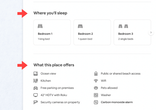
The property screen mentions something very human, which is the act of sleeping – Airbnb could have just as easily called it “Bedrooms.”
Let’s talk about who we represent on our side of the conversation. We speak for our client’s or employer’s brands. It could also be a sub-brand or an individual product’s brand.
Think of your voice as your personality. Voice is determined in large part by your brand’s attributes/personality. At Big Nerd Ranch, our traits are things like Brave, Pioneering, and Seasoned. Your client should be able to furnish some documentation about their brand. If not, a workshop may be in order.
Tone conveys mood. If voice determines what you say, tone is how you say it. Tone should be adapted to fit the user’s circumstances and state of mind. The tone you employ while talking at a birthday party would (hopefully) be different than that you would use at a funeral. Likewise, the tone used while onboarding would differ from the tone of an error message.
Check out this message from the Slack app, highlighting some recent feature changes. Slack describes its brand voice as human, clear, and concise. The tone is upbeat and informative.
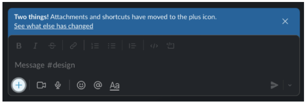
They nailed the delivery. “Two things!” You can imagine a coworker tapping you on the shoulder to relay a quick thought. Let’s check that “Human” checkbox on Slack’s list of brand traits.
The informative sentence that follows is clear and concise, summarizing the updates in just nine words. The accompanying link is direct and phrased in plain language—it also offers the user additional information should they be interested. While Slack’s product team no doubt was tempted to list all of the other improvements they worked so hard on, they showed restraint in highlighting just two and tucked the rest away for more curious readers.
It’s important to note the positioning of the message; It is positioned within the context of the features in question. Had the announcement been delivered outside of that context, in a modal or an email, for example, additional explanation or images may have been needed.
One more thing. Let’s acknowledge the politeness of the message. It does not interrupt the user from going about their business, but perches atop the input field until the user acknowledges it.
Editor’s Note: How much can you make UX copywriting?
Effective UX writing doesn’t just make you a better developer — it opens the exciting career path of technical writing. According to ZipRecruiter, the average UX copywriter makes more than $100,000 a year, with experienced UX content writers making over $150,000. Good UX writing is hard to come by and a critical part of the software design process.
Now that we have discussed three important principles of good UX writing: plain language, conversational writing, and voice and tone, let’s take a look at one last example and see if we can check the boxes on what we’ve learned. How does this final step in the Airbnb booking process rate?
Plain language? Check. It’s clear, concise, and informal. It uses short phrases and sentences and avoids jargon.
Conversational? Check. From the prompt, it’s clear how I’m to respond. It even has a suggested start to help get me on my way.
Proper use of voice and tone? Check and check. “Straight-forward,” “Thoughtful,” and “Spirited” are some of Airbnb’s brand values, and all are represented in this example.
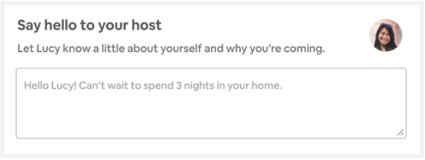
Airbnb has earned itself an A+!
Major bonus points!: Perhaps most importantly, Airbnb takes advantage of this interaction to accomplish goals important to both the users (both Traveler and Host) and to the business. In one of their posts, Airbnb mentions a couple of their company goals:
The copy nudges these two strangers into making a social connection, thereby encouraging a social relationship that benefits both the users and the business.
When written effectively, microcopy can make your designs more effective and the overall experience much more clear and enjoyable for your user. Keep in mind the three principles covered, take time to focus, and reap the rewards.
Nielson Norman Group’s UX Writing Study Guide
Microcopy: The Complete Guide by Kinneret Yifrah
There are several design patterns used these days in the .NET ecosystem. What are they? What are the benefits and drawbacks of each pattern?...

Large organizations with multiple software development departments may find themselves supporting multiple web frameworks across the organization. This can make it challenging to keep...

If you spend enough time in the tech space you get used to hearing phrases that tend to lose their meaning over time. Are...