
Building Quality iOS Apps, Quickly
iOS MacAt Big Nerd Ranch, we take pride in building quality apps for our clients. Unfortunately, quality isn't the only concern when building an app...
At WWDC, Apple debuted Xcode 11 with a diverse array of interface refinements, tool improvements, and major new features. Let’s take a look at some of the key changes that should greatly improve your day-to-day coding experience.
The most noticeable feature in Xcode 11 is the editor. Gone is the pillbox/drop down button for switching states between editor view, assistant view, and author view. In their place is a single Code Review button.
 .
.
However, all is not lost. The Author view and the Assistant view have moved into a toggle on the editor itself. The Log view has moved into an Inspectors tab and has been renamed History.
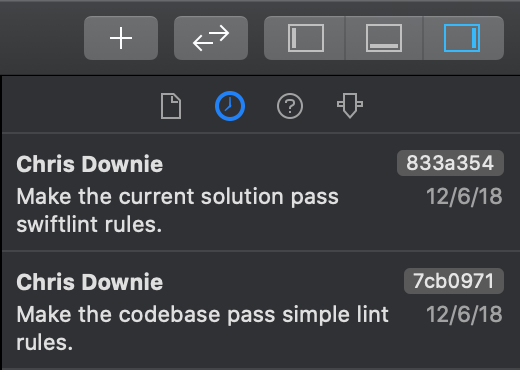
In fact, the Editor Options button now gives you a context-sensitive editor. You can choose between Editor Only, Editor & Canvas (for Swift UI), and Editor & Assistant, which mimics the old behavior of Assistant view.
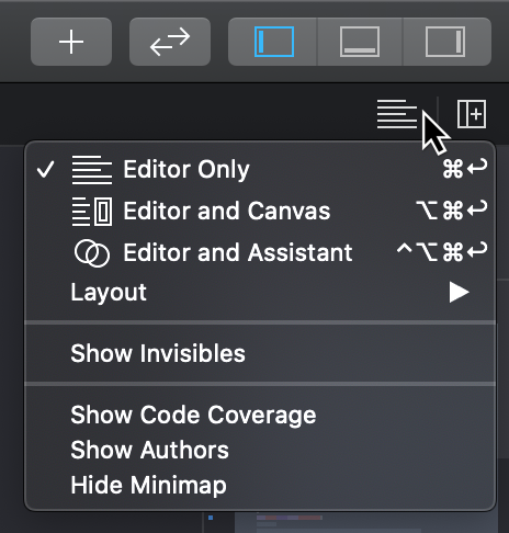
Moving this option into the editor is especially powerful considering…
You can now customize your workspace by opening any number of editors in any mishmash of horizontal & vertical configurations.
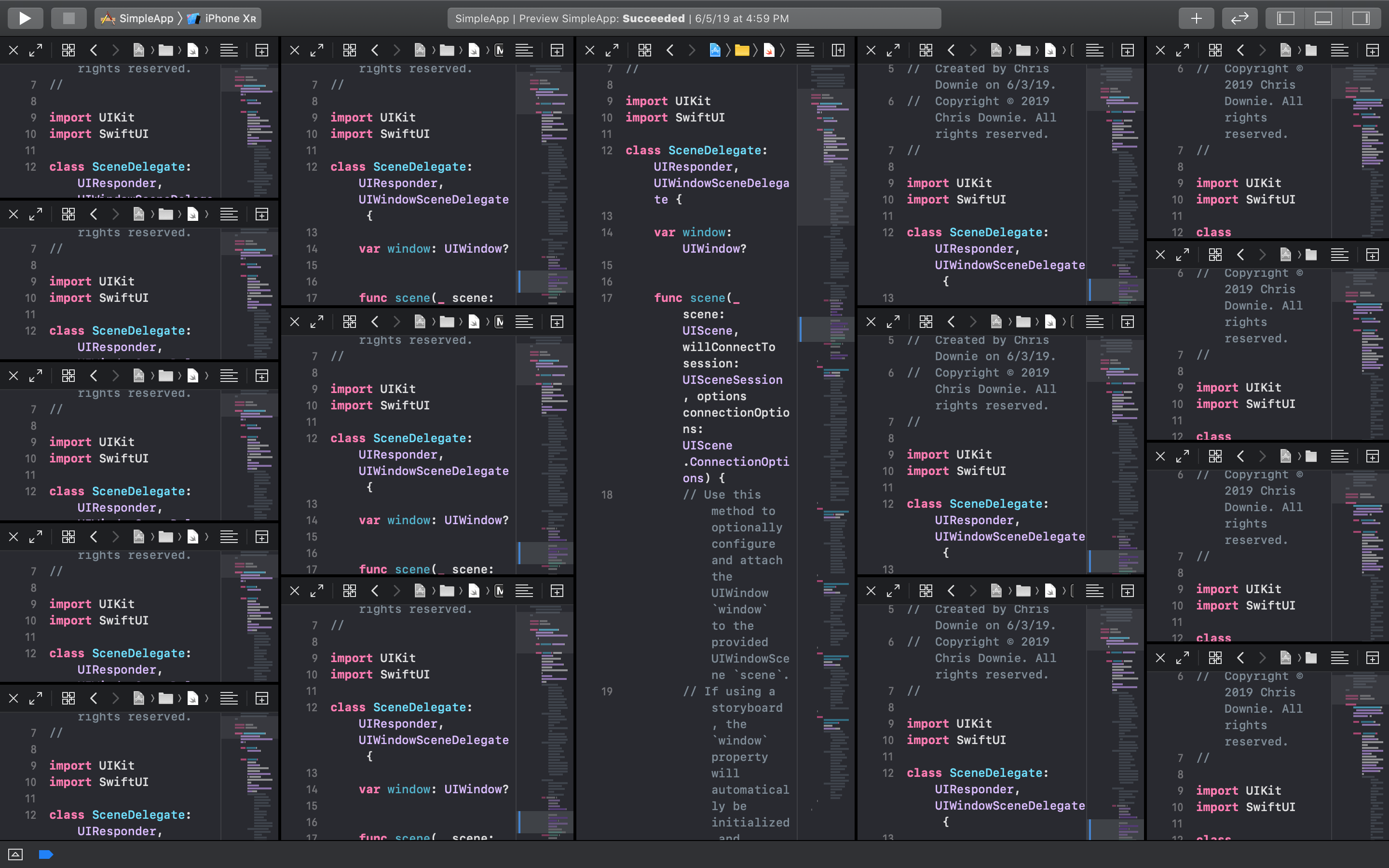
Each of these editors provide the same options in the Editor Options dropdown, letting you fully customize the exact views into your project that you want to see at one time. By default, you can add another column to the right by clicking the Add Editor button, and add a row below by option-clicking that button instead. This button is context-sensitive, so whether a row or a column gets added depends on which kind you added previously. However, holding option always changes the icon and lets you add an editor in the opposite dimension.

While you can slice-and-dice your screen to your heart’s content, eventually you’ll want to focus on one implementation. When that moment comes, you can dedicate all your on-screen real estate to the problem at hand by clicking the Focus button (or key command ⌃⇧⌘↩︎).
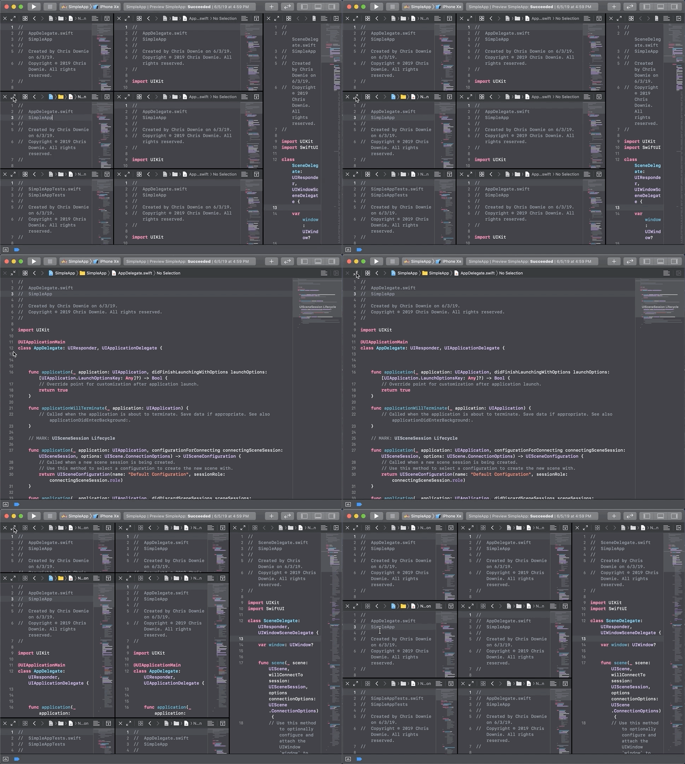
Once you’ve got your grid of editors set up, you can also quickly cycle between them by using the ⌘` key command.
Each editor also gets its own mini-map, a stylized overview of the shape of your code, in the top right corner. This has been present in other IDEs for some time and is a welcome addition to Xcode.
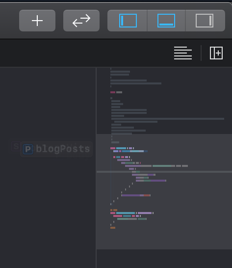
Xcode’s mini-map works especially well with MARK comments. If you’ve made it a regular habit of grouping sections of your code with a // MARK: - Title, then those titles show up legibly in the mini-map.
Unlike other editors, the mini-map is interactive. You can click on those section headers, or on functions in your code to jump around in your editor view
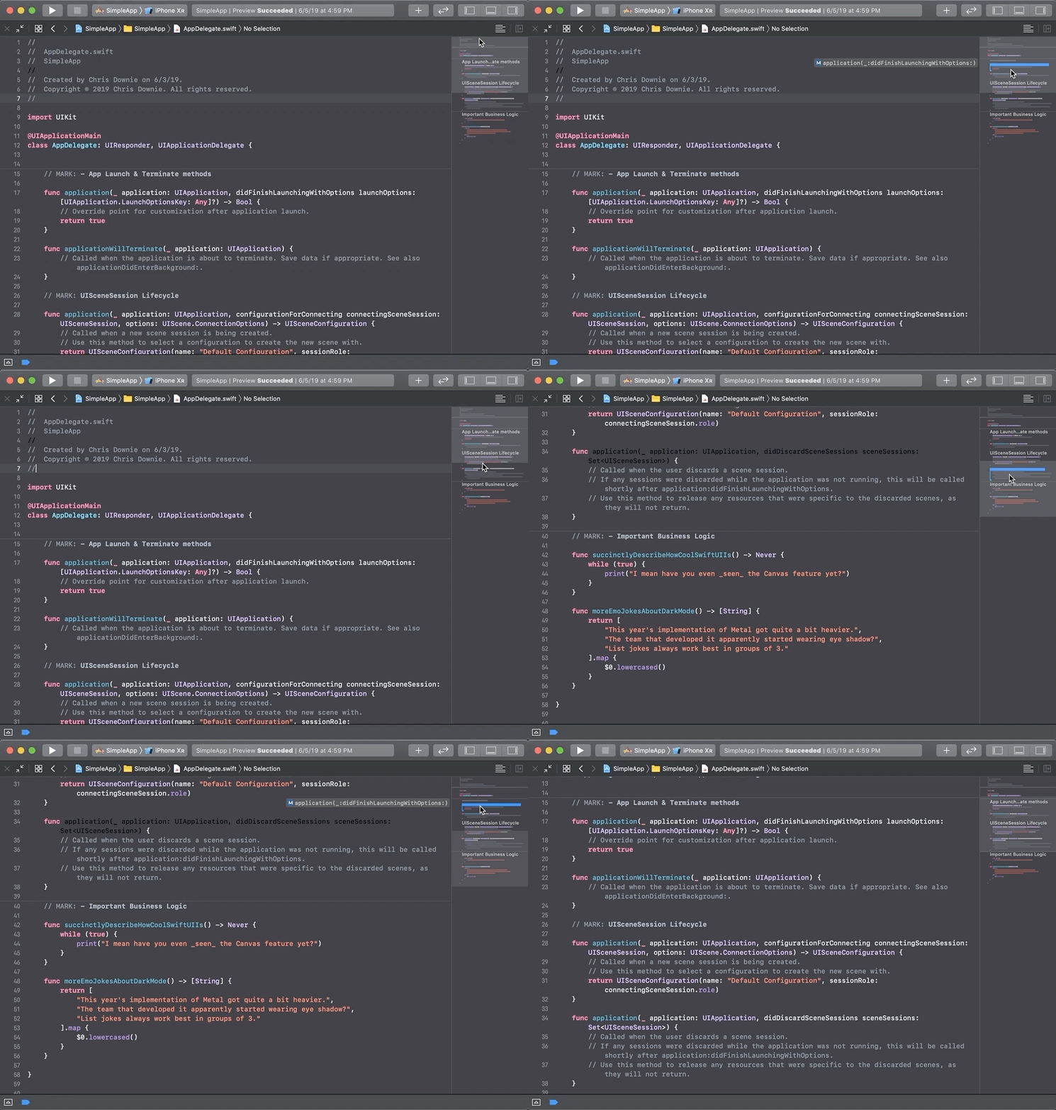
However, if you’re not a fan of the thousand-foot view of your code, you can always disable the mini map by selecting the Hide Mini Map option from the Editor Options dropdown.
While CocoaPods and Carthage will still remain relevant dependency managers for the foreseeable future, Xcode 11’s deep integration with the Swift Package Manager makes it the de facto way to manage Swift dependencies going forward. Adding a Swift Package to your existing project is as easy as entering the repository URL into a prompt.
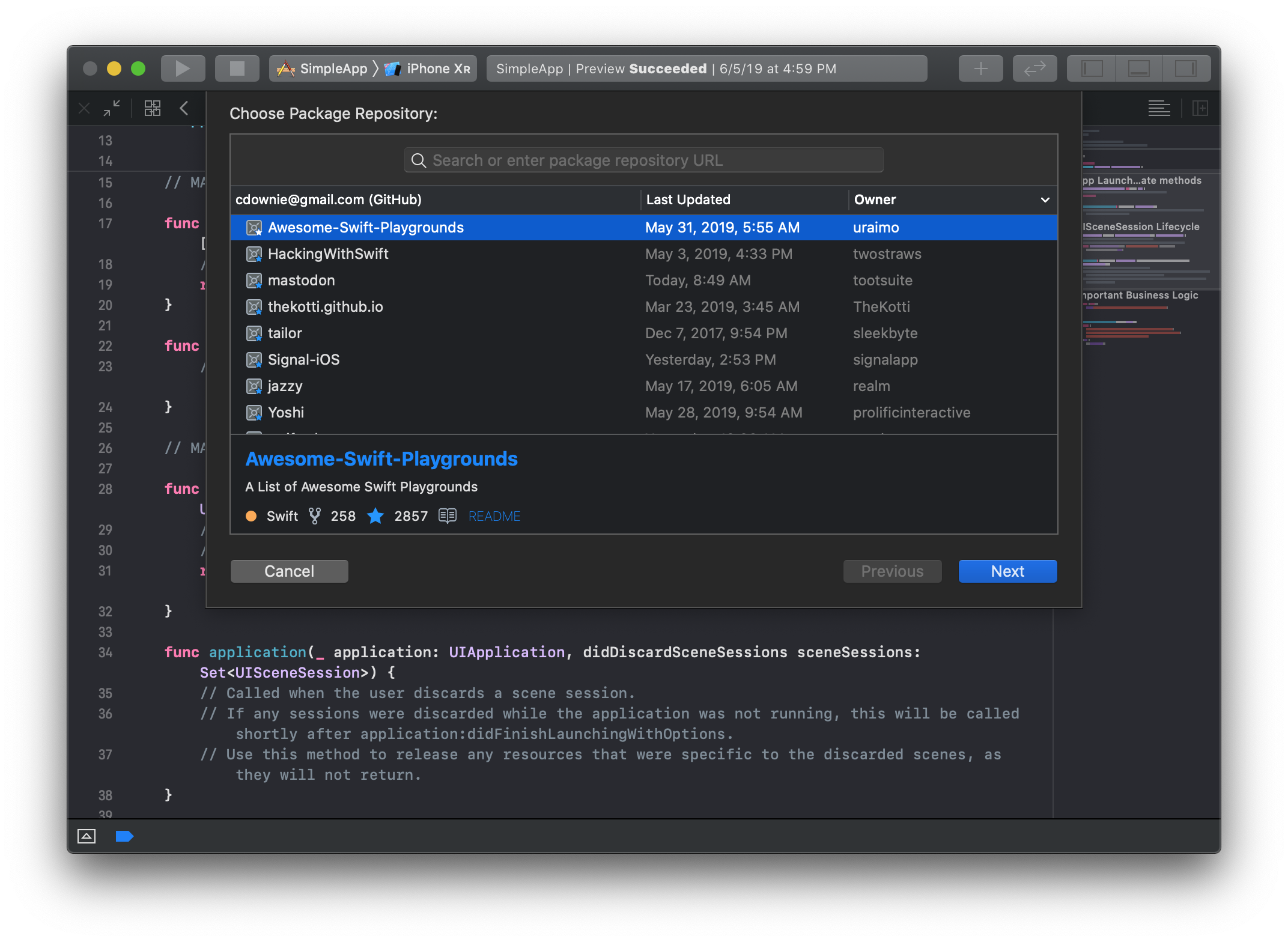
This works for private Swift packages as well. If you have a package you want to share internally, just make sure to add the GitHub, GitLab, or Bitbucket account to Xcode, and the repository prompt will be pre-populated with private Swift packages you can access.
Xcode can also resolve Swift Package Manager dependencies against local code. If you’re developing your own package, or hacking someone else’s for fun and profit, you can add the package folder directly to your project. Xcode is smart enough to realize it’s the same as the one specified in your dependencies, and will resolve to your local copy instead of the one specified in your dependency file.
This wouldn’t be a complete WWDC 2019 blog post without mentioning SwiftUI. While an upcoming blog post will talk about SwiftUI as a framework, for now let’s just discuss what it feels like to edit Swift UI.
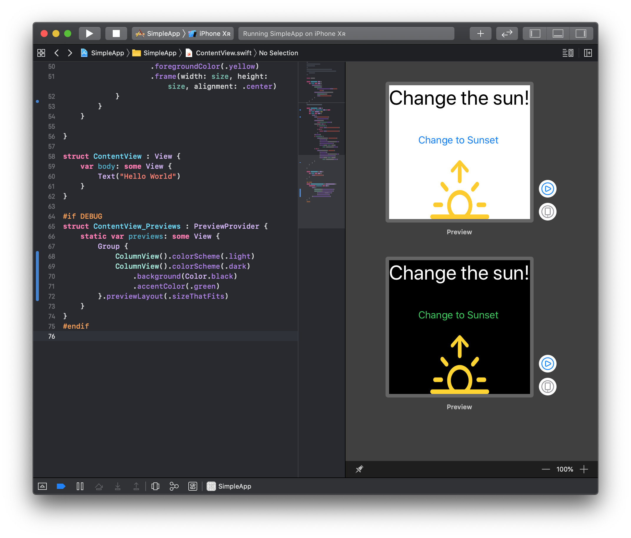
It’s fast. With the Editor & Canvas editor style selected, you get an Assistant-like view of your code & its display all at once. After an initial build, changes made to the code are quickly reflected in the Canvas. Similarly, the canvas provides an Interface Builder-style visual means to change your layout that instantly adjusts the underlying code to match your changes.
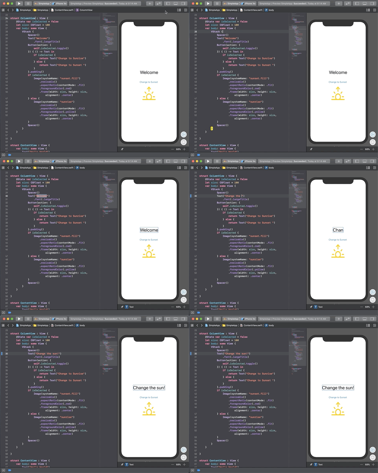
However, the Canvas view is much more powerful than a simple Storyboard. You can configure the Canvas to show what your view looks like under a variety of conditions: different dimensions, text sizes, and yes, even the much-touted Dark Mode new to iOS 13.
Finally, the Canvas can be used to actually test the interaction of your app. While looking at an iPhone-shaped preview of your app, just click the Live Preview button. Don’t blink! I’ve had this switch from preview to running app so quickly I missed it.
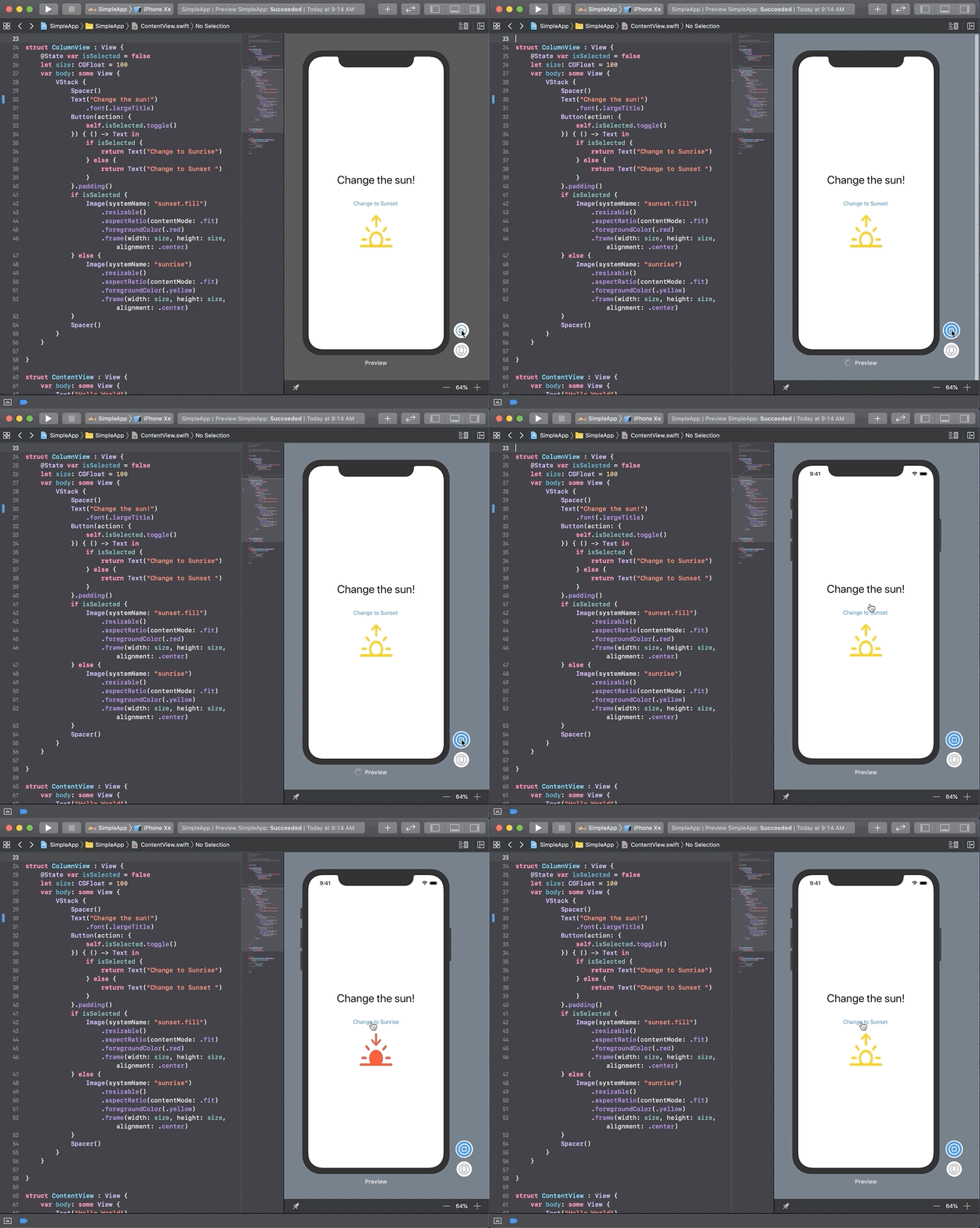
A small caveat: All the nimble new features of the Canvas screen only work well on macOS Catalina, at least as of Xcode 11 beta 2. Hopefully we’ll see this improve as the betas progress.
All these features show Apple’s vision: the experience of writing apps for their ecosystem should be fast, configurable, and fun. Xcode 11 makes a considerable step forward to make this vision a reality, and I can’t wait to make it part of my daily toolchain.

At Big Nerd Ranch, we take pride in building quality apps for our clients. Unfortunately, quality isn't the only concern when building an app...

How can you detect when the user connects their phone to their car’s stereo? This simple question that came up during a feature brainstorm...

Automate your build and deploy process with fastlane and CircleCI! We'll build on our fastlane commands from Part 1 and show how to configure...