Writing is Designing: Three Principles for Writing Effective UX Copy
Design MarketingImagine, if you will, that you’ve discovered a cute new gem of a bakery. The pastry chef welcomes you into the ambient, delightfully quirky...
While the visual design of iOS 8 remains similar to its predecessor, it is packed with features that require special design attention.
With iOS 8, developers have access to features like TouchID, CloudKit, WatchKit, HealthKit and HomeKit, so designers must think about where (or if) these features fit into an application during the planning stages. In particular, the inclusion of designing for Apple Watch can be a large undertaking, so that should be considered far in advance. By doing this, more time can be devoted to designing for edge cases, which are often a side effect of added functionality.
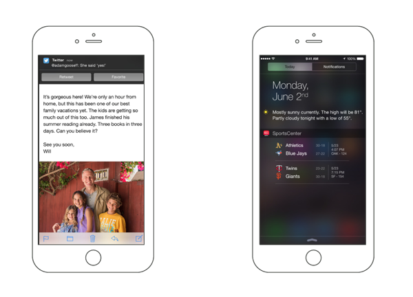
iOS 8 introduced extensions that require design attention as well, like third-party interactive notifications and Notification Center widgets. Again, these will likely require minimal visual design. However, understanding what content is displayed, how it is displayed, and how the user can interact with these is crucial to the user experience.
Interactive notifications will allow the user to tap one of two actions or the top of the notification to go directly into the application. Since the latter may be overlooked, its important to remember to use these buttons for the most common features the user would need instead of simply navigating back to the application.

Widgets in the notification center will need a bit more visual design because of their potential for functionality. Note that these widgets allow tappable buttons, but cannot utilize the keyboard. Also, these widgets will come as a companion to the application and will not be standalone.
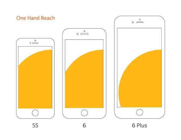
The introduction of the iPhone 6 and 6 Plus with Retina HD screens satisfied the demand for larger phones, but these larger screen sizes can have a big effect on how users use an application, as you can see in the image below.

Approximate one-handed thumb reach across iPhones 5S / 6 / 6 Plus.
Take a hands-on approach when designing an app. Test your mockups on one of these larger devices and figure out what’s easy for the user to do with one hand, and design around that. If there is a particular action that you want the user to use often, put it where they can easily reach it. In addition to this, the iPhone 6 Plus also supports split views in landscape mode. This should definitely be taken advantage of, but it’s important to note that this is not supported on the iPhone 6 or 5S, so don’t rely on this functionality too much.
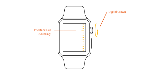
The Apple Watch also brings a variety of brand new interface opportunities. With it comes a new, more legible typeface, a rounded translation of iOS and new physical interactive elements (digital crown, “force tap” retina display and “taptic” feedback). Designing for this device will, more than ever, be about merging the user interface with the physical device. For example, the experience of the digital crown could be greatly improved if the screen gave a visual indication for when it is turned.

It’s also important to note that the Watch will also have two screen sizes (1.5 inch and 1.7 inch), so designers should keep legibility in mind when designing for the smaller size.
With the addition of two new iPhone sizes and the two Apple watch sizes, designers and developers will have to be more flexible in their layouts. This is where the concept of Adaptive UI will come into play. Adaptive UI is the ability to specify layout rules based on Size Classes, which are really just breakpoints set by Apple. It is comparable to responsive design on the web.
Xcode 6 offers a GUI that encourages design to become involved in the development process. This is an excellent opportunity for design to learn about and communicate better with development and create a smoother process. Overall, there are a few key changes that affect how design can better use Xcode.
For more information about designing for iOS 8 and Apple’s new devices, sign up for our week-long iOS and Android Design Bootcamp! If you’re looking to level up your development skills, sign up for our one-day iOS 8 bootcamps and Swift classes.

Imagine, if you will, that you’ve discovered a cute new gem of a bakery. The pastry chef welcomes you into the ambient, delightfully quirky...

There are several design patterns used these days in the .NET ecosystem. What are they? What are the benefits and drawbacks of each pattern?...

Large organizations with multiple software development departments may find themselves supporting multiple web frameworks across the organization. This can make it challenging to keep...