
Swift Regex Deep Dive
iOS MacOur introductory guide to Swift Regex. Learn regular expressions in Swift including RegexBuilder examples and strongly-typed captures.
When WatchKit was announced, I was so excited to get the code and begin using the hardware on the Apple Watch. But like most everyone else, I was disappointed when WatchKit 1 leaned so heavily on the phone that hardware access was simply impossible. It felt a bit like the iPhone’s launch, when we asked about apps and were given Mobile Safari.
That changed when WatchKit 2 was announced. The big change is allowing code to run on the watch itself, rather than in the extension space on the phone.
Running on the watch increases the difficulty of some things like communication with your containing app, and it can lead to power consumption issues, but it unlocks so much potential that it’s worth it.
And most of that potential is in the hardware. The first and easiest piece to chew off is the Digital Crown.
In WatchKit 1, all we had was the WKInterfaceTable, which could be scrolled with the crown. With the new APIs, you can access the crown via a new interface class called a WKInterfacePicker. To use this class, you add it to your interface and add an outlet to your interface controller. In willActivate, you attach some items, call [self.picker focusForCrownInput] and you’re off.
The picker, like iOS pickers, requires a set of data items from which to pick. Unlike iOS, they are not retrieved via delegation, but set all at once via -setItems:. Why? Well, because the UI and the code are still running in two different processes. Changes to UI elements are batched up and transmitted in the next spin of the run loop.
The picker’s items are of type WKPickerItem. These items have a title, an accessory image, a caption and a content image. There are three methods of presentation: List, Stack and Sequence. Depending on the choice of presentation, you will set some of these values, but never all.
The list presentation is pretty close to the iOS representation of a UIPickerView. Things fade at the top and bottom of the list, and the selected item appears in the center. It’s good for the same sorts of things that you’d use a UIPicker for, such as a predetermined list of options (your favorite Pallookaville soda flavors, perhaps).
Filling your picker is pretty simple:
    NSMutableArray *items = [[NSMutableArray alloc] initWithCapacity:101];
    for(int ctr=0; ctr <= 100; ctr++) {
        WKPickerItem *item = [[WKPickerItem alloc] init];
        NSString *title = [NSString stringWithFormat:@"Title %d", ctr];
        item.title = title;
        [items addObject:item];
    }
    return [items copy];
The resulting list looks like this:
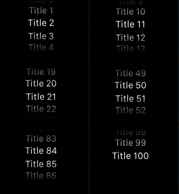
I found that the list presentation works great with text, but not so much for images. The contentImage or accessoryImage will be scaled down to the row height.
Another thing I noted was that if you set a title and an accessory image, they become left justified. Titles without the accessory image are centered.
The stack offers a little animation similar to a Rolodex. What’s a Rolodex, you young whippersnappers ask?

Apple’s version isn’t quite like this, but it’s similar. When it settles, only the selected card is visible.
For this, let’s switch the code to return image-based picker items. I used the Radial Chart Image Generator to create a ring of images and attached them to my picker with this code:
    NSMutableArray *items = [[NSMutableArray alloc] initWithCapacity:101];
    NSLog(@"requested items");
    // -images returns NSArray<WKImage>
    for(int ctr = 0; ctr <= 100; ctr++) {
        NSString *imgName = [NSString stringWithFormat:@"round%d",ctr];
        WKImage *image = [WKImage imageWithImageName:imgName];
        WKPickerItem *item = [[WKPickerItem alloc] init];
        item.caption = imgName;
        item.contentImage = image;
        [items addObject:item];
    }
    [self.picker setItems:[items copy]];
In Interface Builder, I also turned on “Focus: Outline with Caption.” The result was this:

Note: Not all images work well with the stack picker. Images that have transparency will show the backing image through those transparent holes.
The sequence view is what you choose if you wish to spin through a set of images in a flat manner.
This is the one that is appropriate for most custom controls, as you can implement pretty much anything your heart desires. (I may put together a WKInterfaceSlider replacement that uses the crown. That needs to be a thing.)

The picker will fire off an IBAction when its value changes, so it’s easy to act upon it just as any other UI event. The picker supplies the selected index, which you can then map back to a meaningful construct.
Let’s make the watch tap the wrist as the value changes! This is simple enough to do…
- (IBAction)pickerChanged:(NSInteger)value {
    [[WKInterfaceDevice currentDevice] playHaptic:WKHapticTypeClick];
}
Now you will get tactile feedback as you scroll through your controller. There are a bunch of different haptic types; I’ll cover those in the next post.
It took me around 10 minutes to write the code necessary to work the Digital Crown, but deploying to the device was a long, sordid affair. To wit:
Not once did I manage to get Xcode to show me the debug session on the extension. I wasn’t able to get console output, making NSLog useless. I am not sure how long it will take Apple to fix this, or whether I should just add my own mechanism for the purpose of remote logging.
In any event, that’s a topic for another day. In the meantime, we’ve got watch apps to write. Happy coding!

Our introductory guide to Swift Regex. Learn regular expressions in Swift including RegexBuilder examples and strongly-typed captures.

The Combine framework in Swift is a powerful declarative API for the asynchronous processing of values over time. It takes full advantage of Swift...

SwiftUI has changed a great many things about how developers create applications for iOS, and not just in the way we lay out our...