Why Accessibility in Tech is Vitally Important
Accessibility DesignA well-designed and thoughtful app experience makes people happy. Happy people make for loyal customers. The more loyal customers your application has, the happier...
Semantic HTML is what is used as the building blocks of a fully accessible web page. The following will demonstrate how two versions of a website can be visually exactly the same but seem very different and challenging to use for those using assistive technologies.
Semantic HTML is the use of HTML markup to relay the meaning of what is being displayed on the screen for the browser, and subsequently, an assistive technology, to interpret. In order to use the internet and digest content on web pages, individuals with visual impairments need to rely on screen readers such as JAWS, NVDA, and VoiceOver to navigate the web. All of these tools utilize an Accessibility API exposed by the browser to access something called the Accessibility Tree. The Accessibility Tree is derived directly from the DOM and provides semantic information for screen readers and other assistive technologies to consume. This is where semantic HTML comes into play. The browser can only populate the Accessibility Tree with the information provided to it through HTML markup written by the developer, you!
To demonstrate how important semantic HTML is, let’s first look at some HTML that is not semantic, and take a peek at what the Accessibility Tree looks like.
<html lang="en">
<head>
<meta charset="UTF-8">
<title>My Website</title>
</head>
<body>
<div class="header">
<h1>My Website</h1>
<div class="nav">
<ul>
<li><a href="#">Home</a></li>
<li><a href="#">Blog</a></li>
<li><a href="#">About</a></li>
</ul>
</div>
</div>
<div class="main">
<h1>Blog</h1>
<div>
<h2>Blog Post 1</h2>
<img src="https://via.placeholder.com/150" />
<p>Lorem ipsum dolor sit amet, consectetur adipiscing elit, sed do eiusmod tempor incididunt ut labore et dolore magna aliqua. Ut enim ad minim veniam. Duis aute irure dolor in reprehenderit.</p>
</div>
<div>
<h2>Blog Post 2</h2>
<img src="https://via.placeholder.com/150" />
<p>Lorem ipsum dolor sit amet, consectetur adipisc irure dolor in culpa qui officia deserunt mollit anim id est laborum.</p>
</div>
</div>
<div class="footer">
<p>© 2021 Big Nerd Ranch</p>
</div>
</body>
</html>
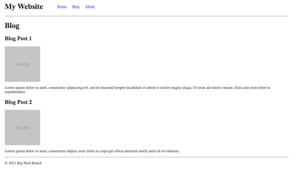
If you open up this HTML in a web browser, you will see a very simple, albeit ugly, website. Note that I added some very minor styling to arrange and separate items appropriately.

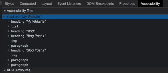
Taking a look at the Accessibility tab in the browser, you will see something like this (it may vary slightly between browsers):

As you can see, all of the content on the page is present within the tree. These are derived from the HTML elements in the DOM that contain information relevant to assistive technology. An HTML div is considered a non-semantic element. They are used to structure your webpage, but they do not tell the browser anything about the content they contain. Therefore they are excluded from the Accessibility Tree.
While this web page does look how we want it to look, the current HTML does not provide meaning, or semantics, for the browser to properly structure the Accessibility Tree. Instead, the browser structures it as a flat list of content. This does not allow someone using a screen reader to properly interpret what information is grouped together, or where they are on the page.
Let’s actually open up a screen reader of your choice to listen to what someone using these technologies would hear. When you have it open, use the arrow keys to go both forward and backward through the webpage. Try doing this with your eyes closed! You’ll probably notice, even on this simple page, it is very easy to get lost. You hear a lot of text being read to you, but there is no certainty where that text exists on the page.
Let’s try to clean up the HTML to provide more meaning to the structure of this website.
<html lang="en">
<head>
<meta charset="UTF-8">
<title>My Website</title>
</head>
<body>
<header class="header">
<h1>My Website</h1>
<nav class="nav" aria-label="Main Navigation">
<ul>
<li><a href="#">Home</a></li>
<li><a href="#">Blog</a></li>
<li><a href="#">About</a></li>
</ul>
</nav>
</header>
<main class="main">
<h1>Blog</h1>
<article>
<h2>Blog Post 1</h2>
<img src="https://via.placeholder.com/150" alt="Placeholder Image" />
<p>Lorem ipsum dolor sit amet, consectetur adipiscing elit, sed do eiusmod tempor incididunt ut labore et dolore magna aliqua. Ut enim ad minim veniam. Duis aute irure dolor in reprehenderit.</p>
</article>
<article>
<h2>Blog Post 2</h2>
<img src="https://via.placeholder.com/150" alt="Placeholder Image" />
<p>Lorem ipsum dolor sit amet, consectetur adipisc irure dolor in culpa qui officia deserunt mollit anim id est laborum.</p>
</article>
</main>
<footer class="footer">
<p>© 2021 Big Nerd Ranch</p>
</footer>
</body>
</html>
If you load this updated HTML into the browser you will see, well, it looks exactly the same from a visual perspective. But take a look at the accessibility tab and you’ll notice with just these new semantic elements in place, the Accessibility Tree is now structured differently.

You can now see that the tree is split up into three elements: banner, main, and contentinfo. The semantic HTML that we wrote for our webpage has automatically given our browser what is called an ARIA role for each semantic element that structures the site. What do these ARIA roles tell an assistive technology?
banner element comes from our header and contains informative content about the website, and is typically located at the top of a webpage.main element contains, as it indicates, the main content or topic of the webpage.contentinfo element comes from the footer on our webpage and typically contains identifying information about a webpage such as copyright.These are just a few of the many ARIA roles that are available. For a full list of ARIA roles, check out this page on MDN Web Docs.
If you click on the banner dropdown in the Accessibility tab, you will also see a heading and a navigation block. Taking a look back at our first non-semantic Accessibility Tree, you can see that the navigation items within our ul element is simply shown as a list. This would not tell someone using a screen reader that they are looking at navigation. We do not want to force a user to have to stop and try to figure out where the navigation is on the webpage. Using the nav HTML element will apply the ARIA role of “navigation” and allow a screen reader to convey this to the user.
Now open up the main element in the Accessibility Tree and you will see there is a heading and two article elements. An article is a section of the page that displays content that can be completely standalone content such as news articles and, as in our example, blog posts. This will allow someone using assistive technology, such as a screen reader, to differentiate the blog post from the rest of the content on the screen.
I’ve also added something called aria-label to the nav component. This gives a little bit more context about what the element contains. While on this simple webpage an additional label of “main navigation” may not be necessary, it is very common for a page to have more than one nav element in order to separate out the main navigation from other navigation on the current page. Without a label, a screen reader will read both navigation elements the same. Providing a label will remedy this, and give context that the user is on the main navigation for the website, and not a sub-navigation area.
Finally, I added a property to the img elements: alt. This should be on every img element that you use. A visually impaired individual may not be able to see the images on a web page. The alt text that you write should very briefly describe what the image is and will allow a screen reader to tell the user what is being shown in the image.
What I have demonstrated here is just scratching the surface of semantic HTML. While we only looked at a few of the available semantic HTML elements, you can clearly see how much they play an important role in providing all users with the best web experience possible. Sure, you can create a web page with anonymous HTML elements and have it look exactly how you want it to look. But in order to provide the structure and meaning behind what you see for assistive technologies to correctly interpret, building a website with semantic HTML provides the building blocks necessary.

A well-designed and thoughtful app experience makes people happy. Happy people make for loyal customers. The more loyal customers your application has, the happier...

Getting started with accessibility in your app may be intimidating at first, but there are some handy tools out there to get you started.

Looking to implement VoiceOver accessibility in your application? This post goes over the basics of implementing VoiceOver accessibility and handling custom UI controls with...