
From Punched Cards to Prompts
AndroidIntroduction When computer programming was young, code was punched into cards. That is, holes were punched into a piece of cardboard in a format...
Android developers spend a lot of time developing tablet versions of their applications.
OK, maybe they don’t, which is probably why there was a big push at Google I/O this year for developers to optimize their apps for devices larger than phones. Google even announced a featured section of the Google Play Store for tablet-optimized apps. Of course, Android developers have powerful tools that can be used to create applications that gracefully scale to different screen sizes. Last week, Google added another tool to our arsenal: SlidingPaneLayout.
You may have seen the new Hangouts application released last week. This app is designed around the SlidingPaneLayout, which is a new addition to the support library.
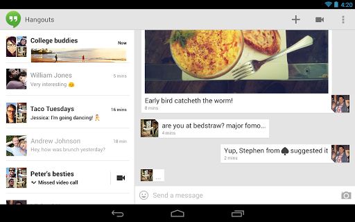
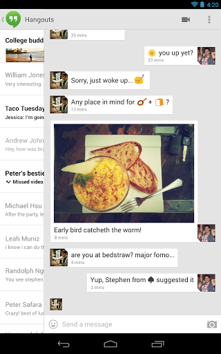
A SlidingPaneLayout consists of two panes: the master pane and the detail pane. In the Hangouts application, the master pane contains a list of ongoing hangouts and the detail pane contains the actual hangout conversation. Selecting an item in the master pane will update the detail pane.
The really cool thing about SlidingPaneLayout is that the rightmost pane, the detail pane, can be dragged horizontally to uncover the master pane below. On a screen that is large enough to display both panes, the user will see both simultaneously. On a small screen, the user will see a single pane at a time and can slide the detail pane to reveal the master pane.
Good news! SlidingPaneLayout is incredibly easy to use. SlidingPaneLayout is a ViewGroup, so it is designed to contain child views. However, this particular ViewGroup is intended to have only two children. To make use of this Layout, simply add its tag to your layout XML file for an Activity:
<android.support.v4.widget.SlidingPaneLayout
    xmlns:android="http://schemas.android.com/apk/res/android"
    android:layout_width="match_parent"
    android:layout_height="match_parent" >
    <textview android:layout_width="250dp"
        android:layout_height="match_parent"
        android:background="#CC00FF00"
        android:text="Pane 1" />
    <textview android:layout_width="400dp"
        android:layout_height="match_parent"
        android:layout_weight="1"
        android:background="#CC0000FF"
        android:text="Pane 2" />
</android.support.v4.widget.SlidingPaneLayout>
That’s it. You are now using SlidingPaneLayout and you have a tablet-optimized app!
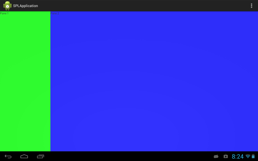
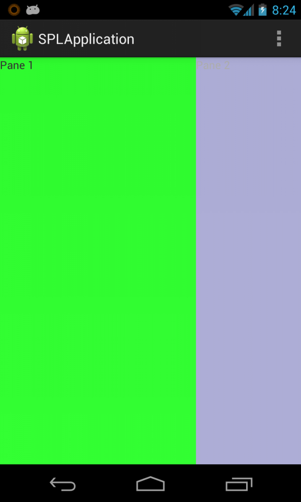
Of course, a real app would have something more complex than two TextViews in each of the panes. Fragments would be a great fit here.
A master Fragment and a detail Fragment could be used, and would encapsulate all of your app’s custom controller code into reusable classes. If requirements change and you decide to do things the old-fashioned way (without SlidingPaneLayout), you would have to change only the Activity that is hosting your Fragments, not the Fragments themselves.
As you would expect, SlidingPaneLayout works just fine with Fragments. I highly recommend using a Fragment for each of the panes.
However, there is one problem. Options menus (the items that show up in the Action Bar or when hitting the menu hardware button on some devices) do not work correctly. Since the SlidingPaneLayout is just a ViewGroup, it is not in control of the options menu and the user will always see the menu items from both fragments, even when you’re looking at just a single pane.
In an ideal world, I would like to see the SlidingPaneLayout show only the options items that are available for the currently selected Fragment in the layout (of course, seeing menu items for both fragments is fine, if the user is on a device that is large enough to show both panes). Obviously, there are ways to implement this yourself, but it does require a little extra work. The Hangouts application is clearly doing that extra work to update the options menu and the rest of the Action Bar when panes become selected.
SlidingPaneLayout is not a natural fit for all applications, and it’s certainly not a replacement for the new Navigation Drawer paradigm. It is a handy Layout, though, especially when creating applications that work well on any size device. Of course, there are downsides, like the Fragment options menu problem from above. SlidingPaneLayout is also marked as experimental in the documentation, so its future is uncertain. Like ViewPager, though, this will cause a problem only if/when you decide to update to a new version of the support library.
I’m excited to see the Android team take components that they use internally and encourage developers to include them in their own apps. Components like these as well as those contributed by other Android developers allow us to make better Android apps with less work.

Introduction When computer programming was young, code was punched into cards. That is, holes were punched into a piece of cardboard in a format...

Jetpack Compose is a declarative framework for building native Android UI recommended by Google. To simplify and accelerate UI development, the framework turns the...

Big Nerd Ranch is chock-full of incredibly talented people. Today, we’re starting a series, Tell Our BNR Story, where folks within our industry share...