Swift Regex Deep Dive
iOS MacOur introductory guide to Swift Regex. Learn regular expressions in Swift including RegexBuilder examples and strongly-typed captures.
The tvOS focus engine and collection views can bring a robust and interactive control to the television screen, but to design any layout that is non-linear, you will need to create a custom layout. In this post, we’ll create a custom control for a tvOS app, using the Big Nerd Ranch areas of development as example content, to show how to create a custom layout in the shape of a circle. The end goal will look like this:

When we finish the project, we want to see a wheel of content that the user can swipe through. When they make a selection, the focus should transition to a table of content related to their selection. To follow along, the source code for this tutorial can be found on GitHub here.
UIKit uses collection views to present ordered data in your app. If you’ve used the Photos or Music apps or an iPhone, chances are you have interacted with a Collection View. At any given time, a collection view has a single layout object which tells it where to place items and how they should look. You can use custom collection view layouts and their collaborating objects to present data on the screen in a creative way that distinguishes your app from a vanilla grid of cells.
UICollectionView is a powerful class with many opt-in behaviors that can make your app more engaging and visually attractive to a user. As a tvOS developer, this is generally one of your goals. Once you have laid the groundwork for a custom collection view layout, you have a flexible interface to handle callbacks, add decoration or supplementary views, adjust selection and highlight styles, and customize reordering behavior, among the myriad options. Collection views are important enough to get their own focus engine callbacks and properties in tvOS. collectionView(:canFocusItemAt:) and collectionView(:didUpdateFocusIn:with:)are methods you will be glad to have when we implement navigation in tvOS in the second part of this blog series.
Implementing a custom collection view can be a hefty undertaking and you should make sure that Apple’s provided UICollectionViewFlowLayout and UICollectionViewDelegateFlowLayout classes are not capable of what you’re trying to do. The most common situations that call for a custom layout are when your desired layout looks nothing like a grid or line-based layout, or if you want to change the positions of cells frequently enough that it becomes more work to constantly update the information in the flow layout than to make your own. With that, let’s take a look at the ecosystem of UICollectionView and
implement our own.
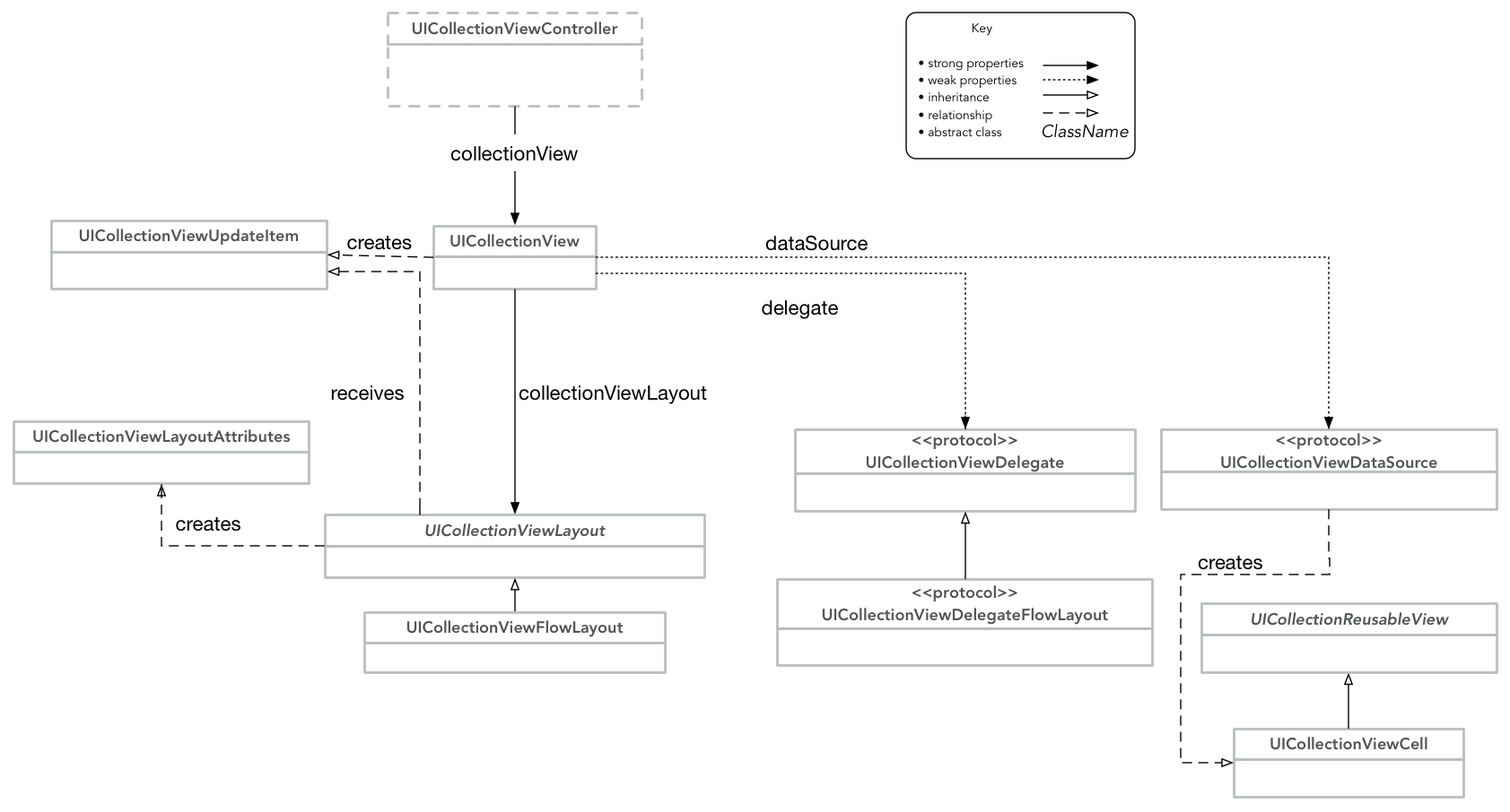
Collection views are a coordination of many classes, each assists in displaying data
or handling user interaction. The classes shown here aren’t a complete set, but do
the majority of a collection view’s work. They are also the classes we will be subclassing
or using heavily throughout this walkthrough. We won’t be using the classes associated
with Flow Layout, but they are shown to give you an idea where they fit in. This
diagram may be helpful to reference as we write our custom layout.
Create a blank single-view tvOS application in Xcode. Don’t worry about the boiler plate for now. The personality of our collection view is going to come from its custom layout, so create a new file called CollectionViewWheelLayout.swift and add the following code:
import UIKit

class CollectionViewWheelLayout: UICollectionViewLayout {

    var itemAttributesCache = [UICollectionViewLayoutAttributes]()

    override var collectionViewContentSize: CGSize {
        guard let collectionView = collectionView else {
            preconditionFailure("collection view layout doesn't have a collection view!")
        }
        return collectionView.frame.size
    }

    override func prepare() {
        // create a layout attribute for each cell of our collection view
    }

    override func invalidateLayout() {
        super.invalidateLayout()
        itemAttributesCache = []
    }

    override func layoutAttributesForElements(in rect: CGRect) -> [UICollectionViewLayoutAttributes]? {
        let itemAttributes = itemAttributesCache.filter {
            $0.frame.intersects(rect)
        }
        return itemAttributes
    }

    override func layoutAttributesForItem(at indexPath: IndexPath) -> UICollectionViewLayoutAttributes? {
        return itemAttributesCache.first {
            $0.indexPath == indexPath
        }
    }

}
The role of a UICollectionViewLayout subclass is to provide the collection view with the size and position of its elements in the form of UICollectionViewLayoutAttributes objects. These are the methods that must be implemented to subclass UICollectionViewLayout. We generate the positions for our collection cells in prepare(). The superclass implementation of prepare() does nothing. In a subclass, at a minimum prepare() should compute enough information to return the overall size of the collection view’s content area. At a maximum, it should create and store all layout attribute objects your view will use. We’ll cache this data in the itemAttributesCache. If at any time we should invlidate this layout, all we have to do is clear the cache.
The collectionViewContentSize property is a ‘gimme’ in this situation. It represents the size of the entire collection view displayed. Contrast this with the visble rectangle of a scroll view. In our case, our view doesn’t scroll vertically or horizontally and is visible in its entirety at all times.Our collectionViewContentSize is the frame of the collection view.
The layoutAttributesForElements(in:) and layoutAttributesForItem(at:) methods perform lookups in this cache based on what the caller is asking for and return the requested layout attributes.
We use a lazy variable to ensure that the calculation of coordinates only gets done once. We will use other means to rotate and animate the view later, rather than juggling rotation matrices in our collection view layout. configureLayout contains trigonometry for arranging squares’ corners around a circle. Add a spacing property and a definition for configureLayout.
Implement prepare() below and add an itemSpacingDegrees property to allow for customization of the sizes of the collection view cells.
var itemSpacingDegrees: CGFloat = 3.0
...

override func prepare() {
    guard self.itemAttributesCache.isEmpty, let collectionView = self.collectionView else { return }
    for section in 0..<collectionView.numberOfSections {
        let itemCount = collectionView.numberOfItems(inSection: section)
        let cgItemCount = CGFloat(itemCount)

        for i in 0..<itemCount {
            let bounds = collectionView.bounds
            let O = CGPoint(x: bounds.midX, y: bounds.midY)
            let R = bounds.width / 2.0
            let radiansSoFar = CGFloat((i * 360/itemCount)).degreesToRadians
            let endAngle = radiansSoFar + (360.0/cgItemCount - self.itemSpacingDegrees).degreesToRadians
            let θ = (endAngle - radiansSoFar)
            let r = (R * sin(θ/2.0)) / (sin(θ/2.0) + 1)
            let OC = R - r
            let x = cos(radiansSoFar + θ / 2.0) * OC - r + O.x
            let y = sin(radiansSoFar + θ / 2.0) * OC - r + O.y
            let frameOrigin = CGPoint(x: x, y: y)
            let cellFrame = CGRect(origin: frameOrigin, size: CGSize(width: 2*r, height: 2*r))

            let indexPath = IndexPath(item: i, section: section)
            let layoutAttributes = UICollectionViewLayoutAttributes(forCellWith: indexPath)
            layoutAttributes.frame = cellFrame
            self.itemAttributesCache.append(layoutAttributes)
        }
    }
}
guarding on an empty item attributes cache is an extra safety measure. prepare() is only called when the layout is explicitly invalidated or if there are changes to the view. Because our view stays constant on the screen and we have a constant content area, prepare() should only get called the first time the view is loaded.
Feel free to omit the unicode theta, or press Cmd-Ctrl-Space to bring up the drawer and select your favorite style of theta from the 25 available choices. You will also need two extensions to keep degrees to radians conversions out of sight:
extension Int {
    var degreesToRadians: Double { return Double(self) * .pi / 180 }
}
extension CGFloat {
    var degreesToRadians: CGFloat { return self * .pi / 180 }
}
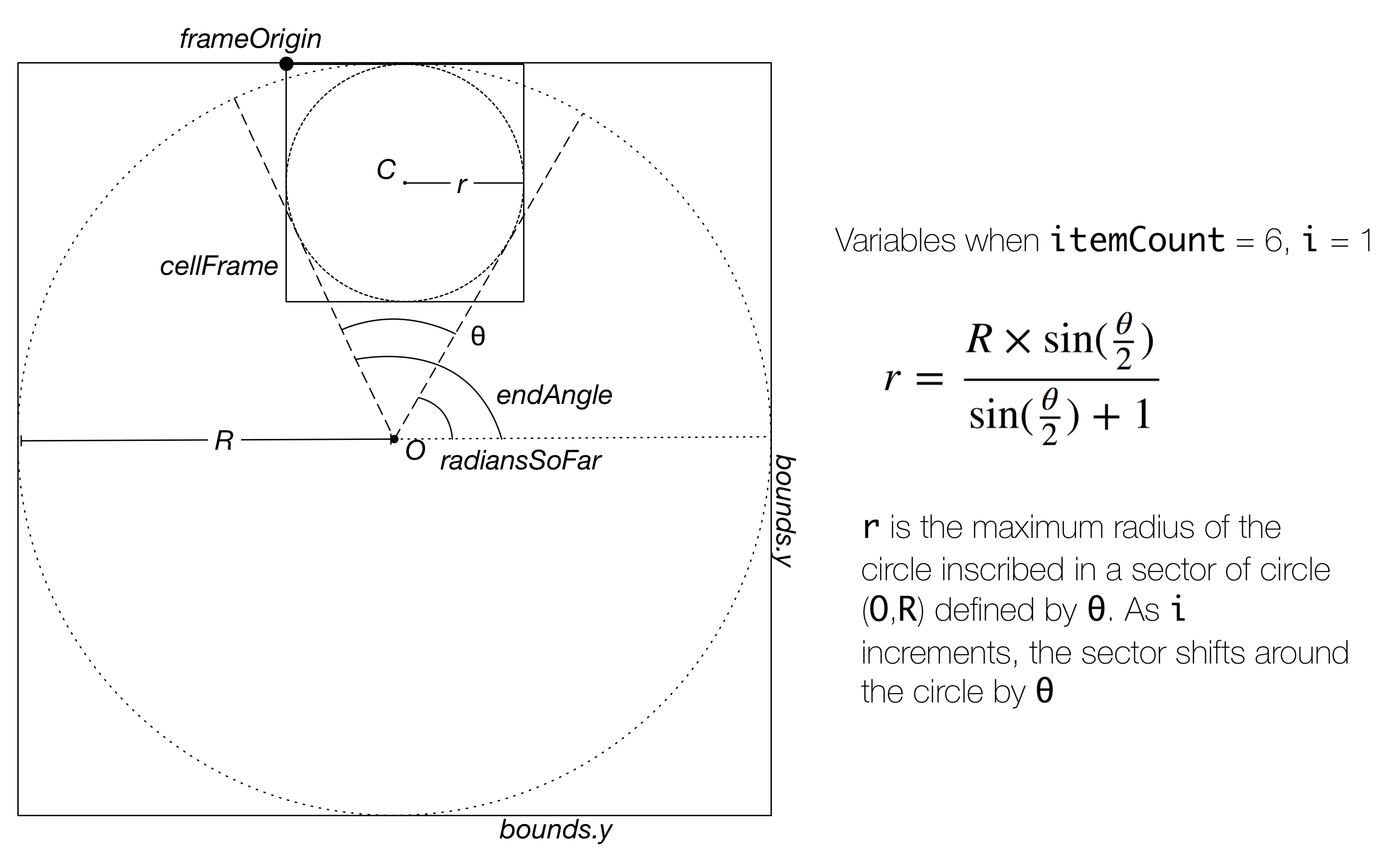
This math is lengthy, but not overly complex. Each iteration of the loop calculates the position of the upper-left corner of the frame for each collection view cell around a center point. If you want to create non-linear collection view layouts, you’ll have to revisit sohcahtoa. To match each variable to a calculated dimension, see the figure below.
Extend the ViewController class to conform to UICollectionViewDataSource and give it the two necessary methods.
extension ViewController: UICollectionViewDataSource {

    func collectionView(_ collectionView: UICollectionView, numberOfItemsInSection section: Int) -> Int {
        return images.count
    }

    func collectionView(_ collectionView: UICollectionView, cellForItemAt indexPath: IndexPath) -> UICollectionViewCell {
        let cell = collectionView.dequeueReusableCell(withReuseIdentifier: "WheelCell", for: indexPath) as! CollectionViewWheelCell
        let image = images[indexPath.row]
        let imageView = UIImageView(image: image)
        cell.cellImage = imageView
        return cell
    }
}
Download the .lsr images from this project’s GitHub or create your own. Using Apple’s layered image format gets you parallax and depth effects on your images in tvOS. Drag the images folder into the Assets.xcassets folder in Xcode. Now add the images array as a property on ViewController with image literals. Then type in the first few letters of the name of each image, and select the autocomplete
suggesion. Xcode support for layered image literals isn’t visually ideal, but makes
instantiating images easy.

Create the cell class CollectionViewWheelCell. This cell will hold only the image.
class CollectionViewWheelCell: UICollectionViewCell {
    var cellImage: UIImageView? {
        didSet {
            configureImage()
        }
    }

    override var reuseIdentifier: String? {
        return "WheelCell"
    }

    private func configureImage() {
        guard let cellImage = cellImage else {
            return
        }
	cellImage.frame = contentView.bounds
        contentView.addSubview(cellImage)

        cellImage.translatesAutoresizingMaskIntoConstraints = false
        cellImage.centerXAnchor.constraint(equalTo: centerXAnchor).isActive = true
        cellImage.centerYAnchor.constraint(equalTo: centerYAnchor).isActive = true
        cellImage.widthAnchor.constraint(equalTo: widthAnchor).isActive = true
        cellImage.heightAnchor.constraint(equalTo: heightAnchor).isActive = true

        cellImage.adjustsImageWhenAncestorFocused = true
    }
}
In Main.storyboard, add a collection view with a width and height of 550 and constrain it towards to left of the screen. 95 points from the top layout guide and 20 points from the left will be ideal for part 2 of this tutorial when we introduce a split view controller. In the Attributes Inspector, configure the collection view to have 0 items and a Custom layout. We manually registered our cells earlier. Select your CollectionViewWheelLayout from the dropdown. Finally, set the background color to Default or transparent.
The final steps are hooking up a collection view outlet to your view controller and configuring it in ViewControler.swift’s viewDidLoad().
@IBOutlet var collectionView: UICollectionView!

override func viewDidLoad() {
    super.viewDidLoad()
    collectionView.register(CollectionViewWheelCell.self, forCellWithReuseIdentifier: "WheelCell")
    collectionView.dataSource = self
    collectionView.clipsToBounds = false
}
Build and run the application. Press Cmd-Shift-R to get the simulated remote on the sceeen if it isn’t there already. Try holding down option and panning around the remote. Check out all of that free behavior the focus engine gives you because you used a collection view and positioned your views well! If you are curious to see how fliexible our collection view is, try adjusting the return value of collectionView(:numeberOfItemsInSection:) and add a modulus operator to the array subscript in collectionView(:cellForItemAt:). (let image = images[indexPath.row % images.count]) if you increase the item count.
You now have a collection view using a custom layout displayed on the screen, it looks good, and you can add selection callbacks right now. In the next post in the series, we’ll learn how to create the behavior in the animation at the top of this page.
Learn more about why you should update your apps for iOS 11 before launch day, or download our ebook for a deeper look into how the changes affect your business.

Our introductory guide to Swift Regex. Learn regular expressions in Swift including RegexBuilder examples and strongly-typed captures.

The Combine framework in Swift is a powerful declarative API for the asynchronous processing of values over time. It takes full advantage of Swift...

SwiftUI has changed a great many things about how developers create applications for iOS, and not just in the way we lay out our...