From Punched Cards to Prompts
AndroidIntroduction When computer programming was young, code was punched into cards. That is, holes were punched into a piece of cardboard in a format...
Cassowary is a bird that lives in the tropical forests of New Guinea and mostly eats fruit. It is also the name of the algorithm and software for solving systems of linear equations and inequalities, developed in the 1990s at the University of Washington. It turns out that linear equations are really well suited for specifying the parameters of user interface elements, namely, the positions and sizes of views, their relationships to each other, etc. Instead of painstakingly crafting artisanal, bespoke, pixel-perfect-but-not-adaptable user interfaces, the UI can be defined by declaring how its elements are positioned with respect to each other.
Cassowary’s contribution was the efficiency with which it could solve all those equations. Since people are very sensitive to the smoothness of graphics, speed of rendering the UI is very important. In 2016, both iOS and Android have first-party layout systems based on Cassowary. This explores ConstraintLayout and compares it to Auto Layout.
A constraint is a rule that specifies of how properties of views relate to each other. For example, we might want the views to be aligned along their top edge. Rather than manually setting their vertical position to be equal to the same number, the constraint would simply state that their top edges must be equal to each other, like so: view1.top = view2.top.


More generally, a constraint defines the relationship between properties of views, called anchors, in an expression of this form (shown here as an equality, but inequalities can be used, too):
view1.attribute1 = multiplier * view2.attribute2 + constant
To translate these constraints into actual positions and sizes, the constraint solver applies the Cassowary algorithm to find the solution. In the illustration above, the top positions of the views are set up as follows:
view1.top = view2.top
view1.top = container.top + constant
Since the container size and position are known, the second expression gives us the solution for view1.top, and, consequently, the solution for view2.top.
Many of the same anchors exist in both Auto Layout and ConstraintLayout. Both have top, bottom, baseline, left, and right. There is a slight terminology difference for the internationalization-friendly anchors: leading and trailing for Auto Layout vs start and end for ConstraintLayout. Auto Layout also has centerX and centerY, which are missing from the current version of ConstraintLayout. The same centering effect can be achieved in ConstraintLayout with other mechanisms, such as the guidelines or using both left and right constraints. In addition, ConstraintLayout defines the begin and percent anchors exclusive to guidelines.
| Android | iOS |
|---|---|
| top | top |
| bottom | bottom |
| left | left |
| right | right |
| start | leading |
| end | trailing |
| centerX | |
| centerY | |
| baseline | baseline |
Auto Layout provides the top and bottom layout guides that help with aligning views to the top or the bottom of the screen. They adapt to the presence of various bars at the top or bottom of the screen: status, navigation, tab, tool, and active call/audio recording. Some of these can appear dynamically (e.g., active call), others are determined at the time the view controller is presented (e.g., pushing the view controller onto the navigation stack). There are also layout margins on the sides that allow views to keep a certain distance from the edge of the screen.
Interface Builder allows adding horizontal and vertical guides, but they’re not actual views, they only exist during editing. Constraints cannot be defined in terms of edit-time-only guides.
ConstraintLayout guidelines, on the other hand, are first-class citizens. They’re special non-rendering views, permanently View.GONE from sight, but playing an important role in layout. They show up as vertical or horizontal lines in the UI and can be set at either a fixed position or a fixed percentage from an edge. For example, a vertical guideline that goes through the center of the screen would look like this:
    <android.support.constraint.Guideline
        ...
        android:orientation="vertical"
        app:layout_constraintGuide_percent="0.5"/>
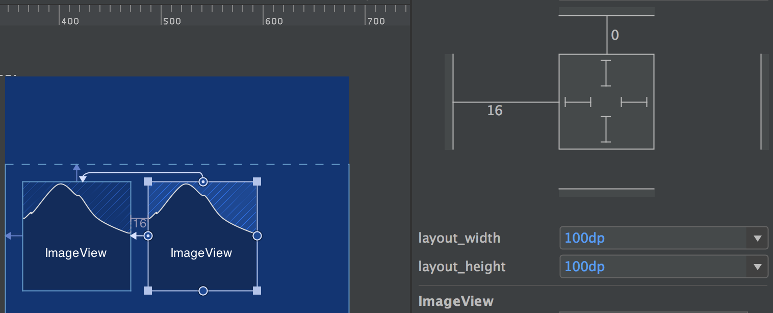
Like other layouts, ConstraintLayout defines its own LayoutParams, which its children can use to specify their position and sizing. Constraints are created by using layout params of the form app:layout_constraintAnchor1_toAnchor2Of="@id/view2". As a result, ConstraintLayout’s constraints are one-way and directed out of one view to another view.
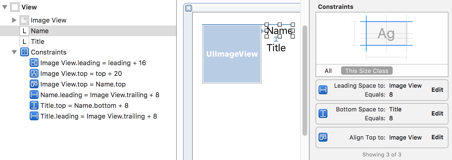
On iOS constraints are separate objects. They are defined in the view that’s the closest common ancestor of the views that are related by it. For example:
Auto Layout scales priorities from 0 to 1000, where 1000 means absolutely required and lower priorities mean those can be broken sooner.
ConstraintLayout doesn’t have explicit priorities, every constraint is required.
With Auto Layout, each view needs to have enough constraints to determine its vertical and horizontal position and size. For some Views, their intrinsic size may serve as the constraint for size (width and height). A UILabel (usually a single line of text) typically only needs the position constraints, for example, center horizontally in container, and standard distance from top. A UIImageView can also infer its size from its contents, but depending on the source of the image, it may not behave as expected at the design time, so it may need to add explicit width and height constraints. Alternatively, it may be anchored to the inside of its container.
In ConstraintLayout, all views typically have one of three size specifications for width/height:
wrap_content, which has the same meaning as in other layouts. Roughly equivalent to intrinsic content size in Auto Layout.dp value. Toggling the size control to this setting will result in the editor inserting the current dp size of the view. This is the same as setting an explicit dimension (width or height) constraint in Auto Layout.0dp) will cause the view to occupy the remaining space while satisfying the constraints.ConstraintLayout allows only legal combinations of anchors for constraints. The anchors must be of the same “type”. The type mainly represents the axis (vertical or horizontal), but there additional subtleties. For example, the i18n-friendly (Start/End) and legacy (Left/Right) anchors cannot be mixed. Furthermore, baselines can only be constrained to other baselines. Finally, baseline and top/bottom are mutually exclusive and addition of a new constraint will result in the removal of the other. For example, if a TextView was already baseline-aligned to another view, adding a top constraint will remove the baseline constraint.
This rule is enforced by the XML schema that defines only legal layout attributes (e.g., layout_constraintBaseline_toBaselineOf) and within the ConstraintLayout itself.
| Anchors | Type |
|---|---|
| Baseline | Vertical (Text only) |
| Top, Bottom | Vertical |
| Start, End | Horizontal (1) |
| Left, Right | Horizontal (2) |
ConstraintLayout exposes the baseline anchor, whereas LinearLayout has baselineAligned turned on by default and RelativeLayout has align_baselineTo.
Auto Layout uses different classes in order to enforce compatibility when specifying the constraint programmatically. All these classes are subclasses of the generic NSLayoutAnchor class declared as follows (using Swift notation):
class NSLayoutAnchor<AnchorType : AnyObject> : NSObject {
    ...
    func constraint(equalTo anchor: NSLayoutAnchor<AnchorType>) -> NSLayoutConstraint
    ...
}
Subclasses use themselves as the generic constraint, for example:
class NSLayoutXAxisAnchor : NSLayoutAnchor<NSLayoutXAxisAnchor> {
Such declaration enforces correctness of the constraints through the language’s type system (in both Swift and Objective-C).
| Anchors | Type | Class |
|---|---|---|
| Baseline | Vertical (Text only) | NSLayoutYAxisAnchor |
| Top, Bottom | Vertical | NSLayoutYAxisAnchor |
| Leading, Trailing | Horizontal (1) | NSLayoutXAxisAnchor |
| Left, Right | Horizontal (2) | NSLayoutXAxisAnchor |
| Width, Height | Dimension | NSLayoutDimension |
NSLayoutAnchor defines methods that create NSLayoutConstraints with another anchor and an optional constant, i.e., constraints of the forms anchor1 <REL> anchor2 or anchor1 <REL> anchor2 + constant, where <REL> is “equal”, “less than or equal”, or “greater than or equal”.
While NSLayoutXAxisAnchor and NSLayoutXAxisAnchor do not define any extra methods over NSLayoutAnchor, their sibling NSLayoutDimension adds several methods to expand expressive power. The added NSLayoutDimension methods make it possible to express constraints of the form anchor1 <REL> constant and anchor1 <REL> multiplier * anchor2 + constant.
ConstraintLayout joins a growing number of UI systems that use the Cassowary constraint solver algorithm. Despite the common foundation, the implementations may differ in the specifics. Auto Layout and ConstraintLayout use some of the same mechanisms and even terminology, like anchors and constraints, but vary in their approaches to the API. Since ConstraintLayout is still very young, there are many exciting possibilities for its evolution.

Introduction When computer programming was young, code was punched into cards. That is, holes were punched into a piece of cardboard in a format...

Jetpack Compose is a declarative framework for building native Android UI recommended by Google. To simplify and accelerate UI development, the framework turns the...

Big Nerd Ranch is chock-full of incredibly talented people. Today, we’re starting a series, Tell Our BNR Story, where folks within our industry share...