Swift Regex Deep Dive
iOS MacOur introductory guide to Swift Regex. Learn regular expressions in Swift including RegexBuilder examples and strongly-typed captures.
This Swift UI tutorial will introduce you to the techniques and code needed to add custom shapes in Swift UI’s framework. We can create our own shape by drawing the Path ourselves, and these custom shapes are used to display a task that is running or to show feedback to the user when interacting with an element on the screen.
SwiftUI gives us some powerful tools out of the box, shapes being one of them. Apple provides us shapes like Capsule, Circle, Ellipse, Rectangle, and RoundedRectangle. A shape is a protocol that conforms to the Animatable, and View protocols, which means we can configure their appearance and behavior. But we can also create our own shape with the power of the Path struct! A Path is simply an outline of a 2D shape that we will draw ourselves. If you’re thinking, ok but how is this practical? Custom shapes and animations are used to display a task that is running or to show feedback to the user when interacting with an element on the screen. Here’s where we’re going, and we’ll get there by building the vehicle body, adding some animation and styling, then adding the sunset behind it. Let’s get started!
Since we’re working on an iOS application, the origin of CGRect will be in the upper-left, and the rectangle will extend towards the lower-right corner. To build our shape we’re going to start the origin in the bottom-left corner and work clockwise. You can read the official Apple Documentation for more details on CGRect.
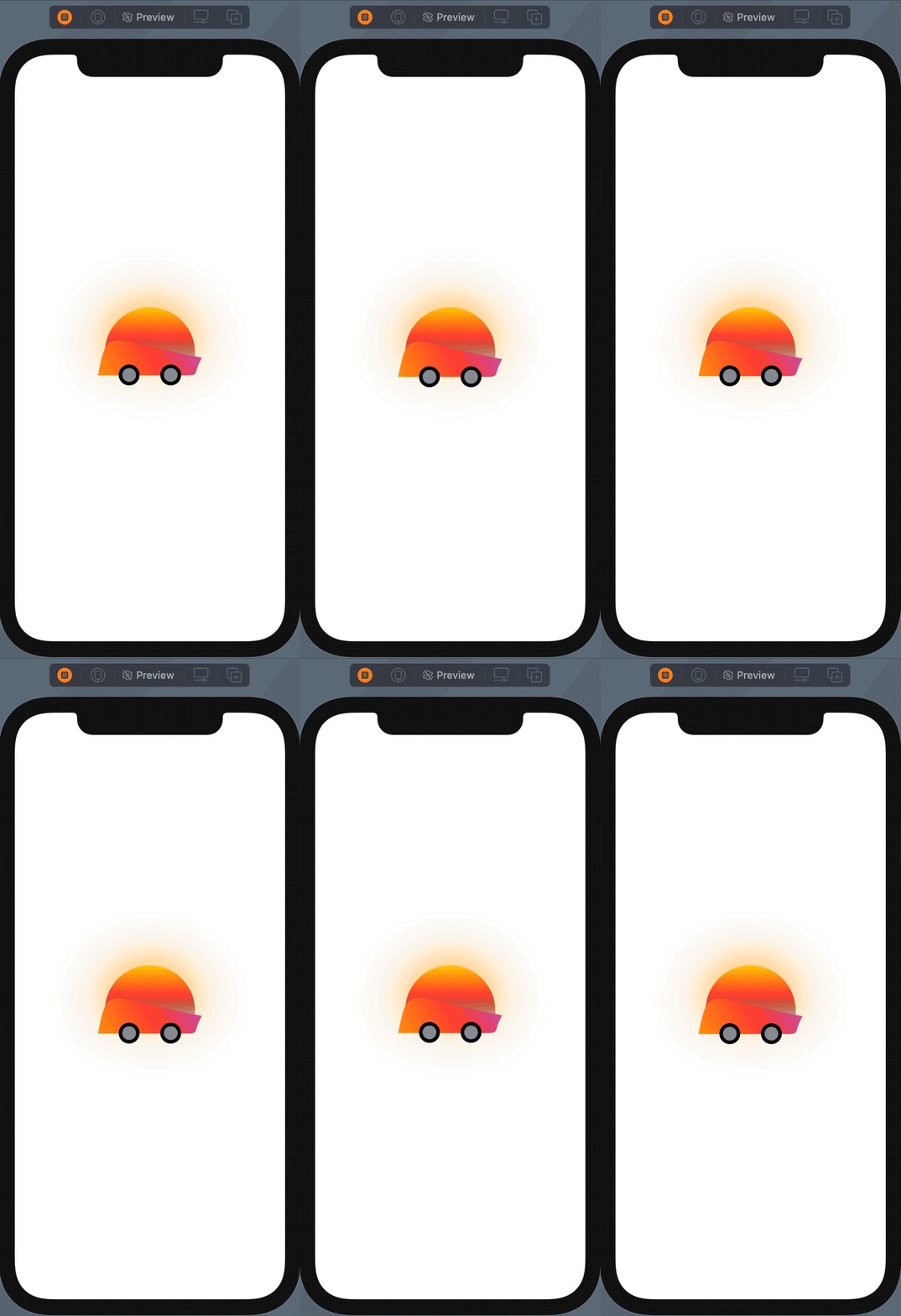
Based on this we can plan our shapes before fumbling around with numbers and CGPoint values. For this example, we’ll build a vehicle and animate it to look like it’s moving. I’ve drawn out the frame of the vehicle using Path, and we’ll use the Circle shape to make the wheels and hubcaps. Again, here is what it will look like:
 Create a
 struct that conforms to the Shape protocol. In it we need to add the func path(in rect: CGRect) -> Path method. This is what allows us to draw our shape.
struct VehicleBody: Shape {
    // 1.
    func path(in rect: CGRect) -> Path {
        // 2.
        var path = Path()
        // 3.
        let bottomLeftCorner = CGPoint(x: rect.minX, y: rect.maxY)
        path.move(to: bottomLeftCorner)
        // 4.
        path.addCurve(to: CGPoint(x: rect.maxX, y: rect.maxY * 0.7),
                      control1: CGPoint(x: rect.maxX * 0.1, y: rect.maxY * 0.1),
                      control2: CGPoint(x: rect.maxX * 0.1, y: rect.maxY * 0.4))

        path.addCurve(to: CGPoint(x: rect.maxX * 0.8, y: rect.maxY),
                      control1: CGPoint(x: rect.maxX * 0.9, y: rect.maxY),
                      control2: CGPoint(x: rect.maxX, y: rect.maxY))

        // 5.
        path.closeSubpath()
        // 6.
        return path
    }
}
Let’s go through what’s happening in the code.
path(in:), which is required by the Shape protocol. This returns a Path which we will create. It takes a CGRect parameter that will help us lay out our shape.Path. Remember a Path is the outline of a 2D shape.path where our starting point will be using the move(to: CGPoint) function. Here is where our parameter CGRect will help us find our starting point. Thinking in terms of a grid or coordinates, we want our shape to start at the bottom-left corner. A CGRect is a structure that contains the location and dimensions of a rectangle, and a CGPoint is a structure that contains a point in a two-dimensional coordinate system. For iOS the bottom-left corner of a CGRect is the minX or 0, and maxY or the largest value of y on the coordinate system.path has a function called addCurve, and it does exactly what the name says. It adds a cubic Bézier curve to the path with specified end and control points. The endPoint is the endpoint of the curve. Essentially where you want the curve to end. The path the curve will take starts at our move(to:) point, rect.minX, and rect.maxY. controlPoint1 and controlPoint2 determine the curvature of the segment. The addCurve must be called after the move(to:) or after a previously created line. If the path is empty, this method does nothing. This method can seem overwhelming at first, so I’d suggest reading Apple's official documentation. If you’re wondering how I ended up with these control points, I simply changed each point until I was happy with the shape. Feel free to modify these points in your own shape. This is what the curves should look like: We can then close off our shape’s path by calling
 closeSubpath(). This will create a straight-line segment from the last to the first point of our shape.path.Now that we have our frame, let’s add some wheels using a shape we get for free. If you haven’t guessed it already, we’re going to use the Circle shape for our wheels. In order to line things up correctly, we need to layout our view with a few ZStacks. Let’s create a new struct that we’ll build our vehicle parts in.
struct Vehicle: View {
    var body: some View {
        // 1.
        ZStack {
            // 2.
            VStack(spacing: -15) {
                // 3.
                VehicleBody()
                // 4.
                HStack(spacing: 30) {
                    // Back wheel
                    ZStack {
                        Circle()
                            .frame(width: 30, height: 30)
                        Circle()
                            .fill(Color.gray)
                            .frame(width: 20, height: 20)
                    }
                    // Front wheel
                    ZStack {
                        Circle()
                            .frame(width: 30, height: 30)
                        Circle()
                            .fill(Color.gray)
                            .frame(width: 20, height: 20)
                    }
                }
            }
            // 5.
            .frame(width: 150, height: 100)
        }
    }
}
ZStack allows us to overlap views.ZStack isn’t enough to put our parts in the correct placement. Adding a VStack will stack our frame and wheels, vertically. We can then adjust the spacing to line our wheels up so half their height aligns with the bottom of the frame.VehicleBody()HStack and give them a spacing of 30. Next, our wheels will each be wrapped in a ZStack so we can place the hubcap on top of the wheel. First add the wheel shape with Circle() and give it a frame with a width and height of 30. Then, add the hubcap with a width and height of 20. Give the hubcap a fill color of gray so we can see it over the wheel. Repeat this for the second wheel.Now that we have the frame and wheels of our vehicle we’re going to add some animations and ride off into the sunset.
Since we’ve just built a sweet vehicle that looks like it can handle some off-roading, I think our suspension should animate to show that. We don’t need a lot of code to make this happen, but we need to take care to animate the right elements. For this our animation will be on the parent VStack of the VehicleBody. We need to add a @State property to tell our view to animate, and two modifiers after the frame modifier of the VStack placing the wheels relative to the body:
struct Vehicle: View {
    // 1.
    @State var isPlayingAnimation: Bool = false

    var body: some View {
        ZStack {
            VStack(spacing: -15) {
                ...VehicleBody()
                ...HStack(spacing: 30)
            }
            // 2.
            .offset(y: isPlayingAnimation ? -3 : 0)
            // 3.
            .animation(Animation.linear(duration: 0.5).repeatForever(autoreverses: true))
        }
    }
}
@State property to manage our animation offset y position just above var body: some View.offset modifier to change the y position of our ZStack. Place this just after the .frame modifier. We want the vehicle to move up and down like a bouncing effect.animation modifier with a linear type. Finally, add the .repeatForever(autoreverses: true) function so our vehicle will appear to bounce…forever. We’re going to add the same functions to the
 HStack that contains our Circle shapes, but we’ll change the y position and animation duration slightly. This will give us a nice suspension effect.
.offset(y: isPlayingAnimation ? -2 : 0)
.animation(Animation.linear(duration: 0.4).repeatForever(autoreverses: true))
We’ll add one more shape to create our sunset, and then we’ll style our vehicle a bit. Our sunset will be in the shape of a Circle. Let’s add it directly inside our top ZStack.
Circle()
    .fill(LinearGradient(gradient: Gradient(colors: [.yellow, .red, .clear, .clear]), startPoint: .top, endPoint: .bottom))
    .frame(width: 130, height: 130)
    .shadow(color: .orange, radius: 30, x: 0, y: 0)
I’ve added some style to my vehicle, but feel free to style yours however you’d like. Here’s mine:
.fill(LinearGradient(gradient: Gradient(colors: [.purple, .red, .orange]), startPoint: .topTrailing, endPoint: .bottomLeading))
Lastly, in order to see our animation work, we need to add the onTapGesture function to our top ZStack and inside the closure toggle the isPlayingAnimation bool. Now we can interact with our animation simply by tapping it.
.onTapGesture {
    self.isPlayingAnimation.toggle()
}
You can see the animation right inside the canvas preview of Xcode by pressing the play button above the preview device. Or build and run on a simulator .
Our example shows just how easy it is to create a custom shape in SwiftUI. We barely scratched the surface of what we can do here, so I encourage you to explore some of the other functions in Path such as addArc or addQuadCurve. For example, try using quad curves to build a vehicle with more rounded corners.

Our introductory guide to Swift Regex. Learn regular expressions in Swift including RegexBuilder examples and strongly-typed captures.

The Combine framework in Swift is a powerful declarative API for the asynchronous processing of values over time. It takes full advantage of Swift...

SwiftUI has changed a great many things about how developers create applications for iOS, and not just in the way we lay out our...