The post Now Available React Programming: The Big Nerd Ranch Guide appeared first on Big Nerd Ranch.
]]>Your production-ready app will include a cart, a login page, and other e-commerce features.
What do you need to know?
Before you dive into the book, you will want to be familiar with the basics of HTML and CSS. It will also help to have a foundational knowledge of JavaScript, although we will cover some JavaScript concepts throughout the book. You will use these three languages as you build your React application. No need to know anything about React as we will take you through it step by step.
What will you learn?
Components
You will build your application with functional components and JSX. Using components will allow you to reuse code across your application. Components also help organize your code in a logical way that makes it easier to understand and allows for the separation of concerns.
Hooks
You will learn how and when to use the most common React hooks: useEffect, useState, useReducer, useRef, useContext, useMemo, and useCallback. You will have opportunities to compare similar hooks and choose the one to fit your situation best. Additionally, we will walk you through creating a custom hook so that you can further take advantage of all hooks have to offer.
Sharing State
You will use props and context to share the state between components and to keep up with the state between multiple pages. We will compare the trade-offs between the methods, so you can select which is best for each use case in your application.
API Integration
You will practice connecting your app to a server using both API requests and web sockets so that you can send and receive information. You will also learn how to display loading and error states to keep your users in the loop during API interactions.
Testing
You will learn how to thoroughly test your React components and flows using React Testing Library. You will also gain experience writing end-to-end tests with Cypress, a powerful testing framework for modern web applications. Additionally, we will cover setting up a mock server to test your application in a controlled environment. By comparing different testing methods, you will learn to choose the most effective approach for your needs.
Performance Tuning
Once you’ve completed the two applications and honed your React skills, you will dive into performance optimization. You will discover how to fine-tune your components to ensure your applications respond quickly to user interactions. You will analyze the bundle size of your application and use lazy loading to reduce the time to first contentful paint. You will analyze a large page that responds slowly to user input and use tools like memo, useMemo, useCallback, and useTransition to improve responsiveness.
Helpful Tools
There are several community libraries that you will use throughout this book. One of those will be React Router, which you will use to navigate your application. You will use PropTypes to specify the props coming into your components, so you will know if your components receive incorrect props. You will also use ESLint to check your application for coding errors and to enforce coding style.
Where can you buy the book?
You can order print and DRM-free electronic copies from InformIT. It is also available from Amazon and other booksellers.
If you want the whole Big Nerd Ranch experience, enroll in one of our bootcamps or bring us on-site with our corporate training.
The post Now Available React Programming: The Big Nerd Ranch Guide appeared first on Big Nerd Ranch.
]]>The post Introduction to Svelte appeared first on Big Nerd Ranch.
]]>Unlike other frameworks, Svelte does not run in the browser, nor does it use the virtual DOM. Instead, it uses a compiler that runs at build time to compile components into standalone JavaScript modules. This approach leads to faster and more efficient applications, making Svelte an excellent choice for building high-performance web applications.
The best way to see all that Svelte offers is to build an app yourself!
Follow along with us to build a Todo app and witness Svelte in action as you implement some of its key features.
Getting Started
We assume the reader has Node.js (version 16 or above), a code editor, and a browser installed.
To initialize the todo app, run the following command in your terminal:
npm create vite@4 svelte-todo -- --template=svelte-ts
This command uses the build tool Vite to create and scaffold a Svelte project for you entitled svelte-todo.
This example also adds the option at the end of the command to include TypeScript in your application.
You may be prompted to install create-vite.
Enter y to continue.
To get your project running, follow the steps listed:
cd svelte-todonpm installnpm run dev -- --open
Congratulations! Your Svelte app is running in your browser at localhost:5173. Open the directory in your code editor. The Vite scaffolding adds a small demo app. To remove it, simply delete these files:
./src/assets./src/lib./app.css
Also, perform the following edits:
- Delete the entire contents of
./src/App.svelte. - Remove the line
import './app.css'frommain.ts.
Create a Component
Let’s create your first Svelte component.
- First, create a new folder inside the
srcdirectory calledcomponents. - Create a new file in the components folder called
TodoItem.svelte.
As the title implies, you are creating a to-do item. We know we will need a checkbox and a description of the item. Svelte components consist of three different parts: JavaScript, HTML, and CSS.
That’s it.
Start by adding the HTML.
<div>
   <input type='checkbox' />
   <span>{item}</span>
</div>
In the code above, you are using familiar HTML tags. There is one question, though: how do you get access to item? Add JavaScript to your component by using script tags. By convention, these typically reside at the beginning of the file.
<script lang="ts">
   export let item: string;
</script>
Variables that will be used by your HTML, like item, are declared inside your script tags. Then, you access them inside brackets like <span>{items}</span>.
In this case, there is an extra keyword: export. This means that the value of item comes from an external source and will be passed into the component as a property. The lang="ts" is optional and denotes that you are using TypeScript inside the tag. That is everything you need for your first component. To see your component in the browser, you need to use it in your application.
Open the file ./src/App.svelte and replace the previous contents of the file:
<script>
import TodoItem from './components/TodoItem.svelte';
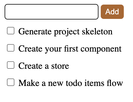
let todoItems = [
'Generate Project Skeleton',
'Create your first component',
'Create a store',
'Make a new todo items flow'
]
</script>
{#each todoItems as todoItem}
<TodoItem item={todoItem} />
{/each}
Let’s look at the JavaScript inside the script tags first. The TodoItem component that you created is being imported. Anytime a component is used in another component, it must be imported inside the script tag.
Next, you declare a new variable called todoItems. This is very similar to how the item variable was declared in the TodoItem component, with one big difference. There is no export keyword. This means that this variable is local to this component; the value is not coming from an external source. todoItems is an array that contains a list of items you will accomplish during this tutorial.
Now, take a look at the HTML. This looks different than the HTML you have already seen. That’s because it uses a logic block. In Svelte, you can add logic to HTML by wrapping it in curly braces. The character # lets you know that a logic block is beginning, and the character / signifies the block’s end.
Because todoItems is an array, you can use an each block to iterate through the array and complete an action with each of the items in the array. In this case, you are looking at each item and returning a TodoItem component. Notice that the item is being assigned to the TodoItem component as an attribute-this is how TodoItem has access to the item variable. Check out your application in the browser. You should have a list of items to check off as complete!
Go ahead and check off Generate project skeleton and Create your first component—you’re halfway there!
Stores
Like other frameworks, including React, Svelte has tools for managing global and local state. Unlike the React Context API, the Svelte store does not rely on hierarchy. Components can consume state without being directly nested under provider components. The Svelte store also doesn’t even require that the calling code be Svelte. A store could be consumed through any plain JavaScript module.
Svelte provides three types of stores out-of-the-box writable, readable, and derived. It also provides the ability to create a custom store (you can read more about that at Svelte), but in this tutorial, we will just use a writable store.
Creating a store
Inside /src, create a new directory and file /stores/todo.ts. Inside the new todo.ts file, start by importing the writable store type from svelte/store:
import { writable } from 'svelte/store';
Since this is TypeScript, we must define a type for our store. We could just use a string[], but we want to be able to mark items as done. So, let’s create a type that allows us to define a to-do item and maintain its done status.
In this example, we’re going to export this type because we will need to import it later on in the tutorial, but you may not always need to do this.
export type TodoItemType = {
   item: string;
   done: boolean;
}
Now we can define our store with the default to-do items we used earlier.
export const todoItems = writable<TodoItemType[]>([
   { item: 'Generate project skeleton', done: true },
   { item: 'Create your first component', done: true },
   { item: 'Create a store', done: false },
   { item: 'Make a new todo items flow', done: false },
]);
Consuming the store
Navigate back to App.svelte. Since we’ll be pulling our todo items from a store, we will no longer need the local array todoItems. Let’s replace it with our new store.
<script lang='ts'>
   import TodoItem from './components/TodoItem.svelte';
   import { todoItems } from './stores/todo';
</script>
Now our page is broken because we need to update our loop to use the item key inside the todoItem object we have in our store. Do that now.
{#each todoItems as todoItem}
   <TodoItem item={todoItem.item} />
{/each}
Wait, our page still isn’t displaying our to-do items! That’s because the value of todoItems is a store. It’s not the value of our store. To get that value, we need to subscribe to the store. We can manage subscriptions manually with the subscribe and unsubscribe functions on the store, but this adds quite a bit of additional code.
Thankfully, Svelte offers an easy way to “auto-subscribe” to a store. Auto-subscribing is as simple as prefixing our usage of the store with a $.
{#each $todoItems as todoItem}
   <TodoItem item={todoItem.item} />
{/each}
Look how clean that is!
Writing to the store
Let’s make a new component called AddTodoItem.svelte in the /components directory. This component will handle adding new items to our list. Before we interact with the store, let’s first create our UI. We will want a text input to type out our new item and a button to add it to the store.
<input type='text'/>
<button>Add</button>
We need to maintain our input value locally. If you are familiar with React, you would typically do this by utilizing the useState hook and onChange or onBlur props, but in Svelte we use a concept called binding. We’ll start by defining the variable we want to bind the input value to in a script tag:
<script lang='ts'>
   let todoItem = '';
</script>
Next, we will use bind to bind the value of the text input to todoItem.
<input type='text' bind:value={todoItem} />
Now the value of the variable will be synced with the value of the input, and we’ll be able to use it inside our click handler. So, let’s create a new function and assign it to the on:click event handler for the button.
<script lang='ts'>
   let todoItem = '';
   const addTodoItem = () => {
      alert(todoItem);
   }
</script>

<input type='text' bind:value={todoItem} />
<button on:click={addTodoItem}>Add</button>
Before we can test this in the browser, we need to import and render this component in App.svelte.
<script lang='ts'>
   import TodoItem from './components/TodoItem.svelte';
   import AddTodoItem from './components/AddTodoItem.svelte';
   import { todoItems } from './stores/todo';
</script>

<AddTodoItem />

{#each $todoItems as todoItem}
   <TodoItem item={todoItem.item} />
{/each}
Check out your browser. Type a message in the text box and click “Add”. You should see a browser alert with the message you just typed.
Nice work!
To add a value to the store without overriding what is already there, we will use the update function that exists on the store object. This function takes a function as its only parameter. The parameter function will be passed the current value of the store. We can modify that value and return it to update the store.
Update the script tag in AddTodoItem.svelte:
<script lang='ts'>
  import { todoItems, type TodoItemType } from '../stores/todo';
  let todoItem = '';

  const addTodoItem = () => {
    todoItems.update((store: TodoItemType[]) => (
      [
        ...store,
        {
          item: todoItem,
          done: false
        }
      ]
    ));
  }
</script>
If you want to take it a step further, try updating TodoItem.svelte to toggle the “done” status in the store when a user checks the checkbox.
Styling
Styling in Svelte is scoped to the component the style is defined in. You can accomplish this functionality with other frameworks using things like CSS modules or styled-components, but with Svelte it is included out of the box. So, we don’t have to worry about clashing tag styles or accidentally re-using a class name. These styles also live inside the same file as the component code, typically at the end of the file.
Let’s start by adding some padding to the list of items. Add the following code to the end of TodoItem.svelte:
<style>
   div {
      padding-top: 10px;
   }
</style>
And some styles to AddTodoItem.svelte:
<style>
  button {
    padding: 5px 8px;
    background-color: #b16326;
    color: white;
    border-radius: 5px;
    border: none;
  }

  button:hover {
    background-color: #e38d39;
    cursor: pointer;
  }

  input {
    padding: 5px 8px;
    border-radius: 5px;
    border: 1px solid black;
  }
</style>
Notice our styles assigned to the input tag do not affect the input we have rendered inside TotoItem.svelte.
Conclusion
We’ve gone over the basic concepts of Svelte component structure, binding, stores, and styling. If you want to take things further, take a look at the official Svelte interactive tutorial for some more advanced topics, and be on the lookout for more Svelte blog posts!
The post Introduction to Svelte appeared first on Big Nerd Ranch.
]]>The post Building a Design System and Consuming it in Multiple Frameworks using Stencil.js appeared first on Big Nerd Ranch.
]]>This blog post will be exploring these questions by building a design system with Stencil.js. The design system will support white-labeling via CSS Variables. Then the design system will be used without a framework, and with the React, Vue, Svelte, and Stencil frameworks.
Stencil is a compiler for web components that can build custom elements for use across multiple frameworks. The compatibility of custom elements with various frameworks is tracked by Custom Elements Everywhere.
The code for this blog can be found on GitHub at https://github.com/BNR-Developer-Sandbox/BNR-blog-stencil-design-system.
Building the Components
Each component encapsulates its own CSS and functionality. Developers wanting to publish a web component library can follow the Getting started guide for Stencil. The Stencil API provides decorators and lifecycle hooks to reduce boilerplate code and define implementation patterns.
Stencil Decorators
The Stencil API provides a number of decorators that are removed at compile time.
Each Stencil Component uses the @Component() decorator to declare a new web component defining the tag, styleUrl, and if the Shadow DOM should be used or not.
@Component({
  tag: "ds-form",
  styleUrl: "ds-form.css",
  shadow: true,
})
Lifecycle Hooks
The Stencil API also provides various lifecycle hooks. The only lifecycle hook used in this codebase is the render() method which uses JSX to return a tree of components to render at runtime.
Application Shell
The ds-shell component provides a header, main, and footer section available via slots. The header and footer slots are named slots, while the main content area uses the default unnamed slot. This component provides the general layout for an application.
import { Component, Host, h } from "@stencil/core";

@Component({
  tag: "ds-shell",
  styleUrl: "ds-shell.css",
  shadow: true,
})
export class DsShell {
  render() {
    return (
      <Host>
        <header>
          <slot name="header"></slot>
        </header>
        <main>
          <slot></slot>
        </main>
        <footer>
          <slot name="footer"></slot>
        </footer>
      </Host>
    );
  }
}
Hero
The ds-hero component provides a default slot container and encapsulates the CSS for the component.
import { Component, Host, h } from "@stencil/core";

@Component({
  tag: "ds-hero",
  styleUrl: "ds-hero.css",
  shadow: true,
})
export class DsHero {
  render() {
    return (
      <Host>
        <slot></slot>
      </Host>
    );
  }
}
Form
The ds-form component provides generic form handling by listening for input, change, and click events that bubble up to the form element. The component uses the @Element() decorator to declare a reference to the host element in order to dispatch the formdata event from the host element when the form is submitted. The component also uses the @State() decorator to declare the internal state of the form data.
import { Component, Element, Host, State, h } from "@stencil/core";

@Component({
  tag: "ds-form",
  styleUrl: "ds-form.css",
  shadow: true,
})
export class DsForm {
  @Element() el: HTMLElement;
  @State() data: any = {};
  onInput(event) {
    const { name, value } = event.target;
    this.data[name] = value;
  }
  onChange(event) {
    const { name, value } = event.target;
    this.data[name] = value;
  }
  onClick(event) {
    if (event?.target?.type === "submit") {
      const formData = new FormData();
      Object.entries(this.data).forEach(([key, value]) => {
        formData.append(key, String(value));
      });
      const formDataEvent = new FormDataEvent("formdata", { formData });
      this.el.dispatchEvent(formDataEvent);
    }
  }
  render() {
    return (
      <Host>
        <form
          // form event
          onInput={(event) => this.onInput(event)}
          onChange={(event) => this.onChange(event)}
          onClick={(event) => this.onClick(event)}
        >
          <slot></slot>
        </form>
      </Host>
    );
  }
}
White-labeling the components
In order to implement white-labeling, CSS Variables are used in the components which can be set by the design system consumer. The example repository only sets three variables to illustrate the idea; a complete design system would likely include more variables including sizes, fonts, etc.
Each application defines CSS Variables to implement a different brand.
:root {
  /* CSS Variables for theming white-labeled components */
  --primary-color: red;
  --secondary-color: gold;
  --tertiary-color: green;
}
Each application also defines a simple CSS Reset.
body {
  margin: 0;
  background-color: var(--tertiary-color);
}
Consuming the components
While consuming the custom elements the same HTML structure was used in each framework. Each example application implemented in each framework composes the ds-shell component for application layout, with a ds-hero to provide a call-to-action content area, and a unique form and form handler to process the form.
<ds-shell>
  <h1 slot="header">App Name</h1>
  <ds-hero>
    <ds-form>
      <label>
        Your Name:
        <br />
        <input type="text" name="name" />
      </label>
      <br />
      <label>
        Your Expertise:
        <br />
        <input type="text" name="expertise" />
      </label>
      <br />
      <input type="submit" value="Say Hello" />
    </ds-form>
  </ds-hero>
  <span slot="footer">
    <span>1</span>
    <span>2</span>
    <span>3</span>
  </span>
</ds-shell>
Event binding
The main difference between frameworks was binding the formdata event. Each framework has a slightly different syntax for declaring event handlers. The following examples demonstrate the event binding syntax for each framework.
Without a Framework
The Design System includes an implementation of the application without a framework in index.html. CSS Variables are defined in a <style> tag in the <head> tag. The event listener is added in a <script> tag at the end of the <body> tag.
<!DOCTYPE html>
<html dir="ltr" lang="en">
  <head>
    <meta charset="utf-8" />
    <meta
      name="viewport"
      content="width=device-width, initial-scale=1.0, minimum-scale=1.0, maximum-scale=5.0"
    />
    <title>Design System</title>

    <script type="module" src="/build/design-system.esm.js"></script>
    <script nomodule src="/build/design-system.js"></script>
    <style type="text/css">
      :root {
        /* CSS Variables for theming white-labeled components */
        --primary-color: red;
        --secondary-color: gold;
        --tertiary-color: green;
      }

      body {
        margin: 0;
        background-color: var(--tertiary-color);
      }
    </style>
  </head>
  <body>
    <ds-shell>
      <h1 slot="header">App Name</h1>
      <ds-hero>
        <ds-form>
          <label>
            Your Name:
            <br />
            <input type="text" name="name" />
          </label>
          <br />
          <label>
            Your Expertise:
            <br />
            <input type="text" name="expertise" />
          </label>
          <br />
          <input type="submit" value="Say Hello" />
        </ds-form>
      </ds-hero>
      <span slot="footer">
        <span>1</span>
        <span>2</span>
        <span>3</span>
      </span>
    </ds-shell>

    <script>
      function handleFormData(event) {
        event.stopPropagation();
        const { formData } = event;
        const data = Object.fromEntries(formData);
        const { name, expertise } = data;
        alert(`Hello ${name}, I hear you are good at ${expertise}.`);
      }

      const form = document.getElementsByTagName("ds-form")[0];
      form.addEventListener("formdata", (event) => handleFormData(event));
    </script>
  </body>
</html>
In order to add the event listener without a framework the native addEventListener method is used.
form.addEventListener("formdata", (event) => handleFormData(event));
React
The React application is implemented in App.js with CSS Variables in index.css.
import "design-system/ds-shell";
import "design-system/ds-hero";
import "design-system/ds-form";

function handleFormData(event) {
  event.stopPropagation();
  const { formData } = event;
  const data = Object.fromEntries(formData);
  const { reaction } = data;
  alert(`I am surprised that you reacted ${reaction}.`);
}

function App() {
  return (
    <ds-shell>
      <h1 slot="header">React App</h1>
      <ds-hero>
        <ds-form onformdata={(event) => handleFormData(event)}>
          <label>
            How did you react?:
            <br />
            <input type="text" name="reaction" />
          </label>
          <br />
          <input type="submit" value="What is your reaction?" />
        </ds-form>
      </ds-hero>
      <span slot="footer">
        <span>1</span>
        <span>2</span>
        <span>3</span>
      </span>
    </ds-shell>
  );
}

export default App;
React uses a lowercase onformdata attribute in JSX to bind the formdata event to a handler.
<ds-form onformdata={(event) => handleFormData(event)}>
  <!-- ... -->
</ds-form>
Vue
The Vue application is implemented in App.vue with CSS Variables in base.css.
<script setup>
  import "design-system/ds-shell";
  import "design-system/ds-hero";
  import "design-system/ds-form";

  function handleFormData(event) {
    event.stopPropagation();
    const { formData } = event;
    const data = Object.fromEntries(formData);
    const { view } = data;
    alert(`${view}!?! Wow! What a view!`);
  }
</script>

<template>
  <ds-shell>
    <h1 slot="header">Vue App</h1>
    <ds-hero>
      <ds-form @formdata="handleFormData">
        <label>
          How's the view?:
          <br />
          <input type="text" name="view" />
        </label>
        <br />
        <input type="submit" value="Looking good?" />
      </ds-form>
    </ds-hero>
    <span slot="footer">
      <span>1</span>
      <span>2</span>
      <span>3</span>
    </span>
  </ds-shell>
</template>

<style>
  @import "@/assets/base.css";
</style>
Vue uses a lowercase @formdata attribute set to the function name to bind the formdata event to a handler.
<ds-form onformdata={(event) => handleFormData(event)}>
  <!-- ... -->
</ds-form>
Svelte
The Svelte application defines application variables and the form handler in main.js.
import App from "./App.svelte";

const app = new App({
  target: document.body,
  props: {
    appName: "Svelte App",
    fieldLabel: "Your Location",
    fieldName: "location",
    submitLabel: "Where you at?",
    handleFormData: (event) => {
      event.stopPropagation();
      const { formData } = event;
      const data = Object.fromEntries(formData);
      const { location } = data;
      alert(`Where's ${location}?`);
    },
  },
});

export default app;
App.svelte uses the variables from main.js to render HTML and bind events.
<script>
  export let appName, fieldLabel, fieldName, submitLabel, handleFormData;
  import "design-system/ds-shell";
  import "design-system/ds-hero";
  import "design-system/ds-form";
</script>

<ds-shell>
  <h1 slot="header">{appName}</h1>
  <ds-hero>
    <ds-form on:formdata="{handleFormData}">
      <label>
        {fieldLabel}:
        <br />
        <input type="text" name="{fieldName}" />
      </label>
      <br />
      <input type="submit" value="{submitLabel}" />
    </ds-form>
  </ds-hero>
  <span slot="footer">
    <span>1</span>
    <span>2</span>
    <span>3</span>
  </span>
</ds-shell>
The CSS Variables are defined in global.css.
Svelte uses a lowercase on:formdata attribute to bind the formdata event to a handler.
<ds-form on:formdata="{handleFormData}">
  <!-- ... -->
</ds-form>
Stencil
The Stencil application is implemented in app-root.tsx with CSS Variables in app.css.
import { Component, h } from "@stencil/core";
import "design-system/ds-shell";
import "design-system/ds-hero";
import "design-system/ds-form";

@Component({
  tag: "app-root",
  styleUrl: "app-root.css",
  shadow: true,
})
export class AppRoot {
  handleFormData(event) {
    event.stopPropagation();
    const { formData } = event;
    const data = Object.fromEntries(formData);
    const { expertise } = data;
    alert(`So you are good with ${expertise}...`);
  }
  render() {
    return (
      <ds-shell>
        <h1 slot="header">Stencil App</h1>
        <ds-hero>
          <ds-form onFormData={(event) => this.handleFormData(event)}>
            <label>
              Your Expertise:
              <br />
              <input type="text" name="expertise" />
            </label>
            <br />
            <input type="submit" value="Say Something" />
          </ds-form>
        </ds-hero>
        <span slot="footer">
          <span>1</span>
          <span>2</span>
          <span>3</span>
        </span>
      </ds-shell>
    );
  }
}
Stencil uses a camel case onFormData attribute to bind the formdata event to a handler.
<ds-form onFormData={(event) => this.handleFormData(event)}>
  <!-- -->
</ds-form>
Conclusions
Building web components allows developers to reuse UI elements in multiple frameworks. Starting with a design system, developers are able to develop a basic app shell in React, Vue, Svelte, and Stencil. The compatibility within frameworks is tracked by Custom Elements Everywhere. The application for each framework had different ways to handle events but each project handled imports, html, and CSS similarly. A properly configured Stencil project can be used to publish a component library that is consumed by developers across multiple frameworks.
Event Bindings
The main difference is how events are bound to handlers in each framework.
Without a framework use addEventListener(). In React use onformdata to listen for formdata events. In Vue use the @formdata shorthand or v-on:formdata to listen for events. In Svelte use on:formdata to declare a handler for formdata events. In Stencil use onFormData in order to handle events published by components.
The post Building a Design System and Consuming it in Multiple Frameworks using Stencil.js appeared first on Big Nerd Ranch.
]]>The post Learn the Lifecycle of a Web Component by Building a Custom Element appeared first on Big Nerd Ranch.
]]>Web components are a web standard that was first introduced in 2011 but have not seen much adoption. Adopting web standards creates a future-proof solution because the web is built to be backward compatible. Custom elements are part of the web component ecosystem, and the lifecycle methods of a custom element are key to creating the desired UI experience. The following is an exploration of the available lifecycle methods and how they could be used when creating a custom button component. The button component used in this blog post is part of a larger photo gallery demo. The full code for the photo gallery can be found here. We also have a demo available. Explore the photo gallery code base and demo to learn more about web components.
TL;DR
This is the button that will be built in this post with all available lifecycle methods:
const template = document.createElement("template");
template.innerHTML = `<button id="button">Click ME</button>`;

customElements.define(
  "wc-button",
  class extends HTMLElement {
    constructor() {
      super();
      this.attachShadow({ mode: "open" });
      this.shadowRoot.appendChild(template.content.cloneNode(true));
    }

    connectedCallback() {
      this.addEventListener("click", this.onclick);
    }

    adoptedCallback() {
      console.log(“moved to a new document”);
    }

    disconnectedCallback() {
      this.removeEventListener("click", this.onclick);
    }

    static get observedAttributes() {
      return ["disabled"];
    }

    set disabled(bool) {
      this.setAttribute("disabled", bool.toString());
    }

    get disabled() {
      return this.getAttribute("disabled") === "true";
    }

    attributeChangedCallback(attrName, oldVal, newVal) {
      switch (attrName) {
        case "disabled": {
          this.shadowRoot.getElementById("button").disabled = newVal === "true";
          break;
        }
        default: {
          console.log("unhandled attribute change", attrName, oldVal, newVal);
          break;
        }
      }
    }

    onclick() {
      const button = this.shadowRoot.getElementById("button");
      if (event.composedPath().includes(button)) {
        console.log("button clicked");
      }
    }
  },
);
Defining Custom Elements
In order to register a web component, you must define a Custom Element. To define a custom HTML element, use customElements.define(). This function registers a custom element that extends the HTMLElement interface, a native browser API. customElements.define() takes three parameters: the name of the custom element, the constructor for that element, and an optional options object. As of this writing, the options object only supports a single option called extends which is used to specify the name of a built-in element to extend in order to create a customized built-in element. In this example, the name of the custom element is wc-button and the second parameter is the element class.
customElements.define(
  "wc-button",
  class extends HTMLElement {
    // ...
  }
);
It is important to note that the name of a custom element must include a dash to avoid naming conflicts with any built-in HTML elements. Additionally, custom elements need a closing tag because there are only a few HTML elements that can be self-closing. Custom elements can be imported into HTML files inside a <script type="module"> tag and then used in the same manner as any standard HTML element. Setting the type attribute equal to module is important in order to declare the script as a JavaScript module, and for the component to be imported properly.
<html>
  <head>
    <script type="module">
      import "/button.js";
    </script>
  </head>
  <body>
    <wc-button></wc-button>
  </body>
</html>
constructor()
The constructor is defined within the class to define a custom element. Generically, the constructor is a method used to create and initialize an object instance of that class. In the web component lifecycle, the constructor is the first method of the lifecycle and is called once the web component is initialized. The first method called in the constructor is super, a keyword used to access and call functions on the parent object. super must be called first in order to access this and establish the correct prototype chain. In this case, the parent element being accessed is HTMLElement, a class that provides a standard set of properties, event handlers, methods, and events.
Using the Shadow DOM provides encapsulation of the HTML, CSS, and behavior of the web component keeping it hidden from other elements on the same web page.
const template = document.createElement("template");
template.innerHTML = `<button id="button">Click ME</button>`;

customElements.define(
  "wc-button",
  class extends HTMLElement {
    constructor() {
      super();
      this.attachShadow({ mode: "open" });
      this.shadowRoot.appendChild(template.content.cloneNode(true));
    }
  }
);
Following super, a shadow root is created and attached to the custom element thereby creating an internal shadow DOM structure. When attaching the custom element to the shadow root, the mode must be set to open. When open, the shadow DOM can be accessed using JavaScript. However, when closed, the shadow DOM cannot be accessed from the outside. Once attached, content can be added to the shadow DOM via this.shadowRoot. For example, here the template content is appended to the shadow root using this.shadowRoot.appendChild().
connectedCallback()
The connectedCallback() method will be called once each time the web component is attached to the DOM. Since the shadow root was attached in the constructor(), then connectedCallback() can be used to access attributes, child elements, or attach event listeners. If the component is moved or removed and re-attached to the DOM, then connectedCallback() will be called again.
customElements.define(
  "wc-button",
  class extends HTMLElement {
    // ...
    connectedCallback() {
      this.addEventListener("click", this.onclick);
    }

    onclick() {
      console.log("clicked handled");
    }
  }
);
In the button example, the connectedCallback() lifecycle method is used to add a click event listener to the component.
attributeChangedCallback()
To use the attributeChangedCallback() method, the attributes to be observed must first be defined in a static method called observedAttributes(). This method returns an array of the attribute names.
Once the attribute has been returned from observedAttributes(), the lifecycle method attributeChangedCallback() will be called every time that attribute is updated. This method has three parameters: the attribute name being changed, the old value of that attribute, and the updated value. Attributes are updated when this.setAttribute() is triggered.
customElements.define(
  "wc-button",
  class extends HTMLElement {
    // ...
    static get observedAttributes() {
      return ["disabled"];
    }
    attributeChangedCallback(attrName, oldVal, newVal) {
      if (attrName === "disabled") {
        this.shadowRoot.getElementById("button").disabled = newVal === "true";
      }
    }
    set disabled(bool) {
      this.setAttribute("disabled", bool.toString());
    }
    get disabled() {
      return this.getAttribute("disabled") === "true";
    }
  }
);
<html>
  <head>
    <script type="module" src="./button.js"></script>
  </head>
  <body>
    <script>
      document.querySelector("wc-button").disabled = true;
    </script>
  </body>
</html>
This example watches the custom element’s disabled attribute; when that attribute is changed, the node’s disabled property is also updated.
Attributes are stored as serialized data. getters and setters can be defined on the class to handle serializing and deserializing data on storage and retrieval.
adoptedCallback()
The adoptNode() method is used to move a node from one document to another. This is often used when working with iFrame components. adoptedCallback() is triggered when document.adoptNode() is used to move the web component to a new document.
customElements.define(
  "wc-button",
  class extends HTMLElement {
    // ...
    adoptedCallback() {
      console.log(“moved to a new document”);
    }
  }
);
document.adoptNode(
  document.getElementById("iframe").contentDocument.getElementById("wc-button")
);
disconnectedCallback()
The disconnectedCallback() method will be called when the web component is removed from the DOM.
customElements.define(
  "wc-button",
  class extends HTMLElement {
    // ...
    disconnectedCallback() {
      this.removeEventListener("click", this.onclick);
    }
  }
);
document.body.removeChild(document.getElementById("wc-button"));
In the button example, this lifecycle method is used to clean up and remove the click event listener.
Conclusion
This custom button element can be reused throughout a project. To recap, when building web components, first the custom element must be registered using customElements.define(). Then, once initialized, the constructor() is called to append the node to the shadow DOM. When the element is attached, the connectedCallback() is triggered and is used to attach an event listener. Each time the disabled attribute on the element is updated, the attributeChangedCallback() is triggered. If moved to another document, the adoptedCallback() method will be used. Finally, when removed from the DOM, the disconnectedCallback() method is called to clean up the event listener.
The post Learn the Lifecycle of a Web Component by Building a Custom Element appeared first on Big Nerd Ranch.
]]>The post Getting Started with Netlify: Creating your first Netlify Site appeared first on Big Nerd Ranch.
]]>git push? By the end of this blog post you will have a deployment pipeline integrated with GitHub and Netlify. Your deployment pipeline will be triggered by every git push to your main branch. Netlify will see your update in GitHub and trigger your build process. Once the build completes successfully your site will be live. If you need to roll back to a previous deploy, you’ll be able to do so through Netlify.
To follow along with this post please sign up for free GitHub and Netlify accounts or have your credentials ready. For detailed instructions on installing git see GitHub’s Set up Git documentation.
Create a GitHub repository for your project
To get started you need to create a new repository in GitHub.
- Start by naming and creating an empty repository.
- Use
git cloneto clone your new repository to your local computer in your terminal. - Change into the new directory of your cloned repository.
The repository for this blog post can be found here. Reference this repository to compare your changes as you follow along.
For detailed instructions see GitHub’s Create a repo and Cloning a repository documentation.
Create a package.json file
In order to run a local development server, you’ll need to install netlify-cli. The following instructions will install netlify-cli locally, but you can install it globally if desired. Netlify CLI provides the netlify dev command. You’ll define netlify dev as your start command to run a local development server.
Create a new file in your empty repository called package.json and save the following content to it:
{
  "devDependencies": {
    "netlify-cli": "*"
  },
  "scripts": {
    "build": "mkdir -p dist && cp -R src/* dist/",
    "start": "netlify dev"
  }
}
In package.json you defined your development dependency on netlify-cli, configured the build script to copy files from src to dist, and defined the start script to run netlify dev. When using a framework, use the build command provided by your framework instead.
Create a netlify.toml file
Netlify uses a TOML configuration file define your build process and published content. Configure a netlify.toml file to define your build and dev settings.
Create a new file in the root of your repository called netlify.toml and save the following content to it:
[build]
command = "npm run build"
publish = "dist"

[dev]
publish = "src"
In package.json you implemented the build script to copy files from src to dist. The [build] section tells Netlify how to build your project. You can run your build by executing npm run build in your terminal. Since you want Netlify to run your build, you set command to npm run build. The value used in command can be replaced by the build step for the framework you are using. The publish setting defines where Netlify will serve static content from. You set publish to the output directory of your build command (dist).
The [dev] section tells Netlify how to run your project for local development. Just like in the [build] section, the publish setting defines where Netlify will serve static content from. This section also has a command setting that can be set to run the local development server for your framework. In this case you are only serving up static files and Netlify will handle that for you by default, so no command setting is needed.
Create a src directory with an index.html file
Since we configured Netlify to serve development content from the src directory you can create that directory with the mkdir src command in your terminal or through your code editor.
Next, create a new HTML document in src/index.html and save the following content to it:
<!DOCTYPE html>
<html>

<head>
  <meta charset="utf-8" />
  <meta name="viewport" content="width=device-width, initial-scale=1" />
  <title>Getting Started with Netlify: Creating your first Netlify Site</title>
</head>

<body>
  <h1>Getting Started with Netlify: Creating your first Netlify Site</h1>
  <p>Hello, world!</p>
</body>

</html>
In this step you’ve created a simple Hello, world! webpage that you can deploy to Netlify.
Create a .gitignore file
Before installing your dependencies you should create a .gitignore file in the root directory and save the following content to it:
node_modules
dist
This will prevent your node_modules, and dist directories from being included in your git commit next.
Git Commit and Git Push
You now have all the files you need to deploy to Netlify. Take a moment to add, commit, and push your changes to GitHub with the following commands in your terminal:
git add -A
git commit -m "My first Netlify Site"
git push origin main
Install your dependencies
Now you are ready to run npm install to install netlify-cli locally. This step will create the node_modules directory for your dependencies. Once npm install completes it will output a summary of the installation.
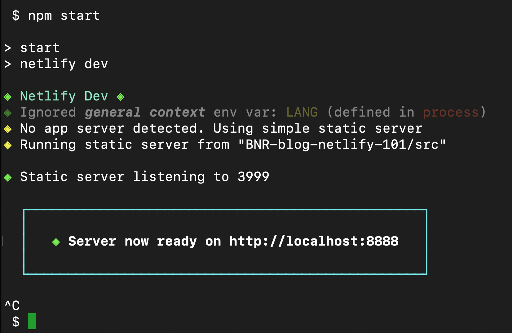
Start your local development server
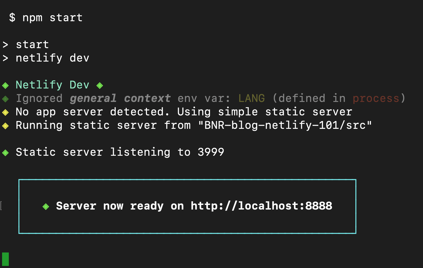
Run npm start in your terminal to start netlify dev as defined in package.json. Netlify Dev will detect that no framework was defined and serve static content from your publish directory which is src in this case. Netlify Dev will print out the local development URL, open your web browser with that URL, and continue running in your terminal. You should now see the rendered version of your index.html file in your browser with your “Hello, world!” message.

At this point you have a local development environment running, but have not yet connected your repository to Netlify. Terminate the local development server by holding the “control” key and pressing the “c” key (also referred to as ^C on a Mac).
Create the Netlify Site
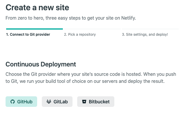
From your Netlify Team Overview screen click New site from Git and follow the instructions.
-
-
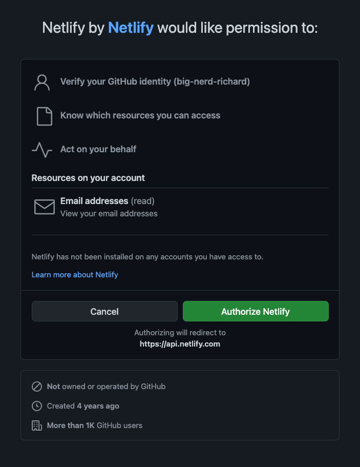
- First, you’ll be asked to “Connect to your Git provider”. Click the “GitHub” button. This will open a new window to authorize the connection between Netlify and GitHub.
- When prompted select “Configure the Netlify app on GitHub” to authorize Netlify to read your repositories in GitHub.
- Once authorized, Netlify will ask you to “Pick a repository”. Find and select the repository you created for this project.
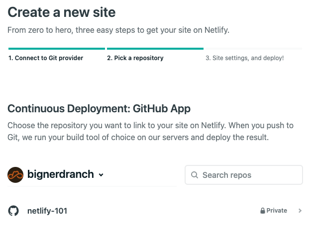
- Now you will be asked to configure the “Site settings, and deploy!”. Since you created a
netlify.tomlfile and pushed your changes to GitHub you’ll notice that this screen is already configured with your settings.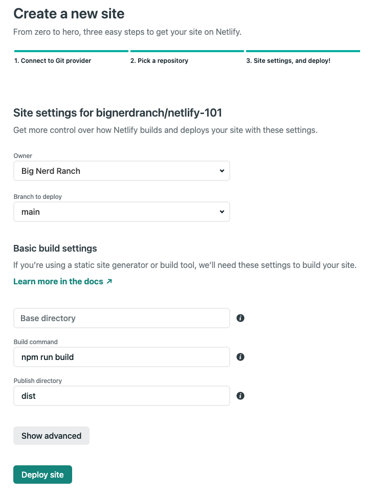
- Click the “Deploy site” button to trigger the first deploy of your new Netlify Site! This will bring you back to the Site overview and you’ll see a “Production deploys” section with your build
Starting Up. Click on your build from the “Production deploys” list which will take you to the Deploy log for that build.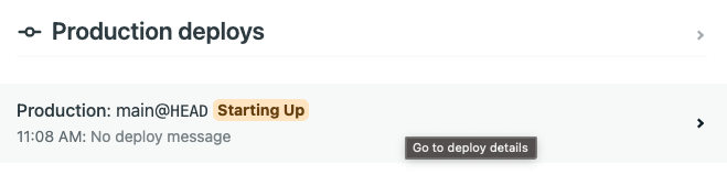
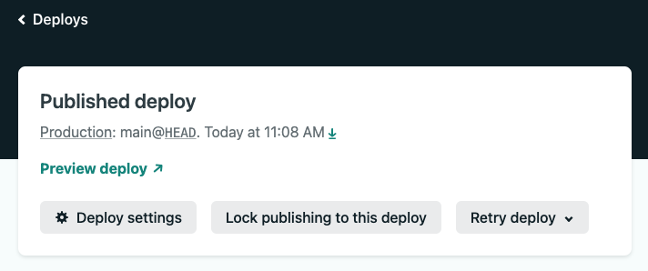
Here you can watch the build output as Netlify runs your build command.- If the build is successful, you’ll see “Site is live ✨” printed in the log and the deploy will be published.
- If there is an error, the deploy will fail and not be published. You can examine the log to determine the failure, make changes, and push those changes to GitHub to trigger a new build.
- Click the link to “< Deploys” near the top of the page. Here you will see that Netlify has generated a unique site name and URL for you in the “Deploys for” section.
- Click the link to your
https://<YOUR-SITE-NAME>.netlify.appsite on the Deploys page. This will open a new window where you will see the same “Hello, world!” page you saw in local development earlier now live in production on Netlify.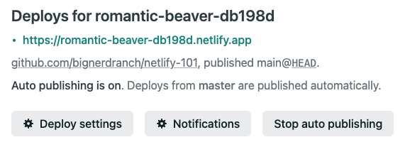
- Pat yourself on the back, you did it! 🎉
- First, you’ll be asked to “Connect to your Git provider”. Click the “GitHub” button. This will open a new window to authorize the connection between Netlify and GitHub.
Update your new Netlify Site
Well, you’d probably like to update your site, so go ahead and get the development server running again with
npm start. Now make some changes to yoursrc/index.htmland reload the page in your web browser. When you are satisfied with your changes in local development then add, commit, and push your changes to themainbranch to trigger a new deploy. Head over to Netlify to view the Deploy log. Once your site is live you can view the changes in production.Instant rollbacks
If you need to roll back to a previous version of the site for any reason, you can do so through Netlify. From the Deploys page, you’ll notice that the most recent deploy is at the top and is marked as
Published.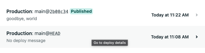
Click on a previous deploy. This will bring you to the deploy log where you will find a
Preview deploylink and aPublish deploybutton. Use thePreview deploylink to review the deploy and make sure it’s the one you want to roll back to. Use thePublish deploybutton to make that deploy the live deploy.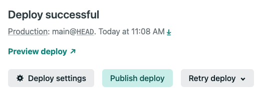
Head back to the Deploys page and notice that your previous deploy is now marked as
Published.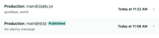
Congratulations!
You now can update your website with a
git pushand can instantly roll back to a previous deploy if you need to. There is a lot more Netlify has to offer. Stay tuned for more! 🙌 -

The post Getting Started with Netlify: Creating your first Netlify Site appeared first on Big Nerd Ranch.
]]>The post Top 5 Things I Learned at RenderATL appeared first on Big Nerd Ranch.
]]>1. Interrupting Less Important Renders in React 18
Shruti Kapoor demoed the new startTransition API as part of her talk on “What’s New in React 18?” This API keeps the rest of the UI responsive while carrying out an expensive re-render. This could be used to allow interrupting the rendering of a complex drawing or large table to keep the input elements, selectors, and sliders that control the settings responsive and up to date. This works by marking all the state updates inside startTransition as transitions. These transitions will be interrupted if new data comes along and the stale updates will be thrown out by React. They are still synchronous and unlike setTimeout(..., 0) they start immediately. Another bonus feature is a pending state available with useTransition so you can apply a loading state to the not yet updated content. I’m excited to use this with my next graph or large table! You can read more about it in this discussion.
2. Security implications for hrefs
Syneva Runyan shared a variety of ways to inject javascript into a page of a React application. One that I had not thought of before was the ability to use the javascript: protocol to inject scripts using the href prop.
For example, a user might be able to enter a link to their homepage. javascript:alert('hi') is a valid URL which would cause the user to receive a popup so purely validating that the link is a URL is not enough for security. Using a larger chunk of code, the attacker could tell the user their session had timed out and request the user’s password.
Currently, you can mitigate this by validating the protocol as well as the url
const url = new URL(userInput);
const isHttp = ['http', 'https'].includes(url.protocol);
Note: This does currently trigger a warning in React, and a future version of React will block the javascript protocol in the href.
3. Accessibility in Code and Content
Homer Gaines offered a wide assortment of ways to improve the accessibility of your website. My favorite code takeaway was making sure the hit area for links at buttons was at least 40px x 40px, which is about the size of a fingertip, so it’s easier for people with less accuracy to tap the button. There a many ways someone could have a hard time hitting a small button accurately from a parent holding a fussy child while trying to order a pizza to someone with a broken arm using their non-dominate hand to long-term disabilities such as Parkinson’s disease. When I am using a website, it’s always frustrating to have to try multiple times to tap a button or, even worse, if I tap the wrong button because they are too small. Thus, I appreciate the effort spent in this area as well.
The content itself is another area for accessibility. Many people have conditions like ADHD or Autism that make reading and concentrating harder. Other people are simply trying to multi-task. Keeping text small and building pages that interact as expected helps these people since it will not be necessary to spend a long time reading instructions or figuring out how to use the website.
4. Refactoring Your Way Up
Adrianna Valdivia encouraged developers to own the code base where they work. Participating in improving it through updating package versions and refactoring the code. Then, highlight the learnings and milestones from your improvements in your 1-on-1s with your manager. This responsibility helped her gain promotions in the company.
5. Techsgiving: Giving Back
If you want to give back but are worried it might take too much time, Genesis Bonds suggested setting up a Calendly link with a couple of time slots per week for mentoring. Then, if someone asks for help, give them the link so they can set up some time with you.
At Big Nerd Ranch, we give back with our internships and our apprentice program.
Culture
I also learned about Atlanta culture and Trap music throughout the conference and by talking to other attendees during the breaks. If you want to learn about React while experiencing ATL and Trap music culture, check out RenderATL 2022.
The post Top 5 Things I Learned at RenderATL appeared first on Big Nerd Ranch.
]]>The post The Five Steps of API-First Design appeared first on Big Nerd Ranch.
]]>Some of the greatest inventions have occurred by accident, but when it comes to creating amazing web services, intentionality is the name of the game. And there’s not much more intentional than API-First Design.
See, web services built without intention often suffer in regards to quality, such as slow delivery and rife with errors. And once put into place, low-quality web services are expensive to update.
But what is API-First Design?
From a high level, API-First Design is a purposeful approach to building high-quality web services in a way that avoids the pitfalls of an ad-hoc build. This approach can be broken down into five steps:
- treat the API of your web service as the standout principle
- appoint product ownership for the API development to ensure a core focus on quality
- design the API contract before coding the web service
- build the frontend and backend alongside one another based on the API contract.
The Five Steps of the API Process
1. Treat the API of your web service as a first-class citizen.
API-First Design is like a lot of great things—it takes time, effort, and money to do correctly. That means learning a new process, having dedicated folks on the project, and realizing that it’s an ongoing process.
But, if you’ve looked at all options and API-First Design is the way to go, then it’s time to put all you have behind it. In practice, that will require committing to the process by getting buy-in from your entire organization. You’ll also need to clear some space in both your organization and budget to ensure you get the most out of your work.
2. Appoint product ownership for the API to keep the focus on high quality.
Quality products always begin with having a product owner, and it’s essential that your API receives the same star treatment. See, building out an API without leadership means that changes will occur in a more haphazard way, leading to poor quality. But, with a product owner, you’ll keep the focus on what’s best for the build and best for the web service overall.
And since this person is going to need to get stakeholders involved from both a technical and non-technical perspective, the role doesn’t have to be a developer or architect. In fact, their most important role is to advocate for your particular process to ensure that the goals are prioritized and met.
3. Design the API contract before building the web service in code.
The next important step is to design the API before writing code. You’re going to want to create something that both your team and stakeholders can understand. It doesn’t have to be super fancy—think sticky notes or a good old-fashioned whiteboard session. Remember, this isn’t coded, and it’s vital that everyone on your team, regardless of their role, is able to understand what is being created and is able to add suggestions.
As your API first design solidifies, translate the API contract to a machine-readable format, such as OpenAPI or GraphQL Schema. This format will have major payoffs in the next step.
4. Automatically generate documentation, client/server stubs, and mocked backends from the API contract.
A lot of time spent designing and creating documentation doesn’t feel very productive, as the documents are stored somewhere and never referenced again. That’s why it’s important to store your API contract in a machine-readable format like OpenAPI or GraphQL Schema. These formats automatically generate a number of extremely useful artifacts that will help your development process go faster.
5. Build the frontend and backend in parallel based on the API contract
Usually, frontend and backend development occurring at the same time can be a slippery slope that leads to a poor quality product. But this is where the API contract comes into play. This API contract prevents frontend and backend developers from interpreting a loose specification differently because the specifications are so well designed from the start.
The API contract is basically your North Star. Changes will still occur, but the API contract will keep you on the right track.
If done correctly, your web service will be consistent, reusable, well-documented, and easy for developers to use.
Don’t Settle for Anything but the Best
Your web service is a valuable resource for your organization, both from a logistical and financial standpoint. If you’re curious to learn more about API-First Design, check out our ebook, API-First Design: How some of the most important work is done before the first line of code is even written, or reach out and chat with a Nerd. We’ll be happy to help!
The post The Five Steps of API-First Design appeared first on Big Nerd Ranch.
]]>The post Learning Vue from React appeared first on Big Nerd Ranch.
]]>Picking up a new framework or library can seem intimidating. The good news is that React and Vue are two popular, well-supported tools for front-end development, and if you already know one, you can leverage your knowledge to become productive with the other relatively quickly.
Both are JavaScript-based, use a virtual DOM, and use composable, reactive components to build applications. They both have CLIs that take care of the boilerplate required to spin up an application quickly and easily. This blog is written with React developers learning Vue in mind, but if you are a Vue developer learning React, stick around. Many of the big, practical differences between the two come down to syntax and knowing one of the two can be easily leveraged into learning the other.
By exploring two applications, one written in React and one written in Vue, that output identical content in the browser, compare how they accomplish the same goal (both were scaffolded with their respective CLIs, Create React App and Vue CLI). Both applications make a request to an API that returns an array of music genres that will be rendered into a list of cards. You can find repositories for the applications below if you want to clone them and experiment, or you can just read along with the code snippets. Both applications are admittedly heavy-handed solutions to the problem presented but should give enough context to understand the basics of both technologies.
App
 The main entry point for both applications is the
 <App /> component. Comparing the React and Vue <App /> components, it may not be instantly clear that React uses JSX to create component structure, while Vue uses HTML. This will become more apparent as you move along.
What does stand out is that not only does the Vue component import the child components it needs, it also registers them in the exported object in the script tag. If you are a React developer and forget to do this, you will get a big, nasty error. Vue registering components this way allows child components that do not need updating to avoid a re-render.
// App.js
import React from "react";
import GenreList from "./GenreList";
import "./App.css";

const App = () => (
  <div id="app">
    <h1>Genres</h1>
    <GenreList />
  </div>
);

export default App;
// App.vue
<template>
  <div id="app">
    <h1>Genres</h1>
    <GenreList />
  </div>
</template>

<script>
import GenreList from "@/components/GenreList.vue";

export default {
  name: "App",
  components: {
    GenreList
  }
};
</script>

<style>
#app {
  font-family: Avenir, Helvetica, Arial, sans-serif;
  -webkit-font-smoothing: antialiased;
  -moz-osx-font-smoothing: grayscale;
  text-align: center;
  color: #2c3e50;
  margin-top: 60px;
}
</style>
By convention, Vue also provides functionality identical to what something like styled-components provides for React. By adding the scoped attribute to the style tag in a Vue component, a unique ID is added to the component that limits the styles to that component only. Both CRA and Vue CLI allow simple setup for using SCSS instead of CSS.
GenreList
<GenreList /> does the heavy lifting of the application, by making your API call, managing the state of the application, and rendering a list of genre cards. Both applications import an identical genreService function that provides the data for the component. Each application sets the response to their internal state management and then iterates over the array of genre objects to render genre cards.
In the React version, you make the API call inside of a functional component with the useEffect hook (this could also be accomplished in a class component with the componentDidMount lifecycle method), and update state with the response data using the useState hook (in a class component, you would call setState on a successful response). You can then map over the genres array in state and render a <GenreCard /> for each genre.
// GenreList.js
const GenreList = () => {
  const [genres, setGenres] = useState([]);

  useEffect(() => {
    genreService
      .getGenres()
      .then((response) => {
        setGenres(response.data);
      })
      .catch((error) => console.log("There was an error", error));
  }, []);

  return (
    <div className="genre-list">
      {genres.map((genre) => (
        <GenreCard genre={genre} key={genre.id} />
      ))}
    </div>
  );
};
Vue 2 doesn’t have the concept of functional versus class components (although Vue 3 will). In GenreList.vue, you use the mounted lifecycle method to make your API call, and you store it in data, which is analogous to React state. In your data description, you give genres a default value of an empty array so that you don’t have any problems when iterating over genres before the API call resolves.
// GenreList.vue
<template>
  <div class="genre-list">
    <GenreCard v-for="genre in genres" :key="genre.id" :genre="genre" />
  </div>
</template>

<script>
import GenreCard from "@/components/GenreCard.vue";
import genreService from "@/services/genreService";

export default {
  components: {
    GenreCard
  },
  data() {
    return {
      genres: []
    };
  },
  mounted() {
    genreService
      .getGenres()
      .then(res => (this.genres = res.data))
      .catch(error => console.log("There was an error", error));
  }
};
</script>

<style lang="css" scoped>
.genre-list {
  padding: 0 15%;
}
</style>
The syntax for iterating over a list in Vue is a bit different than React. Since you are using HTML instead of JSX, you don’t have access to the full power of JavaScript in your template, so Vue uses directives, or special attributes in the markup, that act as instructions to Vue on what to do to the DOM. In this case, you use the v-for directive to tell <GenreList /> to render a component (or HTML element) for every element in a list. Additionally, you can’t use curly brackets to pass props to child components in Vue, so you will need to use v-bind directives to pass props to a child component. This can be written as:
<li v-for="item in items" v-bind:key="item.id" v-bind:item="item">
or
<li v-for="item in items" :key="item.id" :item="item">
Both do the same thing, the second is just a shorthand syntax.
GenreCard
The last component to review in this application is <GenreCard />, which takes a genre object as a prop and renders the data from that object.
In React, <GenreCard /> is a functional component that destructures props on the way in and renders a simple card with a genre and a description.
// GenreCard.js
const GenreCard = ({ genre }) => {
  return (
    <div className="genre-card">
      <h4>{genre.genre}</h4>
      <p>{genre.description}</p>
    </div>
  );
};

export default GenreCard;
The Vue implementation of <GenreCard /> is similar, although you are required to describe the props the component expects to receive. This is very similar to React’s prop-types, although it is not optional in Vue. Vue also uses double curly brackets, called “mustaches,” to inject data into a template, as opposed to React’s single set of curly brackets.
// GenreList.vue
<template>
  <div class="genre-card">
    <h4>{{ genre.genre }}</h4>
    <p>{{ genre.description }}</p>
  </div>
</template>

<script>
export default {
  props: {
    genre: Object,
  },
};
</script>

<style lang="css" scoped>
.genre-card {
  padding: 20px;
  margin-bottom: 20px;
  border: 2px solid black;
}
</style>
Wrapping up
If you’ve been using React or Vue in your development, hopefully this blog has encouraged you to try something new that you aren’t familiar with. Differences are to be expected, but these two technologies are very similar in terms of philosophy, implementation, speed, and ease of use. Developers shouldn’t be discouraged from moving between the two. In fact, working with both should be encouraged, because it makes developers more versatile and expands the range of projects they can work on.
The post Learning Vue from React appeared first on Big Nerd Ranch.
]]>The post Use Flutter to deliver the same experience across multiple platforms appeared first on Big Nerd Ranch.
]]>Our goal for this year [2020] is that you should be able to run flutter create: fluttler run and have your application run on Web browsers, macOS, Windows, Android, Fuchsia, and iOS, with support for hot reload, plugins, testing, and release mode builds. We intend to ensure that our Material Design widget library works well on all these platforms. (The Flutter Roadmap)
Flutter guarantees consistency by owning the entire user experience, rather than deferring to per-platform UI toolkit components. Like a game engine, it takes control of both drawing and event handling and handles them, both input and output, itself. This makes a marked contrast from React Native, which instead marshals native platform views into rendering and event handling on its behalf. This enables Flutter to reliably render content without dropping any frames and with every pixel under its control. A wide array of widgets is available, and their behavior will change when you update your app, not in response to platform changes. This gives you great control, at one main cost: apps using Flutter do not automatically update to track changes in system styles and behaviors. You can adopt Material Design to mitigate the impact of that caveat because Material Design apps follow that UI standard, rather than any specific platform’s.
This is an intentional tradeoff: Flutter’s bet is that the future is more consistently-branded experiences across platforms, where that consistency is owed first to the brand, secondly, if at all, to the platform. Its vision is “to provide a portable toolkit for building stunning experiences wherever you might want to paint pixels on the screen” (“Announcing Flutter 1.20” for one example, though restatements of this vision are many).
Flutter’s community seems small next to React Native, but large next to Multiplatform Kotlin. Its community is certainly very vocal and visible; blog posts, conferences, library updates, and other events and publications continue to stream out. Its “own the stack” approach does more to guarantee consistency across platforms than React Native can provide, and unlike Multiplatform Kotlin, it can readily share UI code across platforms. Also unlike the situation with Multiplatform Kotlin vs Kotlin/JVM, most Dart libraries also work with Flutter, so you won’t find yourself stuck using less-tested packages for common needs. Its hybrid compilation approach and framework design give developers rapid build-and-deploy with stateful hot-reload during build and test while guaranteeing end users fast apps with a consistent latency in release builds. (This consistency results from using ahead-of-time compilation without runtime JIT compilation. Using AOT compilation to native binary code speeds code loading because the code has already been processed for easy loading and running. Not using JIT avoids variation in performance and latency, because there is no JIT compiler variously optimizing and de-optimizing various codepaths based on the specific details of what code has been run when since app launch.)
Accessibility support is solid
I worried that custom rendering would lead to broken accessibility support. In fact, its accessibility support is solid: it builds and maintains a “Semantics tree” to represent accessibility elements as a core part of its rendering pipeline. There’s even automated test support for checking some standard accessibility guidelines, such as text contrast. Dynamic Type support is baked into the Flutter framework. I have not had a chance to investigate how well the stock UI components respect accessibility preferences like Reduce Motion or Bold Text, but those preferences are readily accessible, so it would be easy to accommodate them yourself.
Localization support is not bad
I also worried about Flutter’s localization support, because localization is often overlooked. But the Dart Intl package has robust i18n support, including handling plurals and gender in building localized strings. Number formatting is rather complete. Time support is weak, in that time zones beyond UTC and Local are not supported, and calendar math (nor support for non-Gregorian calendars) is not provided. Overall, it’s a judicious subset of ICU. It’s not as automatic or comprehensive as iOS’s localization system, which also handles resolving localized non-string assets, and automatically selects and loads the appropriate locale configuration on your behalf, but all the pieces are there. And the community is filling gaps; for example, timezone delivers a zone-aware DateTime, while buddhist_datetime_dateformat handles formatting dates per the Buddhist calendar.
Codesharing is nigh total, including UI code
Code can be readily shared across platforms, including UI code. Accommodating platform differences, such as by varying the core information architecture, is not any more difficult than an if/else. You can get yourself into trouble with plugins, which are packages with platform-specific native code, but Flutter’s federated plugins approach serves to make clear which platforms are supported, and even to allow third-parties to provide support for additional platforms. This means that if you hit on a plugin that could be supported on a platform you need but isn’t yet, you could readily implement and publish the support for the plugin on that platform.
Platform support favors Material Design on mobile OSs
“Across platforms” primarily means “across iOS 8+ and Android 4.1 Jellybean and later (API level 16+)”: As of July 2020, Flutter Web is in beta, Flutter macOS is in alpha, and Flutter Linux and Windows are pre-alpha. That said, Flutter’s stated aim is to become “a portable UI framework for all screens”, and it is making steady progress towards that aim. The Flutter team is making visible progress in public with clear goals and rationale. And I was impressed at the team’s response time to third-party contributions: I had several documentation PRs merged in the week I spent with Flutter.
Unlike React Native, which often has had an iOS-first bias, Flutter’s bias is towards Android, or rather, the Android design language. The Material Design widgets are available and work consistently across platforms; iOS is not stinted there. But documentation and examples for using the Cupertino widget set that reproduces the iOS look and feel is harder to come by, and I had trouble getting it to play nice with Dark Mode. If you’re going full-on branded and effectively building your own widget set, you’re going to be on even ground across both platforms, and it might even prove easier than using the first-party toolkit for those platforms.
Dart is an effective tool
I didn’t worry about the Dart language, which is used in writing Flutter apps. It’s thoroughly inoffensive, it has some nice touches, and the ecosystem features a solid static analysis, testing, and packaging story. But if you’re coming from Swift, Kotlin, or TypeScript, Dart will feel familiar, and you’ll be productive very quickly. And if you’re coming from Swift, you’ll be pleased to find async/await support. The biggest tripping points I ran into were:
- Dart requires you write semicolons.
- Dart uses C-style SomeType thing rather than Pascal-style thing: SomeType type declarations.
- Dart uses final/const vs var rather than let/var or val/var. (The final/const distinction resembles const vs constexpr in C++.)
- The cascade syntax with . . is hard to look up unless you happen to guess it’s a descendant of the Smalltalk syntax of a similar name that was used similarly. That said, it reads naturally enough that it’s not much of a stumbling block.
Summary
Flutter seems like the best tool to date for delivering the “same app” across all platforms. It’s a young tool with some rough edges, but I have yet to encounter a multi-platform tool that won’t cut you at times; Flutter’s gotchas seem mostly peripheral, and its rendering approach guarantees a consistency that’s hard to come by otherwise.
The team behind Flutter is responsive and has a clear vision for where the framework is going, including a public roadmap. The actual work happens in public on GitHub, not in a private tree, so it’s easy to follow.
Flutter is both easy to work with and easy to contribute to. The community and project are well-organized, and you probably won’t spend a lot of time flailing around for a library thanks to the Flutter Favorites program.
If you need someone to build an app for multiple platforms, give Big Nerd Ranch a ring.
The post Use Flutter to deliver the same experience across multiple platforms appeared first on Big Nerd Ranch.
]]>The post Testing Webpacker Apps with RSpec System Tests appeared first on Big Nerd Ranch.
]]>To help with this, let’s walk through an example of using RSpec system tests. We’ll set up a Rails app using Webpacker, then set up an RSpec system test that exercises our app, including our JavaScript code, in Chrome.
Setting Up Webpacker
Create a new Rails project excluding Minitest and including Webpacker configured for React. Webpacker can be preconfigured for a number of different JavaScript frameworks and you can pick whichever you like, or even vanilla JavaScript. For the sake of this tutorial, we’ll use React; we won’t be touching any React code, but this demonstrates that this testing approach works with React or any other frontend framework.
$ rails new --skip-test --webpack=react rspec_system_tests
Webpacker organizes your code around the concept of “packs,” root files that are bundled into separate output JavaScript files. Webpacker will set up a sample pack for us in app/javascript/packs/hello_react.jsx, but it isn’t used in our app automatically. To use it, we need to create a route that’s not the default Rails home page, then add it to our layout.
Add a root route in config/routes.rb:
 Rails.application.routes.draw do
   # For details on the DSL available within this file, see https://guides.rubyonrails.org/routing.html
+  root to: 'pages#home'
 end
Create the corresponding app/controllers/pages_controller.rb:
class PagesController < ApplicationController
end
We don’t need to define a #home action on that controller, because when Rails attempts to access an action that isn’t defined, the default behavior will be to render the corresponding view. So let’s just create the view, app/views/pages/home.html.erb and put some text in it:
Hello Rails!
Now, to get our hello_react pack running, let’s add it to the head of app/views/layouts/application.html.erb:
  <%= stylesheet_link_tag 'application', media: 'all', 'data-turbolinks-track': 'reload' %>
   <%= javascript_pack_tag 'application', 'data-turbolinks-track': 'reload' %>
+  <%= javascript_pack_tag 'hello_react' %>
 </head>
Run your server:
$ rails s
Load http://localhost:3000 in a browser and you should see:
Hello Rails!
Hello React!
So our React pack is working. Great!
Setting Up RSpec
Now let’s get it tested. Add rspec-rails and a few other gems to your Gemfile:
 group :development, :test do
   # Call 'byebug' anywhere in the code to stop execution and get a debugger console
   gem 'byebug', platforms: [:mri, :mingw, :x64_mingw]
+  gem 'rspec-rails'
 end

+group :test do
+  gem 'capybara'
+  gem 'selenium-webdriver'
+end
rspec-rails should be added to both the :development and :test groups so its generators can be run from the command line. capybara provides test methods for us to simulate users interacting with our app, and selenium-webdriver lets us interact with real browsers to run the tests.
Ask Rails to set up the necessary RSpec configuration files:
$ rails generate rspec:install
You’ll also need to install chromedriver, a tool for running Google Chrome in tests. Download Chromedriver or install it with Homebrew:
$ brew tap caskroom/cask
$ brew cask install chromedriver
Getting Our Test Working
Now we’re ready to write our test! In older versions of RSpec, the tests that simulated user interaction with Capybara were called feature tests, but now that Rails has built-in system testing functionality, it’s recommended to use RSpec system tests to use that same testing infrastructure under the hood.
Generate a system test:
$ rails generate rspec:system hello_react
This creates the humorously-pluralized hello_reacts_spec.rb with the following contents:
require 'rails_helper'

RSpec.describe "HelloReact", type: :system do
  before do
    driven_by(:rack_test)
  end

  pending "add some scenarios (or delete) #{__FILE__}"
end
Replace the pending line with our test:
-  pending "add some scenarios (or delete) #{__FILE__}"
+  it 'should render a React component' do
+    visit '/'
+    expect(page).to have_content('Hello React!')
+  end
 end
Run the test:
$ bundle exec rspec
Oh no, it fails! Here’s the error:
Failures:

  1) HelloReact should render a React component
     Failure/Error: expect(page).to have_content('Hello React!')
       expected to find text "Hello React!" in "Hello Rails!"
It looks like our test is seeing the “Hello Rails!” content rendered on the server in our ERB file, but not the “Hello React!” content rendered on the client by our JavaScript pack.
The reason for this is found in our test here:
RSpec.describe "HelloReact", type: :system do
  before do
    driven_by(:rack_test)
  end
By default, when we generate an RSpec system test, the test specifies that it should be driven_by(:rack_test). Rack::Test is a testing API that allows you to simulate using a browser. It’s extremely fast, and that’s why it’s the default for RSpec system tests.
The downside of Rack::Test is that because it doesn’t use a real browser, it doesn’t execute JavaScript code. So when we want our tests to exercise Webpacker packs, we need to use a different driver. Luckily this is as easy as removing the before block:
 RSpec.describe "HelloReact", type: :system do
-  before do
-    driven_by(:rack_test)
-  end
-
   it 'should render a React component' do
Rails’ system test functionality uses selenium-webdriver by default, which connects to real browsers such as Google Chrome. When we don’t specify the driver in our test, selenium-webdriver is used instead.
Run the test again. You should see Google Chrome popping up and automatically navigating to your app. Our test passes! We’re relying on Chrome to execute our JavaScript, so we should get maximum realism in terms of ensuring our JavaScript code is browser-compatible.
One more useful option for a driver is “headless Chrome.” This runs Chrome in the background so a browser window won’t pop up. This is a bit less distracting and can run more reliably on CI servers. To run headless chrome, add the #driven_by call back in with a new driver:
 RSpec.describe "HelloReact", type: :system do
+  before do
+    driven_by(:selenium_chrome_headless)
+  end
+
   it 'should render a React component' do
When you rerun the test, you’ll see a Chrome instance launch, but you should not see a browser window appear.
Alternatives
System tests are Rails’ built-in mechanism for end-to-end testing. An alternative end-to-end testing tool you may want to consider is Cypress. It’s framework agnostic and built from the ground up for rich frontend applications. One of the main benefits of Cypress is a GUI that shows your executing tests. It allows you to step back in time to see exactly what was happening at each interaction, even using Chrome Developer Tools to inspect the state of your frontend app in the browser.
But Rails’ system tests have a few benefits over Cypress as well. For experienced Rails developers, it’s helpful to write your system tests with the familiar RSpec and Capybara API and running them as part of the same test suite as your other tests. You can also directly access your Rails models to create test data in the test itself. In the past, doing so required something like the database_cleaner gem because the server was running in a separate process, but Rails system tests handle wrapping both the test and server in the same database transaction. Because Cypress doesn’t have knowledge of Rails, setting up that data in Cypress takes some custom setup.
Whether you go with Rails system tests or Cypress, you’ll have the tooling you need to apply your testing skills to rich JavaScript applications.
The post Testing Webpacker Apps with RSpec System Tests appeared first on Big Nerd Ranch.
]]>