The post CSS Sprite Management with Gulp, Part 2 appeared first on Big Nerd Ranch.
]]>Previously on CSS Sprites with Gulp, we learned how to automatically generate a sprite sheet and accompanying CSS from a folder of images. That’s a great first step, but there’s a lot more we can do.
Multiple formats
In the previous code examples, you may have noticed that the Gulp tasks were set up to load only PNG images from the img/sprites folder.
However, you absolutely are not limited to PNG formats. By changing the image paths from *.png to simply *, Spritesmith will load every file in that folder—so be sure you don’t have any images around that you wouldn’t want added to the sprite sheet.
You should also aware that if you have any icons that need to have alpha-transparent backgrounds, you’ll still need to save the outputted sprite sheet as a PNG file to preserve them. If you saved it as a JPG, for instance, all the transparent bits would render as black.
SASS
In reading the first installment of this article, I’m sure many were wondering, “What about SASS output?”
While we’re already rendering really useful CSS for our sprite sheet, we can unlock a lot more usefulness by generating SASS instead.
To get started, we’ll need to install the gulp-sass plugin:
npm install --save-dev gulp-sass
And add it as a dependency in our gulpfile.js file:
var sass = require('gulp-sass');
Now, all we have to do for SASS output is specify a filename in our sprite task with an scss extension, like sprite.scss:
gulp.task('sprite', function () {
    var spriteData = gulp.src('img/sprites/*')
        .pipe(spritesmith({
            imgName: '../assets/img/sprite.png',
            cssName: 'sprite.scss' // <<-- just need to change this line
        }));
    spriteData.img.pipe(gulp.dest('img'));
    spriteData.css.pipe(gulp.dest('css'));
});
Now run the sprite task:
gulp sprite
And a new sprite.scss file should be generated. Let’s also add a new watcher to the watch task that will listen for changes to SASS files and automatically run the sass task.
gulp.task('watch', function () {
    gulp.watch(['img/sprites/**/*'], ['sprite']);
    gulp.watch(['css/**/*.scss'], ['sass']);
});
Depending on how many sprite images you have, the generated sprite.scss file can get quite long, so let’s break it down a bit.
A Look Inside
The bulk of the SASS sprite sheet file are variables whose names correspond to their source image counterparts. Let’s look at this example, based on a hypothetical banner1.png image:
$banner1-name: 'banner1';
$banner1-x: 250px;
$banner1-y: 0px;
$banner1-offset-x: -250px;
$banner1-offset-y: 0px;
$banner1-width: 820px;
$banner1-height: 60px;
$banner1-total-width: 1070px;
$banner1-total-height: 250px;
$banner1-image: '../assets/img/sprite.png';
$banner1: (250px, 0px, -250px, 0px, 820px, 60px, 1070px, 250px, '../assets/img/sprite.png', 'banner1', );
These variables should be fairly straightforward and include things like the sprite’s dimensions, position within the master sprite sheet, URL, etc. The same variables have been recreated for every other file within the img/sprites folder.
At the end of the file are variables for the overall sprite sheet:
$spritesheet-width: 1070px;
$spritesheet-height: 250px;
$spritesheet-image: '../assets/img/sprite.png';
$spritesheet-sprites: ($banner1, $banner2, $button1, $button2, $button3, $icon1, $icon2, $icon3, $photo1, );
$spritesheet: (1070px, 250px, '../assets/img/sprite.png', $spritesheet-sprites, );
Mixin It Up
Next are a series of SASS mixins used to add sprite information to your other CSS selectors. Let’s go over them one by one. It should be pointed out that your sprite.scss file should be included by another SASS file, and not manipulated by itself, as it will update every time you rebuild the sprite sheet.
@import 'sprite';
@mixin sprite-width($sprite)
This mixin is used to output the width of a given sprite image. The sprite-height mixin is the same syntax.
@include sprite-width('banner1.png');
@mixin sprite-position($sprite)
This is used to output the exact offset (coordinates) of a given sprite:
@include sprite-position('banner1.png');
Outputs:
background-position: -250px 0px;
@mixin sprite-image($sprite)
This outputs the background image url:
@include sprite-image('banner1.png');
Outputs:
background-image: url(../assets/img/sprite.png);
All the above mixins may not seem immediately useful, but they can come in handy in certain circumstances. Here are the really useful ones:
@mixin sprite($sprite)
This will output a fully formed CSS selector for the specified sprite.
@include sprite('banner1.png');
Outputs:
background-image: url(../assets/img/sprite.png);
background-position: -250px 0px;
width: 820px;
height: 60px;
@mixin sprites($sprites)
This is the big kahuna mixin that will loop over all your available sprite image filenames and generate all the associated CSS. To insert it into your CSS, simply call:
@import 'sprite';   // imports sprite.scss
// $spritesheet-sprites is an array of all sprite image names
@include sprites($spritesheet-sprites);
From there, all you have to do is specify the class names in your HTML:
<div class="banner1"></div>
Change It Up
What if you don’t like the SASS that’s output by Spritesmith? Good news: you can change it!
Deep inside node_modules/gulp.spritesmith/node_modules/spritesheet-templates/lib/templates, you should see a file called scss.template.handlebars. This template is used to lay out the actual SASS output of sprite.scss. To use it to modify it to your liking, just make a copy of that file and put it in your css folder (or wherever). Then, add this config option to your sprite task in gulpfile.js:
cssTemplate: 'css/scss.template.handlebars' // using whatever file location you used
Then just make whatever modifications you need in that template. For example, when I first started using SASS with Spritesmith, I didn’t like that the default selectors specified an exact width and height for sprites. Often, you want to attach a sprite to the upper left corner of a container, but allow the container to be larger. An example would be a wide button that contains HTML text, and a small icon on the side. There’s no reason to create an icon that extends to that full width, so just make it small and anchor it to the side.
So, I duplicated the sprite mixin and called the new one sprite-box. This is now the mixin that I’ll call for a fixed width and height sprite. In the original mixin, I’ll simply remove the references to dimensions. So now those two mixins in the Handlebars template look like this:
@mixin sprite-box($sprite) {
  @include sprite-image($sprite);
  @include sprite-position($sprite);
  @include sprite-width($sprite);
  @include sprite-height($sprite);
  background-repeat: no-repeat;
}

@mixin sprite($sprite) {
  @include sprite-image($sprite);
  @include sprite-position($sprite);
  background-repeat: no-repeat;
}
Note that I also added no-repeat on both, as I rarely have a need for sprite backgrounds to repeat.
So now, all our sprite classes are output in the CSS without dimensions, like so:
.banner1 {
  background-image: url(../assets/img/sprite.png);
  background-position: -250px 0px;
  background-repeat: no-repeat;
}
And in any case where it’s necessary to specify dimensions, just call the sprite-box mixin:
header {
  @include sprite-box($banner1);
}
Which will output this CSS:
header {
  background-image: url(../assets/img/sprite.png);
  background-position: -250px 0px;
  width: 820px;
  height: 60px; }
In the case above, we used the $banner1 variable as an argument instead of 'banner1' to send the entire array of sprite data to the mixin.
Configuration
So far, we’ve only briefly touched on some of the configuration options you can give to Spritesmith, including:
- imgName
- cssName
- cssTemplate
There are a lot more to choose from, a couple of which I’ll go over briefly:
padding
Most of the time, you won’t want the images in your sprite sheet touching each other. It’s good to give them adequate breathing room so that their neighboring sprites aren’t accidentally seen. By setting the padding option, you can specify the amount of pixel padding around each image:
padding: 50
algorithm
This is perhaps one of the most important options, but one you’ll just have to play around with to find one that suits your layout. The algorithm basically tells Spritesmith how to arrange individual sprites within the sheet. There are five options:

- top-down
- left-right
- diagonal
- alt-diagonal
- binary-tree
The default is binary-tree, which will stack the images in the most efficient way possible, horizontally and vertically. diagonal and alt-diagonal arrange them, you guessed it, diagonally. This is a good option to use when it’s critical that sprites aren’t directly above, below or beside each other. One caveat to using diagonal layouts is that your sprite sheet can get very wide quickly. Mobile Safari (and perhaps other browsers) will actually break on backgrounds larger than 3mb. They just won’t display at all at about 6,000px in my tests—I learned this the hard way.
In the end, I prefer using the top-down option, which lays out each image in a vertical line, along with ample padding between them (usually around 50px). So far, I’ve been able to keep sprites from overlapping in containers, while staying within manageable dimensions.
Wrapping Up
Hopefully, these tutorials have been helpful for devs looking for a better way to manage CSS sprites. There are lots of other things you can add on to this technique, like tasks that optimize your sprite sheet for smaller files sizes when it’s created, or support for retina-size images. One thing’s for sure: Once you’ve started generating your sprite sheets automatically, you’ll never go back to the old way.
The post CSS Sprite Management with Gulp, Part 2 appeared first on Big Nerd Ranch.
]]>CSS sprites provide the ability to pack multiple small images into a single file, which is then used as a background on multiple HTML elements. By simply defining the dimensions of the container and shifting the background position around, you’re able to achieve image-based styling globally with just one HTTP request. For larger sites, particularly e-commerce, this technique can reduce those requests by the dozens.
The post CSS Sprite Management with Gulp appeared first on Big Nerd Ranch.
]]>CSS sprites provide the ability to pack multiple small images into a single file, which is then used as a background on multiple HTML elements. By simply defining the dimensions of the container and shifting the background position around, you’re able to achieve image-based styling globally with just one HTTP request. For larger sites, particularly e-commerce, this technique can reduce those requests by the dozens.
At first, I was dismissive of this method, due to a few key drawbacks. For one, being background images, there’s no guarantee they would be visible on printouts. And they could easily break if a user increased the zoom level in their browser. Plus, improper use could adversely affect accessibility.
However, as browsers evolved, I saw the light and have been making use of sprites for things like icons and navigation for years.
Not So Fast: Maintenance Concerns
Enter the real problem with CSS sprites: maintenance. As useful and performant as this technique is, it can be a challenge to create and update even the smallest sprite sheet. If you’re starting from a layered Photoshop design, you first have to extract all “spriteable” elements and place them into a new layered file. Then you’ve got to position them all so that they have ample space between them. Next, export them as a single file, often an alpha-transparent PNG. Then assign classes to your HTML containers and attach the sprite as a background, shifting around coordinates until it looks right. This can often require nudging pixels around in your browser’s web inspector. Good times.
And then… one of those images will have to change. You’ll have to either go back to the original PSD and repeat the process, or update the layered sprite file (if you’re lucky enough to have saved it unflattened). Then you’ll export the PNG again. Rinse, repeat.
But what if the size of the icon has to change? Now you’re in trouble. What if the new image takes up double the space within the sprite sheet? You’ll have to move other icons out of the way. You make the changes and export the PNG, but now you’ve completely blown up your CSS backgrounds! All the dimensions and coordinates are now way off, so you go back and manually adjust everything and hope you never have to do this again.
But you will. Many times.
And it’s even worse when you’ve inherited a large sprite sheet, but don’t have access to the original source files.
This is where an automated sprite generator proves invaluable, and I’ll show you how to implement one using Gulp, a popular task runner.
Installation
This sprite management technique requires installation of Node, Gulp and a couple of plugins.
A full tutorial on installing Node is beyond the scope of this article, but you can find ample instructions via Nodejs.org.
Once Node is installed, you can now install Gulp fairly easily via the command line:
npm install -g gulp
npm install --save-dev gulp
One Gulp plugin we’ll need to install is gulp.spritesmith. Do so via this command:
npm install --save-dev gulp.spritesmith
This will create a folder called node_modules with the Spritesmith plugin underneath.
Now create a file named gulpfile.js in the root of your project folder with this starting code:
var gulp = require('gulp');
var spritesmith = require('gulp.spritesmith');

// Gulp requires a default task to be present
gulp.task('default');
Let’s Get Started
What good is a sprite sheet without images, you say? I’ve created eight placeholder image files inside the /assets/img/sprites folder of the project to get us started.
The first thing we need to do is set up a Gulp task to gather all images in /assets/img/sprites, combine into a single sprite sheet and generate corresponding CSS styles.
gulp.task('sprite', function () {
    var spriteData = gulp.src('img/sprites/*.png')
        .pipe(spritesmith({
            /* this whole image path is used in css background declarations */
            imgName: '../assets/img/sprite.png',
            cssName: 'sprite.css'
        }));
    spriteData.img.pipe(gulp.dest('img'));
    spriteData.css.pipe(gulp.dest('css'));
});
To break it down, here’s what’s happening in this task:
- Gulp gathers data for each PNG image within the
/assets/img/spritesfolder. - We define the name of the generated sprite sheet.
- And define the name of the generated CSS file.
- We then save the sprite sheet to the destination folder: img.
- And save the CSS file to the destination folder: css.
Let’s try it out. Start Gulp, and then run the sprite task:
gulp
gulp sprite
If all went well, you should see a new file appear at img/sprite.png and css/sprite.css. Here’s what the sprite file looks like at this point:
![]()
As you can see, the images are contained in one file, all butted up against each other. As is, it’d be pretty difficult to determine each sprite’s exact dimensions.
Here’s the magic, though. Look inside sprite.css and see that all the dirty work has been done for you. For each image, a CSS class selector has been defined to specify the dimensions and position of the background image. The class is named identically to the image filename:
.icon-banner1 {  /* corresponds to the file named banner1.png */
  background-image: url(../assets/img/sprite.png);
  background-position: 0px 0px;
  width: 820px;
  height: 60px;
}
Things Change
We’re good to go, right? Just then, your designer changes the height of the top banner image. No problem!
You just re-slice the banner from the PSD and save it over the old banner1.png file. Now run:
gulp sprite
And the sprite sheet is regenerated, as is the CSS file with the new information. All the dimensions and coordinates are updated to reflect the modified banner image. And best of all? None of your HTML needs to change. Since all the class names are the same, everything just updates.
A Little Automation
We could probably stop right there and would still be saving ourselves tons of time and frustration. But wouldn’t it be great if we could rebuild the sprite sheet automatically, simply by dropping a new file in the /assets/img folder?
Gulp Watchers
This is where another plugin comes in handy. To get it set up, we’ll need to install Gulp-Watch:
npm install --save-dev gulp-watch
Then, add the dependency to gulpfile.js:
var watch = require('gulp-watch');
Now we add a watch task:
// Watch for changes to sprite images
gulp.task('watch', function () {
    gulp.watch(['img/sprites/**/*.png'], ['sprite']);
});
All we’re telling Gulp to do is watch for any additions or modifications to PNG files in the sprites folder, and then run the sprite task as necessary.
Now, tell Gulp to launch the watch task when it’s first run.
gulp.task('default', ['watch']);
Restart Gulp, and it should now continually listen for anything that happens in the sprite image folder. As before, it’ll regenerate the sprite sheet and all CSS selectors as needed.

But Wait, There’s More!
Let’s look at what we have so far:
- A master sprite sheet is auto-generated from a folder of images.
- A CSS file is created with all the individual sprite data, with class names tied to the image filenames.
- A watcher function listens for changes to that folder and regenerates everything as needed.
This alone will save you precious time and headache. But there’s a lot more we can do. Watch for part two of this article, where I’ll show you:
- How to generate Sass files instead of CSS, complete with loads of useful variables.
- How to use templates to modify the CSS/Sass output to meet your exact needs.
- How to use some of the more useful Spritesmith configuration options.
Andrew will be at CSS Dev Conf, Oct 26-28. Be sure to say hello!
The post CSS Sprite Management with Gulp appeared first on Big Nerd Ranch.
]]>I’m a front-end developer, which means I write HTML, CSS and JavaScript code all day. But I also frequently work with back-end developers on projects, and I often contribute front-end code and assets to web apps built with the Ruby on Rails MVC framework.
The post Making Quick and Easy Page Prototypes in Rails appeared first on Big Nerd Ranch.
]]>I’m a front-end developer, which means I write HTML, CSS and JavaScript code all day. But I also frequently work with back-end developers on projects, and I often contribute front-end code and assets to web apps built with the Ruby on Rails MVC framework.
One issue that I frequently run into is the need to quickly create new page prototypes that aren’t ready to be integrated into the app, but still need to leverage existing Rails layouts and assets. Creating new controllers, views and routes every time is not only time-consuming, but it also leads to unnecessary clutter in the project’s repository. Plus, many front-end devs aren’t familiar enough with MVC or Rails to be comfortable making those kinds of additions.
While working on a Rails project recently, I needed to spin up a new page prototype and decided there had to be an easier solution. In my previous life as a PHP developer using frameworks like CakePHP and CodeIgniter, I’d created something of a “page prototype controller” and wondered if the same could be built in Rails.
As it turns out, you can. Here’s how:
The Controller
The controller itself is created as /app/controllers/pages_controller.rb, with the following code:
    class PagesController < ApplicationController
    end
This is literally all you’ll need in your controller to get started. However, depending on your app, you may also want to bypass authentication with the addition of something like: skip_before_filter :authenticate.
The Route
Next, you’ll need to add a line to your /config/routes.rb file:
get '/pages/:action' => 'pages'
The View
Now, create a folder under /app/views called “pages” and drop a file called test.erb into it.
The Magic
Essentially, any request that starts with “yourdomain.com/pages” is passed to this new controller. Specifically, it passes the second part of the URL string (the ‘:action’ part of the new route), which corresponds to a view of that same name.
For example, “yourdomain.com/pages/test” will load the view at /app/views/test.erb, including the layout from ‘/app/views/layouts/application.html.erb`.
That’s it! I hope this proves useful to other developers needing to create quick HTML prototypes within Rails apps without adding unnecessary work or cruft to the project.
The post Making Quick and Easy Page Prototypes in Rails appeared first on Big Nerd Ranch.
]]>The post Image Optimization with Adobe Fireworks appeared first on Big Nerd Ranch.
]]>There is a growing trend toward using large, full-screen photos on websites. Whether they’re being used as homepage splash images or backgrounds for parallax scrolling, they seem to be everywhere. It’s a trend that also seems to have been co-opted by Responsive Web Design due to RWD’s fluid nature.
The trouble is, as these photos are getting bigger, so are file sizes, and image optimization techniques have only progressed so far in the last few years. The standard “Save for Web” option in Photoshop still produces overly large files, even in the latest Creative Cloud (CC) version. And running the file through an optimization tool like ImageOptim or Smush.it can do only so much.
So how do we make images take up less space without compressing them so much that they resemble 8-bit graphics? One solution might surprise you…
Fireworks.
Yes, Fireworks, that web-centric design tool Adobe has abandoned as of the release of their CC suite. I’d always noticed that Fireworks somehow made smaller JPEGs than Photoshop did. I never heard an explanation, but even after Adobe had owned it for a good long time, none of that optimization goodness ever made its way to Photoshop. I’d often save a full-quality photo in Photoshop, then optimize it with Fireworks.
Then one day, I stumbled on a feature in Fireworks that felt like discovering the Holy Grail: selective JPEGs. In a nutshell, this feature allows you to target specific areas of an image that you’d like to keep high quality, while more aggressively compressing the rest of it. The file size goes down, with negligible loss of quality.
The photoshop way
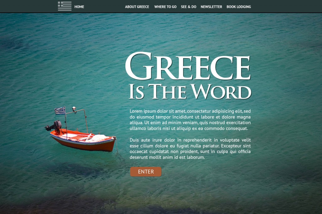
First, let’s start with a suitable image. I’ve chosen this beautiful photo, shot in Mikonos, Greece.*
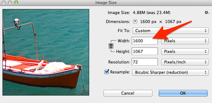
The original image is 3504px x 2336px and is a whopping 4.4mb. In Photoshop, let’s scale it down to 1600 pixels wide.
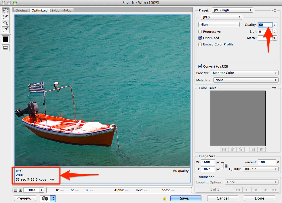
Then we’ll export from Photoshop by going to: File -> Save for Web. However, when saving at 60%, the output is 289kb—way too big, if you ask me. I try to keep large photos from going over 100kb, if I can help it. No scientific reason, it’s just a goal I’ve set for myself.
Saving to 50% brings us down to 212kb, but now we’re getting a lot of artifacting that’s degrading the appearance of the boat in the foreground.
Optimizing with Fireworks
So let’s try it in Fireworks. Note that while Adobe isn’t continuing forward with Fireworks, you can still continue to install it as part of a Creative Cloud subscription. Just go here and click “download” to install.
As before, we’ll open the original 4.4mb JPEG and resize it to 1600 pixels wide.
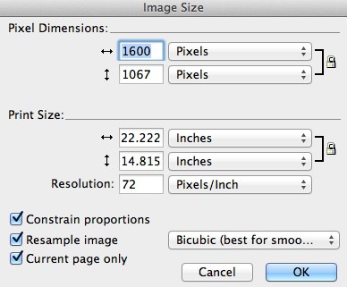
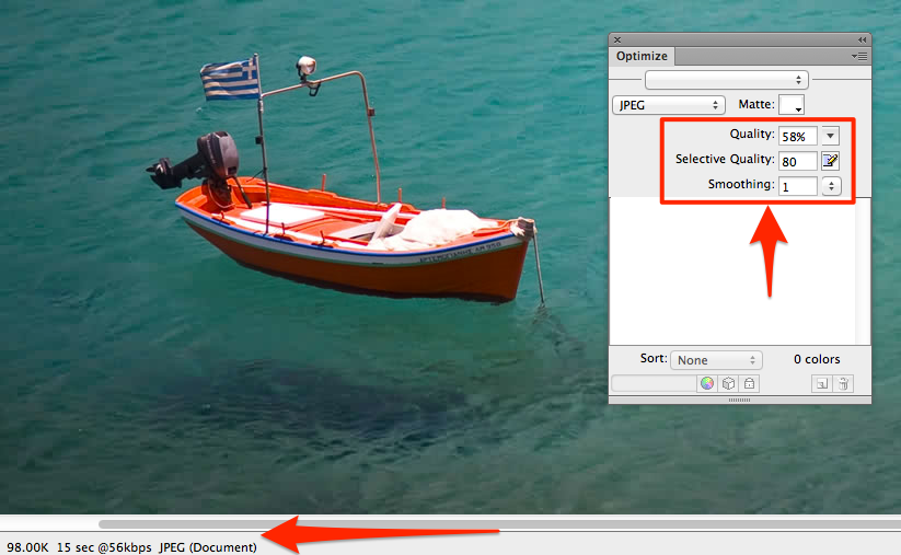
Then open the Optimize palette (F6), set the file format as JPEG and the quality at 60%. If you view the Preview tab, you’ll see quite a bit of compression artifacts, particularly around the boat. So let’s try something different.
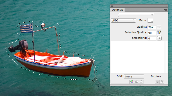
With the Marquee tool (L), outline the boat. It doesn’t need to be too precise.
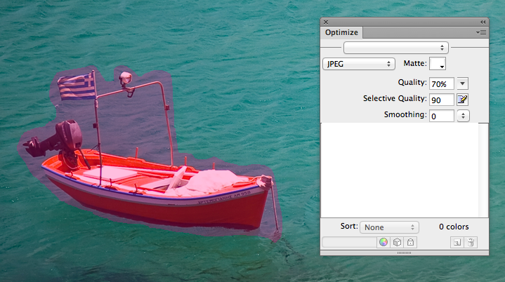
Go to: Modify -> Selective JPEG -> Save Selection as JPEG Mask. The outlined selection will now turn pink.
Whatever is part of the pink JPEG mask can be adjusted independently of the rest of the image. Here, I set the Selective Quality to 80% and with some fiddling, settled on an overall quality of 58%. The water was showing some compression artifacts, so I set Smoothing to 1, just to even it out a bit. And voila! The image is now down to 98kb, just under my target.
Once you find the settings you like, just go to: File -> Export to save your image.
For more complex images (say you want to maintain the quality of several faces in a photo), you can make multiple selections with the marquee tool. Text in large JPEGs can also get very pixelated, so I’ll often make it part of the Selective JPEG mask as well. For good measure, I usually run the exported file through ImageOptim for some additional slimming. For instance, the boat image went from 98kb to 89kb, a savings of 8.7%. Every bit (or byte) counts.
Now you’re ready to integrate into your awesome website.
But you said Fireworks was abandoned?
While it’s true that Adobe has no plans to continue development of Fireworks, they have committed to providing bug fixes and security updates. Fireworks should also be available for download as part of the Creative Suite into the foreseeable future. The current release, CS6, is actually not very old and should work fine with current operating systems. So if you’re a current Fireworks user, there’s no need to switch. And if you have Creative Suite, there’s no barrier to installing it and giving this technique a try.
Happy optimizing!
* Photo by Anton Sulsky, used with permission.
The post Image Optimization with Adobe Fireworks appeared first on Big Nerd Ranch.
]]>As the number of HTML5 web apps has grown in the last couple of years, so too has the number of people with disabilities that impair their use of the Internet. In fact, as many as 314 million people are visually impaired worldwide, and the number of Americans with visual impairment is expected to double by 2030.
The post Web Accessibility: Skip Navigation Links appeared first on Big Nerd Ranch.
]]>As the number of HTML5 web apps has grown in the last couple of years, so too has the number of people with disabilities that impair their use of the Internet. In fact, as many as 314 million people are visually impaired worldwide, and the number of Americans with visual impairment is expected to double by 2030.
Because of this, it’s important that your web sites and apps be as usable and accessible as possible, regardless of your users’ tools or limitations.
Skip Navigation
One of the most common techniques in web accessibility is the “Skip Navigation” link, sometimes referred to as “Skip to Content.” There are a couple of reasons why this feature is used on most accessible websites.
First, a screen reader will always try to read aloud any navigation it comes across, on every page load, no matter what. This can become annoying to those users. Providing a mechanism with which to quickly bypass it can greatly improve their experience. With as little as two keystrokes, they can jump right to the relevant content.
The other benefit is that sighted users who rely on only a keyboard for navigation (those with motor disabilities like paralysis or conditions like Parkinson’s disease) can also quickly bypass navigation containing many links.
For a working example, visit the WebAIM.org homepage, and without doing anything else, hit the tab key. You should see a red button appear in the upper left corner that says “Skip to Main Content.” Hitting the enter key will drop you past the top navigation and search field to where the page’s actual content begins. This is the “Skip Navigation” link in its simplest form.
The Basics
To start building skip functionality of our own, we’ll add a simple hyperlink at the very beginning of our HTML:
<a href="#content" class="skip">Skip to content</a>
But we don’t want sighted users to see that link at all times at the top of the page. So we’ll hide it offscreen with CSS:
    .skip {
        position: absolute;
        top: -1000px;
        left: -1000px;
        height: 1px;
        width: 1px;
        text-align: left;
        overflow: hidden;
    }
    a.skip:active,
    a.skip:focus,
    a.skip:hover {
        left: 0;
        top: 0;
        width: auto;
        height: auto;
        overflow: visible;
    }
This will position the link 1000px off the screen for sighted users, without hiding it from screen readers. When you hit the tab key the first time, the link will receive focus, making the :focus pseudo class kick in, and the link will be visible at the top left of the page.
Then, at some point below the navigation links and other items in the page’s header, we’ll add the ID of content to the div containing the main text of the page:
<div id="content"> … </div>
That’s it! Well, this is the extent to which most tutorials go, anyway. However, look at this live example. When you hit tab, the “Skip Navigation” link appears, and when you hit enter, you jump down the page to the content block (you may need to narrow your browser window to get the full effect). All good, right?
Well, we’re only half working. Yes, the page did scroll the content area into view in the browser window. But it did not change focus, which doesn’t really qualify for skipping navigation. If you hit tab again, you’ll focus on the first link in the navigation list, which is clearly not what we wanted.
I’ve been doing some research on this and found that a lot of sites that include this feature have implemented it in this way. Even sites like the A11Y Accessibility Project stop here.
Take the BBC site for example. Hit tab once, and you focus on the logo. Hit tab again, and you’ll see the “Skip to content” link. Hit enter, and you’ll be taken to the #blq-content content ID. But what actually happened? If you hit tab again, you’ll simply continue tabbing through navigation, which was what we’re trying to skip.
Why is this? According to WebAIM.org:
“Some browsers do not fully support in-page links. While they may visually shift focus to the location of the target or named anchor for the “skip” link, they do not actually set keyboard focus to this location. These bugs can potentially be addressed by using JavaScript to set focus (using JavaScript focus()) to the target element.”
So let’s add a little JavaScript to patch in some added functionality (jQuery, with comments).
    $( document ).ready(function() {
        // bind a click event to the 'skip' link
        $(".skip").click(function(event){
            // strip the leading hash and declare
            // the content we're skipping to
            var skipTo="#"+this.href.split('#')[1];
            // Setting 'tabindex' to -1 takes an element out of normal
            // tab flow but allows it to be focused via javascript
            $(skipTo).attr('tabindex', -1).on('blur focusout', function () {
                // when focus leaves this element,
                // remove the tabindex attribute
                $(this).removeAttr('tabindex');
            }).focus(); // focus on the content container
        });
    });
Now, when we hit enter on the Skip link (see working example), we’re using JavaScript to force focus from it to the content block. Because the Skip link itself has lost focus (i.e., blurred), it’s once again hidden with CSS. When you start hitting tab again, you’ll be starting off within the main content of the page. The header and page navigation have been truly “skipped.”
Super-Awesome Bonus Tip
Depending on the browser you used to view any of the above demos and sample sites, you might have either a) seen them all working fine, or b) not gotten any of them to work at all. If you’re on a Mac, there are a couple of quirks you should know about.
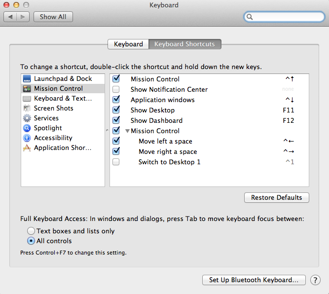
For example, in Firefox and Safari, you might notice that you can’t use the tab key to focus on anything but links and form inputs. The “Skip Navigation” links may not even show up at all. In Firefox, this is solved with a system-level preference. Go to the Apple menu, then to System Preferences -> Keyboard. Toward the bottom of the window you should see options for “Full Keyboard Access.” Check the option that says “All controls.” This makes it possible for potentially anything to gain keyboard focus. Special thanks to WebAIM via Twitter for this valuable tip.
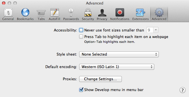
Safari has similar options in its own preferences pane. Open Safari Preferences and click on the Advanced tab. In the Accessibility options, check the box for “Press Tab to highlight each item on a webpage,” and you should be good to go.
I have some concerns as to whether the average user would know to dig deep into preferences to enable those options. WebAIM agreed it was a little obscure, but seemed to think that anyone who relies on keyboard-only navigation would be more likely to come across the fix.
Wrapping Up
This is just one technique to aid in making your site more friendly to keyboard and screen reader users. There’s much more to do, but you’re on your way to making your users with disabilities very happy. We’ll go over more web accessibility techniques in future articles!
The post Web Accessibility: Skip Navigation Links appeared first on Big Nerd Ranch.
]]>Last week, I attended CSS Dev Conference, the “conference devoted solely to CSS, the design language of the web.” It was held in Estes Park, Colorado at The Stanley Hotel, famous for inspiring Stephen King to write The Shining.
The post 13 Scary Cool Things I Learned at CSS Dev Conf 2013 appeared first on Big Nerd Ranch.
]]>Last week, I attended CSS Dev Conference, the “conference devoted solely to CSS, the design language of the web.” It was held in Estes Park, Colorado at The Stanley Hotel, famous for inspiring Stephen King to write The Shining.
After three days of amazing sessions and getting to hear and meet some of my front-end development heroes, I thought I’d do something a little different from the usual recap. A conference at a haunted hotel deserves no less.
So I present to you…
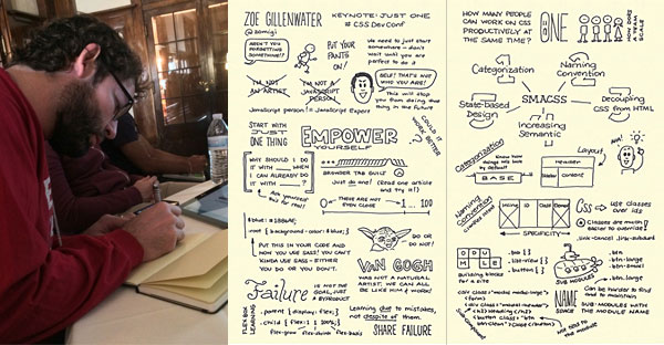
1. Zoe Gillenwater reads my diary
The opening keynote was given by Zoe Gillenwater, web designer, author and expert on accessibility and responsive web design (RWD). Her talk, “Just One,” was about “evolving who we are as web designers and developers by focusing on the power of ‘just one’ in learning, failing and accepting.”
She pointed out that we often feel like we cannot call ourselves experts in certain areas. She herself would say things like “I’m not a JavaScript person,” when in fact she’s actually pretty good at it. I think a lot of us can relate to this feeling.
Another key point was that you shouldn’t “compare your inside with someone else’s outside.” Meaning, we have a tendency to see the great work of others and just chalk it up to them being geniuses who are better than we’ll ever be. As a developer and an artist, I’m absolutely guilty of this behavior. I’ll see some slick widget or site and think that I could never have come up with that. Most of the time, the reality is that other person may have worked weeks or months on that widget and filled up an entire swear jar getting it to work. And in the end, it’s okay to experiment and fail, so long as you use it as a learning (and teaching) experience.
This was my favorite talk of the entire conference by far. It was as if Zoe knew exactly what I and many other developers deal with every day. Time to change the password on my journal.
2. I should do sketch notes
Select sessions were “sketch-noted” by designer and UX consultant Ben Norris. Ben was hired by the conference, and his hand-drawn notes help to better convey concepts and make them easier to retain. I’m a self-confessed horrible note-taker, but watching Ben in action makes me want to try these.
3. Accessibility is on everyone’s minds
One pleasant surprise was the recurring theme of web accessibility. Dennis Lembree of PayPal led a session called “Usability and Accessibility CSS Gotchas,” in which he highlighted a metric ton of tips and tricks to avoid common mistakes in accessibility implementation.
I was impressed to hear a few other speakers touch on the subject, including Wendee Fiorillo in her “Cascade Engineering” talk and Manik Rathee’s “Building Obama,” which covered how the Obama campaign’s donation form became known as a “masterpiece of interaction design.”
As an advocate of usability and accessibility, I think we still have a long way to go towards an accessible web, but I’m more encouraged than ever by our progress.
4. I’ve been doing some accessibility wrong
Speaking of accessibility, I thought I’d share a practice that I found out I was doing wrong. In Dennis Lembree’s CSS Gotchas session, he talked about best practices for hiding content, both for sighted and visually impaired users.
For instance, if I needed to hide some content from sighted users only, I might have done something like this:
    .hide {
        position: absolute;
        left: -9999em;
    }
However, the better practice is to use the “clipping method,” which is better for screen readers on touch-screen devices and RTL language support, like so:
    .hide {
        position: absolute;
        clip: rect(1px, 1px, 1px, 1px);
    }
Another good tip was to never rely on height: 0 alone in transitions, but rather in conjunction with visibility: hidden.
5. Chris Coyier can rock a keynote
 The Stanley lit up red for Halloween.
If you’ve never seen Chris Coyier, creator of CSS-Tricks.com and CodePen, give a talk, you’re missing out. He’s funny, articulate, super smart and passionate about all things CSS. As it turns out, he’s also adaptive. His talk, like all the keynotes, was held in the Stanley’s concert hall, a separate building away from the hotel. This building is notoriously unkind to anything electrical (the crew from Ghost Hunters once made it the focus of an investigation). In fact, it was plagued with audio and video problems all week.
When Chris started his talk, his wireless mic produced feedback that can only be compared to a 747 taking off in the room. Without missing a beat, he went into an impromptu air guitar session to diffuse the situation. Rather than battling with the mic, he removed it and went unplugged the rest of the way.
His keynote, “How To Stay Up To Date On Web Stuff,” dealt with the dilemma we all face: how to keep up on every new, shiny thing that comes along. To make a long story short… you don’t. Nobody can. Instead, we must decide what we want to focus on and learn what interests us. He also gave great advice on how to choose new technologies to implement on projects, asking “Is a technology just short-term cool or long-term right?”
6. Responsive images are still a mystery
According to Christopher Schmitt in his “Adaptive Images In Responsive Web Design” session, more than a year ago he and Chris Coyier had determined there were already at least 24 different responsive image solutions floating around. Most required JavaScript, and many also required server-side scripts. Today, there are even more solutions vying for our attention, including specifications for new HTML methods, such as the srcset attribute for <img> tags, and the (now deprecated) <picture> element.
At this point, which method to implement depends greatly on the needs of your site (or app), and they all come with trade-offs. Hopefully a clear (and browser-supported) winner will emerge soon, but for now, it’s still the wild west for responsive images.
7. Holly”wood” is fake
A quick bit of Stanley Hotel trivia: on a tour of the lobby, our guide shared that the beautiful woodwork we saw was, in fact, not wood at all. When the film crew came to the Stanley in 1996 to shoot The Shining miniseries, they thought the place needed to look warmer and darker. So they added some plaster and drywall beams and airbrushed them to look like the piñon pine found in the billiard room. It looked so good, the hotel decided to keep it after production had wrapped.
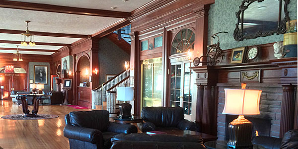
8. Style guides are the new black
With the rise of responsive web design, it’s becoming more and more important to document modules and components in style guides that not only serve as reference for developers, but also as living tests for our CSS.
Showing excellent examples from the BBC, Github and Starbucks, Shay Howe showed how creating style guides with real code can help maintain consistency, improve workflow and “educate through standards.”
Nicole Sullivan’s closing keynote, “Creating Living Style Guides,” helped drive this idea home by showing real-world examples based on her work in refactoring the bloated CSS on a large site.
I know from experience that something like a style guide might be the last thing you feel you have time to focus on, but also trust me when I say you’ll be thankful you made the time.
9. SASS still has a few tricks to teach me
I’ve been using SASS for CSS pre-processing for a while now, but I’d never seen this bit, shared by Micah Godbolt in “Get Your Sass in Line: Tips and Strategies for Teams and Large Projects.”
You can create a SASS mixin that can output the content (i.e., the css attributes) passed to it via an @include statement:
    @mixin respond-to($width) {
        @media (min-width: $width) {
            @content;
        }
    }
    @include respond-to(1024px) {
        .sidebar { float: left; }
    }
This will output:
    @media (min-width: 1024px) {
        .sidebar { float: left; }
    }
This is a handy bit of abstraction I’d never seen before, but have happily tucked away in my bag of tricks.
10. Abstract and reduce
Both the SASS talk and the all-day SMACSS workshop by Jonathan Snook really drove home the importance of reducing dependencies in your CSS. Each separate module or component should be able to live on its own, without any specific containing structure. This makes them way more modular and testable, with the added benefit of being droppable directly into your “living style guides” (remember those?).
11. 3D transforms are seriously cool
Chris Ruppel’s session, “Unfolding the Box Model,” was a mind-blowing excursion into the world of 3D transforms in CSS, and one of the most popular talks of the conference. Simply talking about it won’t do it justice. Do yourself a favor and check out his live demo on Github. Use your left and right arrow keys and prepare to be amazed.
12. People who speak at conferences are just like us
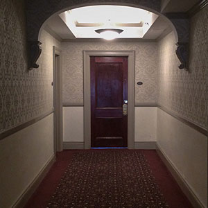 I stood outside the infamous Room 217.
On the last day, all the speakers were assembled for a wrap-up Q&A panel. I asked them, “How do you balance speaking, writing and podcasting, versus doing actual client and consulting work, versus having a family life?”
Nicole Sullivan responded that most of them probably got a lot less sleep than they should, take on too many commitments and have a problem saying “no.” Chris Eppstein shared a touching story about how he used to be a workaholic and then realized “my two-year-old was now seven,” which made him shift some priorities.
Another popular bit of advice was to stop comparing yourself to others. Only you can decide what your work/life balance should be. So often we see what others are cranking out and think to ourselves, “I’m a total slacker,” but in reality, those people may be missing out on the things you take for granted. A nice little bit of perspective from folks many of us have looked up to our whole careers.
13. F.O. Stanley was the 1900s equivalent of Steve Jobs
 Portrait of F.O. Stanley
When you stay at The Stanley Hotel, it’s impossible not to hear stories about its creator, Freelan Oscar (F.O.) Stanley and stand in awe of his accomplishments. Not only did he build the hotel and revitalize Estes Park, he co-invented the Stanley Steamer, a car that ran on steam and was capable of speeds of more than 125 miles per hour. He also held many patents, including one for photographic dry plates, which he later sold to Eastman Kodak. Oh, and he also made violins he sold for $100 apiece, which now sell at auction for five figures.
It seems that every day, I was learning some new fact or bit of trivia about F.O., and I became intrigued by this Rocky Mountain entrepreneur. If he does indeed haunt The Stanley, I’d like to think he would be happy to have so many great minds converge on his hotel to fill their brains with three days of learning in the crisp mountain air.
The post 13 Scary Cool Things I Learned at CSS Dev Conf 2013 appeared first on Big Nerd Ranch.
]]>The folks behind the popular Bootstrap framework recently announced the release of Bootstrap 3. Since its original release two years ago, Bootstrap has grown into an indispensable tool for scores of developers, and while it’s a tool for rapid prototyping, it’s also on the front end of thousands of production websites.
The post A Look At Twitter Bootstrap 3 appeared first on Big Nerd Ranch.
]]>The folks behind the popular Bootstrap framework recently announced the release of Bootstrap 3. Since its original release two years ago, Bootstrap has grown into an indispensable tool for scores of developers, and while it’s a tool for rapid prototyping, it’s also on the front end of thousands of production websites.
Let’s take a look at Bootstrap’s features and see what’s new since version 2.
Get Bootstrap
Before you can dive into Bootstrap, you have to download it, which may cause confusion right off the bat. When you first visit getbootstrap.com, you’ll see some basic navigation, a large title and subtitle, and a big “Download” button. If you click it, you’ll download a .zip archive from Github. Unzip it, and you’ll see quite a lot of files and folders.
It took me a while to figure out what I was even looking at. I saw the usual /js and /less folders, but what was all the other stuff?
Then it dawned on me that I was looking at a static Jekyll site. Once I ran ‘jekyll build' on the folder, it generated a /_gh_pages folder, which is a fully functional version of the Bootstrap documentation site. While certainly cool, I’m not sure that particular download should be the default. I can see novice users being completely baffled as to what to do with it.
However, once you click on “Getting Started”, there are links to a couple other download options, one of which is a pre-compiled and minified version of the Bootstrap CSS and JavaScript files, along with a folder for Glyphicon fonts. Unfortunately, there’s no download option to just grab the framework’s LESS, JavaScript and font files. You’ll have to download the whole shebang and grab what you need.
Mobile First
One of the biggest departures from previous versions of Bootstrap is the move to a “mobile first” approach to the CSS architecture. In other words, all baseline CSS targets the smallest screen sizes first, then scales up. With no media queries specified (or on browsers incapable of handling media queries), the browser will be served mobile style. This allows for a more future-proof application and ensures that mobile users will get the functionality they need without the overhead of larger desktop apps. Then, as you expand outward to larger devices, you can add in more functionality, larger images, etc.
The Grid
The new grid system in Bootstrap 3 appears to be quite good. Where the old system was pixel-based, the new one uses percentages for widths. This aids in responsive design and makes it easier to recalculate column and gutter widths.
I’ve mentioned previously that I like how Foundation’s grids have two breakpoint-based classes, so that you can add a column and specify two different widths based on screen size. Turns out, Bootstrap 3 has four of them:
- Extra-small for phones (less than 768px)
- Small for tablets (768px and up)
- Medium for desktops (992px and up)
- Large for ludicrous size (1200px and up)
So if you want a row that spans two columns on desktop, but stacks the columns on a phone, you might write something like this:
<div class="row">
	<div class="col-xs-12 col-md-6">Column One</div>
	<div class="col-xs-12 col-md-6">Column Two</div>
</div>
Note that Bootstrap’s .row class does not have to be augmented by an additional .columns class, as Foundation’s does.
In addition, you can use similarly named breakpoint variables in your media queries, like so:
// Styles for 768px and up
@media (min-width: @screen-sm) { ... }
The Bootstrap grid also has the usual support for offsetting, pushing and pulling columns for various layout solutions.
LESS? Really?
So far in my research into Bootstrap 3, the biggest head-scratcher has got to be the continued inclusion of LESS as its CSS preprocessor. While I don’t wish to start a war, I think it’s generally accepted that SASS is becoming the dominant player in this space. Having used SASS exclusively since I started using the Foundation framework, I was very hopeful that Bootstrap 3 would also adopt it. Alas, they’re sticking with LESS, which is unfortunate. Happily, SASS ports have already begun to appear.
That said, I do understand there are legitimate benefits to LESS, including its faster compile speed. Here’s one of the creators’ justification for continuing to stick with LESS in Bootstrap. I’m sure it was a tough decision, and likely one that favored ease of use over the additional power of SASS.
Browser Support
Bootstrap 3 supports the latest versions of the most common browsers: Chrome, Safari, Firefox, Opera. IE 8 and 9 _are _supported, with some exceptions: IE8 doesn’t support certain CSS3 properties, and requires the use of something like Scott Jehl’s respond.js for media query support. (Note: Foundation 4 says it doesn’t support either IE7 or 8, but I think that at least media query support could be added with respond.js.)
CSS Components
In addition to its grid system, Bootstrap also includes some good baseline CSS and helper classes. There are typography styles and classes for blocks of code. It also comes with a nice array of table styles, including an interesting take on responsive tables. By wrapping a table in a .table-responsive class, once it’s scaled down to a certain point, the table is scrollable horizontally so you can still see every column, without them being crunched. The trick is that it’s not always apparent that the table is now scrollable horizontally, if scroll bars don’t show up automatically in your browser.
The framework also provides some pretty good form defaults. Stylistically, they’re nothing earth-shattering, but they provide a good starting point towards making usable forms. Additionally, there are some really nice-looking, flexible button presets.
There are also several helper classes, most of which are standard parts of other frameworks, such as .pull-left, pull-right, and .clearfix. They also include a cool helper class called .sr-only, which stands for “screen-reader-only”, and allows you to hide elements from sighted users offscreen while keeping them available to vision-impaired users.
Bootstrap also includes responsive utility classes to control when elements should be hidden or visible. For example, if there’s an element you’d like to have hidden on a phone display you’d use:
<div class="hidden-xs">
JavaScript Plugins
Bootstrap 3 includes 12 jQuery plugins:
- Transitions
- Modal
- Dropdown
- Scrollspy
- Tab
- Tooltip
- Popover
- Alert
- Button
- Collapse
- Carousel
- Affix
I won’t go over them here, but one very nice feature is that each can be completely configured via data-attributes in the HTML, without having to write a single line of JavaScript. For example, to launch a modal dialog with a button:
<button type="button" data-toggle="modal" data-target="#myModal">Launch modal</button>
…would be identical to:
$('#myModal').modal();
This makes it easier for more novice developers to implement plugins without having to do a lot of configuration in JavaScript. Note that Foundation 4 also supports configuration via data attributes, but not for all its plugins.
Bootstrap includes the usual plugin suspects, such as modals, tooltips and alerts. But it also includes some nifty stuff like Scrollspy, which tracks the scroll bar position of an object (or the whole page) and can update things like navigation highlights automatically.
Like Foundation, it also includes plugins for collapsing accordions and tabbed content. However, where Foundation has Bootstrap beat is the fact that these are part of the same plugin in Foundation and can be switched on the fly, for instance on device orientation change.
Overall, Bootstrap’s plugins seem useful and well-crafted, but they’re not terribly unique or groundbreaking. What they have going for them is their ease of configuration and that all public API methods are available and chainable, and the events for most plugins’ unique actions (like, show, hide, etc) are readily available.
The Verdict
All in all, Bootstrap 3 is a pretty solid, yet basic framework. There have been definite improvements over the last version, notably the move to mobile first and the improved grid system. I’ve not had a chance to build anything with it yet, but if one of the SASS conversions is any good, I may give it a try. I still think my framework of choice at this point is Foundation 4, but if I need something simple and lightweight, Bootstrap is a good option.
The post A Look At Twitter Bootstrap 3 appeared first on Big Nerd Ranch.
]]>Things are changing rapidly for front-end developers. It seems that every day someone is releasing a brand new framework, bootstrap, boilerplate or some other convenience meant to get our projects up and running as quickly as possible. And with Responsive Web Design (RWD) being the hot topic that it is, even more are being released to cater to responsive’s specific needs.
The post Responsive Sites With Foundation appeared first on Big Nerd Ranch.
]]>Things are changing rapidly for front-end developers. It seems that every day someone is releasing a brand new framework, bootstrap, boilerplate or some other convenience meant to get our projects up and running as quickly as possible. And with Responsive Web Design (RWD) being the hot topic that it is, even more are being released to cater to responsive’s specific needs.
I’d used Twitter’s Bootstrap framework on several projects and overall, I quite liked it. It’s not without its flaws, but it also served as a great introduction to streamlining writing CSS with a preprocessor like LESS.
However, when it came time to start prototyping a large responsive site, I had to reevaluate how far Bootstrap could take me. While it does have some responsive features, they’re not active “out of the box” and not very comprehensive*.
(* Note that I’m referring to Twitter Bootstrap 2. A review of Bootstrap 3 will be forthcoming.)
Enter Foundation
 That’s where Foundation comes in, billing itself as “the most advanced responsive front-end framework in the world”. I’m not sure I’d go that far, but it’s pretty darn good.
Foundation includes several CSS components for things like alert boxes and progress bars, as well as JavaScript plugins for handling things like image carousels, tooltips and tabbed content.
What sets this framework apart is that every single one of its parts is built to be totally responsive.
The Setup
Flexibility is the name of the game with Foundation, and this definitely extends to how you set it up.
Plain CSS
If you just want to get started ASAP, and using SASS for CSS preprocessing isn’t your thing, you can download a version of Foundation that includes just static files. The downside is that most of the code is in a single .css file that’s 4,600+ lines long(!), which could get a little overwhelming.
Customized CSS
This is the same basic build as the Plain CSS option above, only you can configure your customized Foundation download via a convenient wizard form. You check only the CSS and JavaScript components you want included as well as set your grid widths and gutters.
Standalone SASS
If you’re familiar with using SASS for your CSS production, or just want to get a crash course, you can download a version of Foundation that includes all the .scss files you’ll need. This package can be acquired by downloading a .zip file from the GitHub project.
Sass with Compass
And for the super nerdy, you can build your Foundation project with Compass. This gives you a lot of extra power tools like mixins for lists, typography, CSS3 properties and even creation of CSS sprite sheets (which I’ll be exploring in a future article).
When going the SASS/Compass route, you’re basically installing Foundation and Compass as Ruby gems and configuring Compass to “watch” your files and recompile SASS to CSS as changes are made. You can also use more visual tools like the amazing CodeKit app to simplify this process.
The caveat to this method is that you no longer have all of Foundation’s .scss files within your project. They are included by Compass at compile time. This is all well and good until you need to make changes to Foundation’s “stock” SASS files.
In the end, my team went with a hybrid approach. We still used Compass to do the compilation, but included all .scss files within the project. This allowed us to make minor tweaks to them as needed, and also include them in version control.
The Grid
At the core of Foundation (and in fact, most frameworks) is its grid system, and Foundation’s may be the best I’ve seen. The grid included in Twitter Bootstrap is decent, but relies on pixel widths and you have to come up with the math for column divisions yourself (or by trial and error tweaking settings in a wizard).
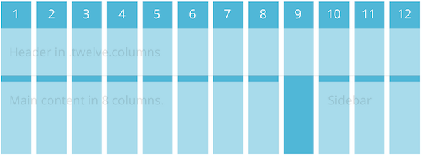
In responsive fashion, the Foundation grid is based solely on percentages. And built-in SASS functions make it super easy to change column and gutter widths which get recalculated when compiled.
One of the coolest bonuses with the Foundation grids, though, is that it contains a few breakpoint-related variations of its column classes. For example, if a div container needs to be six columns on a mobile screen, you’d give it a class like so:
<div class="small-6 columns">
If you wanted that same element to span all 12 columns on a desktop screen, you’d add another class:
<div class="small-6 large-12 columns">
Foundation also includes utility classes to control when elements should be hidden or visible. For example, if there’s an element you’d like to have hidden on a small display:
<div class="hide-for-small">
And if you’d like it visible on everything 768px wide or larger:
<div class="show-for-medium-up">
There are also useful variations like .hide-for-portrait and .show-for-landscape.
I should also note that the grid can be nested any number of levels deep, and has the usual utility classes for pushing, pulling and offsetting elements one way or another.
CSS Components
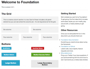 Foundation offers base CSS styles for rapid prototyping.
The Foundation framework includes a grand total of 35 SASS .scss files. This sounds like a lot until you realize you likely won’t use them all. Even on the big site I worked on, we only included 11 of them. That’s part of the beauty of Foundation: it’s extremely modular. If all you wanted it for was its grid system (which is totally worth the price of admission), you could just include grid.scss and go on your merry way.
A lot of these components are more suited to rapid prototyping, where you want to just experiment with placement and hierarchy, as opposed to caring about design. Then once you have an actual design direction and you’ve tested your theories, you can slowly remove those CSS helpers. Some of them are quite useful, including:
Forms
Let’s face it, styling forms is the bane of a UI developer’s existence. However, the forms.scss included with Foundation, along with its JavaScript counterpart, make it much less painful. It already includes many helpful styles for elements like labels and fieldsets, but also has built-in styles for things like error states.
Flex Video
This is a simple addition that allows you to surround an embedded video (YouTube, Vimeo) with a wrapper that will enable the video to properly scale on any device.
JavaScript Components
Even more helpful than the CSS components are Foundation’s JavaScript helper components, of which there are about 14. Here are a few I’ve found very helpful:
Orbit
Orbit is Foundation’s answer to an image carousel. While there is much debate as to whether carousels (or “sliders”) are effective at all, we as UI developers will continue to need to implement them for the foreseeable future.
Not surprisingly, Orbit carousels are fully responsive. Other perks include the ability to deep link to individual slides, and it has a pretty nice preloader wrapper.
It also has some perplexing shortcomings, like not being able to configure whether it auto-plays or not. The slideshows start transitioning automatically no matter what. As a workaround, I had to add a fake “click” on the timer element to stop it before it starts:
$('.slideshow-wrapper').find('.orbit-timer span').click();
It also seems to have no support for being able to detect when only one slide is present. In a perfect world, this wouldn’t happen, but if the slideshow is generated via a client-controlled CMS, it might come up. So we also had to add some JavaScript band-aids to deal with that eventuality.
Section
 The Section plugin is a super versatile tab and accordion component.
Section is an oddly-named component that is used to show and hide tabbed content. This super flexible component can be configured to show tabs vertically or horizontally, with content optionally shown by default.
It also can be used for horizontal and vertical nav bars, as well as accordions. And let’s say you want to have tabbed content on desktop screens, but display it as a vertical accordion on phones. With a bit of JavaScript to detect screen width, you can dynamically add or remove an .accordion class to do just that. Like I said, super flexible.
Reveal
No self-respecting framework would be without some sort of modal dialog support, and Foundation has that covered. Reveal is pretty basic, but fully responsive, and you can specify how much of the screen you’d like it to take up.
Interchange
Interchange is another weirdly-named component that’s pretty useful. Well, sort of. It’s a plugin that attempts to deal with serving multiple image sizes based on the screen dimensions, but not in an altogether successful way.
Here is an example implementation, from the Foundation docs:
<img src="/path/to/default.jpg" data-interchange="[/path/to/default.jpg, (default)], [/path/to/bigger-image.jpg, (large)]">
This example makes things easier by allowing you to specify named media queries, such as “small”, “medium”, “portrait”, etc. You would specify your smallest image as the image source and put the others inside the data-interchange attribute.
The real issue with this approach is that the image source will ALWAYS download, no matter what. Worse, it will often result in a brief “flash,” where the user will see the small version a split second before the proper one appears. For those reasons, we decided not to implement this particular component.
Caveats, Gotchas and Head-Scratchers
As great as Foundation is, it’s not without its problems. Some are minor, and some still have me scratching my head. Here are a few things to consider when evaluating Foundation.
Browser support
One of the first questions you’ll need to answer when considering Foundation is what browsers you’re supporting. Since Foundation is mobile-first, any browser that does not support media queries will always be served the mobile version, regardless of screen size. I’m looking at you, IE 6-8. Luckily, you could still use something like Scott Jehl’s Respond.js to augment that functionality.
Another thing to consider is that Foundation sets everything globally to box-sizing: border-box, which essentially normalizes the box model to no longer figure padding into an element’s width and height. This has really excellent support, but isn’t available in IE 6-7.
Mobile First
You should also be aware that Foundation is built with “Mobile First” in mind. In a nutshell, this means you’re building for the smallest screens possible (i.e., phones) first, and expanding out from there. Another way to think about it is starting with the least capable, lowest-bandwidth devices first, keeping their particular limitations in mind. Believe me, this can be hard to get your head around, but after a while, you’ll just start thinking about it differently.
Naming Conventions
Speaking of thinking differently, Foundation also has some naming conventions that don’t make a lot of sense. For example, it provides a few named breakpoints for use in media queries, like ‘small’, ‘medium’ and ‘large’. However, the ‘small’ breakpoint starts at 768px, or tablet size. ‘Medium’ is 1280px, and ‘Large’ is 1440px and up. This naming scheme can be confusing when the first set of breakpoints you add onto mobile styles is called ‘small’. Weren’t we already at small?
Related to this is Foundation’s breakpoint-based grid classes. They, too have a ‘small’ and ‘large’ version. But here, if you’re defining grid widths for a small screen, you actually use a .small-X class, and .large-X actually starts at 768px. This has required a bit of tweaking on our end to make sure breakpoints on both grid classes and media queries jive right.
And speaking of naming, I have a bit of an issue with some of Foundation’s component names. For instance, their form validation library is called “Abide.” We had originally thought there was no validation, because none of the component names seemed to suggest that. Orbit, Interchange and Section also suffer from this sort of vague naming. I think you should be able to skim a list and figure out right away what everything does, but that’s just me.
Missing Breakpoints
There also is a noticeable gap in Foundation’s built-in breakpoints. The very first one starts at 768px, ostensibly for tablets like the iPad. Normally, you’d consider mobile to go up to about 480px. This leaves a weird phantom zone in Foundation between 480px and 768px, where tablets like the Nook and Kindle Fire live. Sometimes allowing them to adopt the mobile styles is just fine. But often, it just looks weird or broken. For this reason, we also had to go in and insert our own “medium” breakpoints to fill in this gap.
I should note, however, that as I write this, in the current version of Foundation (4.3.1), they are slowly transitioning in that missing breakpoint. There is an add-on grid-5.scss file that adds a medium breakpoint that covers from 640px-1024px. The large grid styles take over after that. It sounds like this will be standardized with Foundation 5.
Conclusion
So there you go. Despite some of its shortcomings, I’ve really enjoyed my time using the Foundation framework. More often than not, I’ve been impressed with the way its pieces “just work”, particularly the responsive bits. It’s clear the devs really know what they’re doing and have put a lot of thought into making this not only a cohesive framework, but truly modular. And with advisors like “Mr. Mobile First”, Luke Wroblewski himself, I’m excited to see what’s next for Foundation.
The post Responsive Sites With Foundation appeared first on Big Nerd Ranch.
]]>Editor’s note: This blog post first appeared in a longer form on Andrew’s personal blog.
The post Working at Big Nerd Ranch: Finding Your People appeared first on Big Nerd Ranch.
]]>Editor’s note: This blog post first appeared in a longer form on Andrew’s personal blog.
The phrase “dream job” is thrown around quite a bit, and can mean vastly different things to different people. For a journalist, the dream job may be working for a national newspaper. For a film student, getting to work with Scorsese. For a web designer, the dream job might be working for any number of shops, or…Big Nerd Ranch.
I’ll be honest, when Big Nerd Ranch first showed up on my radar, I wasn’t exactly sure what they did. I knew they did a lot of developer training, specifically for iOS and Android. But beyond that, it was a bit of a mystery. Once I started poking around, I realized how much they were really into, including a variety of weeklong developer bootcamps, customized on-site corporate training, and app development that includes consulting and products like eClicker and Roominant. It also didn’t hurt that the founder was formerly a developer at NeXT and a developer and trainer at Apple.
But it was this video that sealed the deal for me. I instantly knew this was where I wanted to be:
Why Work with Big Nerd Ranch from Big Nerd Ranch on Vimeo.
I watched it with my wife, and when it was over she turned to me and said, “These are your people.” I immediately applied for a front-end developer position that was open.
My first week
 Coffee is serious business here.
My first day at Big Nerd Ranch was like the first day of school. I was pretty nervous. This was a group of people I’d hoped were just like me, and I was not disappointed. My day started with a quick tour of the offices and some brief training on the somewhat intimidating coffee apparatus. I then was given my goodie bag, which included a wireless Apple keyboard and mouse, a Big Nerd Ranch t-shirt and a book. I got charged with writing blog posts (achievement unlocked!), and I also got a brand new Macbook Pro to work on, which I’m free to customize and make my own. Oh, did I mention the entire place is Mac-based? What a relief not to have to deal with random PC’s, file format differences, etc.
On day two, I attended my first company meeting, referred to as a “fireside chat,” in which we learned about all kinds of cool things going on internally. And as if my first week wasn’t already getting off to a great start, we were also treated to one of Big Nerd Ranch’s regular “bacon bonanza” breakfasts. Mmmm, bacon. And later that night, I got to sit in on my first company game night, where folks will get together to play board and card games. I finally got to learn and play Munchkin and we had a marathon four-hour game!
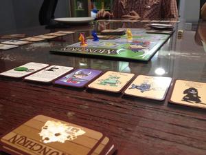 My first game night included a four-hour game of Munchkin!
To cap off the week, I got to sit in on a client meeting for what may quite possibly be the most challenging and fun project I’ve worked on. Ever.
So yeah, it was a good week.
Brilliant, Hardworking and Kind
I think what’s impressed me the most, though, is that every single person you encounter at the Ranch will stop and introduce themselves and ask what you’re working on. Nobody is afraid to ask for help, nor to stop what they’re doing to help a fellow Nerd work through a problem. Everyone truly loves what they do and cares about doing it right. While it’s important that you be a great developer, it’s even more important that you be a great culture fit. There are three characteristics of being a Nerd: brilliant, hardworking and kind. And that’s evident with everyone you’ll meet there.
I’ve worked places where some developers just seem to put in their time and clock out. Not here. We’re all passionate about what we’re doing and I think it shows in everything that comes out of Big Nerd Ranch. I’m excited and incredibly honored to be a part of it. Here’s to many, many more great weeks ahead.
The post Working at Big Nerd Ranch: Finding Your People appeared first on Big Nerd Ranch.
]]>
