Things are changing rapidly for front-end developers. It seems that every day someone is releasing a brand new framework, bootstrap, boilerplate or some other convenience meant to get our projects up and running as quickly as possible. And with Responsive Web Design (RWD) being the hot topic that it is, even more are being released to cater to responsive’s specific needs.
I’d used Twitter’s Bootstrap framework on several projects and overall, I quite liked it. It’s not without its flaws, but it also served as a great introduction to streamlining writing CSS with a preprocessor like LESS.
However, when it came time to start prototyping a large responsive site, I had to reevaluate how far Bootstrap could take me. While it does have some responsive features, they’re not active “out of the box” and not very comprehensive*.
(* Note that I’m referring to Twitter Bootstrap 2. A review of Bootstrap 3 will be forthcoming.)
Enter Foundation
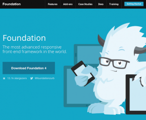 That’s where Foundation comes in, billing itself as “the most advanced responsive front-end framework in the world”. I’m not sure I’d go that far, but it’s pretty darn good.
Foundation includes several CSS components for things like alert boxes and progress bars, as well as JavaScript plugins for handling things like image carousels, tooltips and tabbed content.
What sets this framework apart is that every single one of its parts is built to be totally responsive.
The Setup
Flexibility is the name of the game with Foundation, and this definitely extends to how you set it up.
Plain CSS
If you just want to get started ASAP, and using SASS for CSS preprocessing isn’t your thing, you can download a version of Foundation that includes just static files. The downside is that most of the code is in a single .css file that’s 4,600+ lines long(!), which could get a little overwhelming.
Customized CSS
This is the same basic build as the Plain CSS option above, only you can configure your customized Foundation download via a convenient wizard form. You check only the CSS and JavaScript components you want included as well as set your grid widths and gutters.
Standalone SASS
If you’re familiar with using SASS for your CSS production, or just want to get a crash course, you can download a version of Foundation that includes all the .scss files you’ll need. This package can be acquired by downloading a .zip file from the GitHub project.
Sass with Compass
And for the super nerdy, you can build your Foundation project with Compass. This gives you a lot of extra power tools like mixins for lists, typography, CSS3 properties and even creation of CSS sprite sheets (which I’ll be exploring in a future article).
When going the SASS/Compass route, you’re basically installing Foundation and Compass as Ruby gems and configuring Compass to “watch” your files and recompile SASS to CSS as changes are made. You can also use more visual tools like the amazing CodeKit app to simplify this process.
The caveat to this method is that you no longer have all of Foundation’s .scss files within your project. They are included by Compass at compile time. This is all well and good until you need to make changes to Foundation’s “stock” SASS files.
In the end, my team went with a hybrid approach. We still used Compass to do the compilation, but included all .scss files within the project. This allowed us to make minor tweaks to them as needed, and also include them in version control.
The Grid
At the core of Foundation (and in fact, most frameworks) is its grid system, and Foundation’s may be the best I’ve seen. The grid included in Twitter Bootstrap is decent, but relies on pixel widths and you have to come up with the math for column divisions yourself (or by trial and error tweaking settings in a wizard).
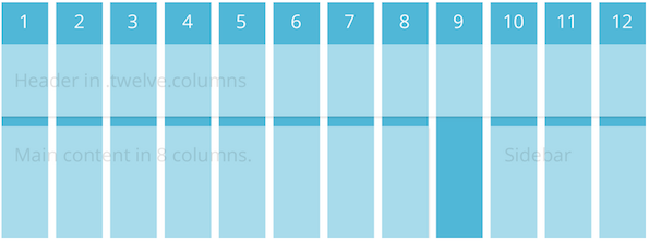
In responsive fashion, the Foundation grid is based solely on percentages. And built-in SASS functions make it super easy to change column and gutter widths which get recalculated when compiled.
One of the coolest bonuses with the Foundation grids, though, is that it contains a few breakpoint-related variations of its column classes. For example, if a div container needs to be six columns on a mobile screen, you’d give it a class like so:
<div class="small-6 columns">
If you wanted that same element to span all 12 columns on a desktop screen, you’d add another class:
<div class="small-6 large-12 columns">
Foundation also includes utility classes to control when elements should be hidden or visible. For example, if there’s an element you’d like to have hidden on a small display:
<div class="hide-for-small">
And if you’d like it visible on everything 768px wide or larger:
<div class="show-for-medium-up">
There are also useful variations like .hide-for-portrait and .show-for-landscape.
I should also note that the grid can be nested any number of levels deep, and has the usual utility classes for pushing, pulling and offsetting elements one way or another.
CSS Components
 Foundation offers base CSS styles for rapid prototyping.
The Foundation framework includes a grand total of 35 SASS .scss files. This sounds like a lot until you realize you likely won’t use them all. Even on the big site I worked on, we only included 11 of them. That’s part of the beauty of Foundation: it’s extremely modular. If all you wanted it for was its grid system (which is totally worth the price of admission), you could just include grid.scss and go on your merry way.
A lot of these components are more suited to rapid prototyping, where you want to just experiment with placement and hierarchy, as opposed to caring about design. Then once you have an actual design direction and you’ve tested your theories, you can slowly remove those CSS helpers. Some of them are quite useful, including:
Let’s face it, styling forms is the bane of a UI developer’s existence. However, the forms.scss included with Foundation, along with its JavaScript counterpart, make it much less painful. It already includes many helpful styles for elements like labels and fieldsets, but also has built-in styles for things like error states.
Flex Video
This is a simple addition that allows you to surround an embedded video (YouTube, Vimeo) with a wrapper that will enable the video to properly scale on any device.
JavaScript Components
Even more helpful than the CSS components are Foundation’s JavaScript helper components, of which there are about 14. Here are a few I’ve found very helpful:
Orbit
Orbit is Foundation’s answer to an image carousel. While there is much debate as to whether carousels (or “sliders”) are effective at all, we as UI developers will continue to need to implement them for the foreseeable future.
Not surprisingly, Orbit carousels are fully responsive. Other perks include the ability to deep link to individual slides, and it has a pretty nice preloader wrapper.
It also has some perplexing shortcomings, like not being able to configure whether it auto-plays or not. The slideshows start transitioning automatically no matter what. As a workaround, I had to add a fake “click” on the timer element to stop it before it starts:
$('.slideshow-wrapper').find('.orbit-timer span').click();
It also seems to have no support for being able to detect when only one slide is present. In a perfect world, this wouldn’t happen, but if the slideshow is generated via a client-controlled CMS, it might come up. So we also had to add some JavaScript band-aids to deal with that eventuality.
Section
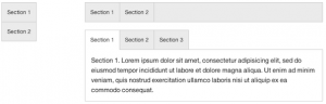 The Section plugin is a super versatile tab and accordion component.
Section is an oddly-named component that is used to show and hide tabbed content. This super flexible component can be configured to show tabs vertically or horizontally, with content optionally shown by default.
It also can be used for horizontal and vertical nav bars, as well as accordions. And let’s say you want to have tabbed content on desktop screens, but display it as a vertical accordion on phones. With a bit of JavaScript to detect screen width, you can dynamically add or remove an .accordion class to do just that. Like I said, super flexible.
Reveal
No self-respecting framework would be without some sort of modal dialog support, and Foundation has that covered. Reveal is pretty basic, but fully responsive, and you can specify how much of the screen you’d like it to take up.
Interchange
Interchange is another weirdly-named component that’s pretty useful. Well, sort of. It’s a plugin that attempts to deal with serving multiple image sizes based on the screen dimensions, but not in an altogether successful way.
Here is an example implementation, from the Foundation docs:
<img src="/path/to/default.jpg" data-interchange="[/path/to/default.jpg, (default)], [/path/to/bigger-image.jpg, (large)]">
This example makes things easier by allowing you to specify named media queries, such as “small”, “medium”, “portrait”, etc. You would specify your smallest image as the image source and put the others inside the data-interchange attribute.
The real issue with this approach is that the image source will ALWAYS download, no matter what. Worse, it will often result in a brief “flash,” where the user will see the small version a split second before the proper one appears. For those reasons, we decided not to implement this particular component.
Caveats, Gotchas and Head-Scratchers
As great as Foundation is, it’s not without its problems. Some are minor, and some still have me scratching my head. Here are a few things to consider when evaluating Foundation.
Browser support
One of the first questions you’ll need to answer when considering Foundation is what browsers you’re supporting. Since Foundation is mobile-first, any browser that does not support media queries will always be served the mobile version, regardless of screen size. I’m looking at you, IE 6-8. Luckily, you could still use something like Scott Jehl’s Respond.js to augment that functionality.
Another thing to consider is that Foundation sets everything globally to box-sizing: border-box, which essentially normalizes the box model to no longer figure padding into an element’s width and height. This has really excellent support, but isn’t available in IE 6-7.
Mobile First
You should also be aware that Foundation is built with “Mobile First” in mind. In a nutshell, this means you’re building for the smallest screens possible (i.e., phones) first, and expanding out from there. Another way to think about it is starting with the least capable, lowest-bandwidth devices first, keeping their particular limitations in mind. Believe me, this can be hard to get your head around, but after a while, you’ll just start thinking about it differently.
Naming Conventions
Speaking of thinking differently, Foundation also has some naming conventions that don’t make a lot of sense. For example, it provides a few named breakpoints for use in media queries, like ‘small’, ‘medium’ and ‘large’. However, the ‘small’ breakpoint starts at 768px, or tablet size. ‘Medium’ is 1280px, and ‘Large’ is 1440px and up. This naming scheme can be confusing when the first set of breakpoints you add onto mobile styles is called ‘small’. Weren’t we already at small?
Related to this is Foundation’s breakpoint-based grid classes. They, too have a ‘small’ and ‘large’ version. But here, if you’re defining grid widths for a small screen, you actually use a .small-X class, and .large-X actually starts at 768px. This has required a bit of tweaking on our end to make sure breakpoints on both grid classes and media queries jive right.
And speaking of naming, I have a bit of an issue with some of Foundation’s component names. For instance, their form validation library is called “Abide.” We had originally thought there was no validation, because none of the component names seemed to suggest that. Orbit, Interchange and Section also suffer from this sort of vague naming. I think you should be able to skim a list and figure out right away what everything does, but that’s just me.
Missing Breakpoints
There also is a noticeable gap in Foundation’s built-in breakpoints. The very first one starts at 768px, ostensibly for tablets like the iPad. Normally, you’d consider mobile to go up to about 480px. This leaves a weird phantom zone in Foundation between 480px and 768px, where tablets like the Nook and Kindle Fire live. Sometimes allowing them to adopt the mobile styles is just fine. But often, it just looks weird or broken. For this reason, we also had to go in and insert our own “medium” breakpoints to fill in this gap.
I should note, however, that as I write this, in the current version of Foundation (4.3.1), they are slowly transitioning in that missing breakpoint. There is an add-on grid-5.scss file that adds a medium breakpoint that covers from 640px-1024px. The large grid styles take over after that. It sounds like this will be standardized with Foundation 5.
Conclusion
So there you go. Despite some of its shortcomings, I’ve really enjoyed my time using the Foundation framework. More often than not, I’ve been impressed with the way its pieces “just work”, particularly the responsive bits. It’s clear the devs really know what they’re doing and have put a lot of thought into making this not only a cohesive framework, but truly modular. And with advisors like “Mr. Mobile First”, Luke Wroblewski himself, I’m excited to see what’s next for Foundation.