


Writing is Designing: Three Principles for Writing Effective UX Copy
Design MarketingImagine, if you will, that you’ve discovered a cute new gem of a bakery. The pastry chef welcomes you into the ambient, delightfully quirky...
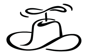
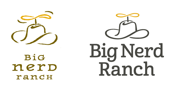
Since 2001, the Big Nerd Ranch logo has featured a nerdy propeller affixed to a 10-gallon hat. This friendly little chap perfectly embodies our character and culture, but it was time for a makeover. Our Design team carried out some small but key changes to help modernize our brand.
![]()
We did not seek a full scale redesign, or embark on a quest to rediscover our spirit animal. Our ethos, spirit and personality haven’t changed over the years; we just needed to do a better job of conveying them.
We wished to do justice to the brilliance of our fellow Nerds, who speak expertly in code, teach app development to others around the world, execute cutting-edge development for Fortune 500 companies and commence authoring a book on a programming language when it is mere days old.
Furthermore, our design department has grown into a well-oiled, full-service UX and UI machine that shares our knowledge and design principles in our iOS Mobile Design and Android Mobile Design bootcamps. We needed to practice what we preach.
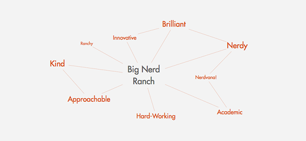
And if we were going to take our logo in a different direction, we had better make darn sure it jived with the brand traits outlined in our style guide. These were all of the things we liked to think about ourselves and strove to be: brilliant, kind, hardworking and more. Some recent market research conducted amongst a pool of our alumni validated our winning personality.
Stylistically, the logo needed some work, but there were other issues to tend to as well: technical concerns related to legibility, flaws in the hierarchy of elements and some misuses of typography.
Big Nerd Ranch is a modern tech company with an Old West name and quirky Nerd twist. The perfect way to marry these two was with a modern slab serif—a nod to Western “Wanted” posters and to contemporary tech, which has breathed new life into the slab. Being the friendly people we are, we also needed a happier character than most slabs provide. Archer, created for Martha Stewart’s brand by Hoefler & Co (née Hoefler-Frere Jones), led the pack for most of the design process, as its ball terminals gave the face much-needed life.
Archer’s description read like our brand guidelines. Modern, credible, and charming, its only initial flaw was its use by countless companies to give their opaqueness some cheer. But Stewart’s slab fell down when set up next to the swashes of the hat.
It wasn’t until we found Cabrito by the foundry Insigne that we knew we had what we wanted. Its creator’s goals of legibility and teaching children to read were a nod to our training and made our logo a pleasure to see across various sizes. Cabrito’s wide range of OpenType features and companion sans meant that we had plenty of tools to work with across our branding.
And we dare you to trill the “r” in Cabrito (which means “little goat” in Spanish) without cracking a smile.
Our original hat with its hand-crafted texture reproduced poorly in digital formats, and the weathered rustic style made it feel a bit dated. The first order of business was to eliminate the brushstroked edge. We did so and quickly achieved a cleaner, smoother, more rounded stroke.
Next, we targeted thin and thick areas and rendered a more consistent line weight. This minimized the calligraphic quality of the line and increased legibility of the overall symbol.
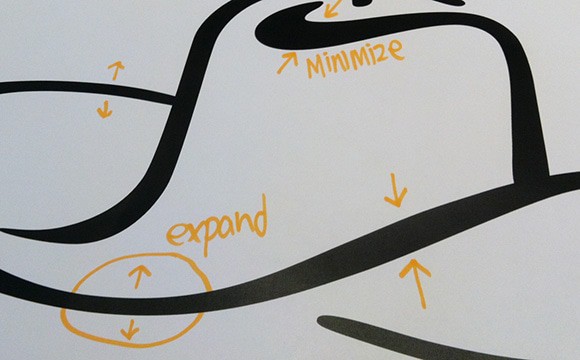
Eliminating the pointed ends of the strokes helped form a more cohesive mark when paired with the letterforms.
Lastly, the movement lines framing the propeller were removed, as the implied movement could be achieved instead through the form itself. The blades were made more symmetrical and their angles now echo the sweeping forms represented in the hat brim.
We integrated, we tweaked, we obsessed, we threw things away, and we landed upon what we believe to be a solid and emotive mark that echoes the friendliness and experience we’re known for.
![]()
The refreshed logo deserved a refreshed color palette. Our previous, more rustic palette could appear muddy and inconsistent on various screens. We needed to commit to colors, rather than using colors that could be interpreted.

We love our Big Nerd Ranch Gold. It communicates our boldness, vibrancy and fun, and so it deserved to stay. We paired that with a strong charcoal to establish our primary tier. To bring about the secondary set, we shook some of the dust off of our green and settled it alongside a bright and lively red-orange.
We love the outcome: a refined, more contemporary mark that remains true to our nerdy heritage. We hope you agree!
Imagine, if you will, that you’ve discovered a cute new gem of a bakery. The pastry chef welcomes you into the ambient, delightfully quirky...

There are several design patterns used these days in the .NET ecosystem. What are they? What are the benefits and drawbacks of each pattern?...

Large organizations with multiple software development departments may find themselves supporting multiple web frameworks across the organization. This can make it challenging to keep...