

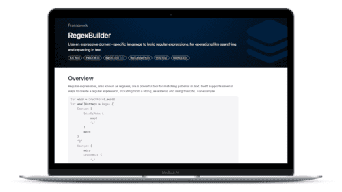
Swift Regex Deep Dive
iOS MacOur introductory guide to Swift Regex. Learn regular expressions in Swift including RegexBuilder examples and strongly-typed captures.
Yesterday, we at the Ranch we were gathered around the campfire for Apple’s latest announcements. It may not have been the wearable or maybe even the inflatable you were expecting (I might have misheard the rumors), but Apple’s fall event, usually dedicated to the iPod and iPhone, has come and gone once again. There is tons of news to unpack for you, your apps and your users. Let’s get going.
The writing has been on the wall for more than a year, and Apple delivered: iPhone 6 comes in two new screen sizes—4.7” and 5.5” diagonal, respectively—and the venerable 4” screen takes a bow. Complemented by a tapered, smooth design, the new devices are a huge change.
Notably, the iPhone 6 breaks almost every UI convention we’ve come to rely on. This is not unintentional on Apple’s part. The iPhone has basically always been a candybar-shaped device with four columns of bubbly app icons. Some considered this to be an olive branch to keep designers and developers focused on building great experiences, while, for example, Android’s techniques for dealing with adaptability had not fully landed yet. Others thought of it as an imposition of control, as with the iPod: iPhone users will only ever see one perfect screen size, and if they did not like it, well, that’s rough. Meanwhile, they have been slowly building up the tools to do adaptability correctly over the years.
In order to push the envelope on display quality, most iOS devices since 2011 have shared the iPhone 4’s Retina display, where 1 point equates to 2 on-screen pixels. At generally more than 300 pixels per inch, developers could leverage increased screen density to make graphics and text sharper. The change was ridiculously easy, and developers had to do little more than update their apps’ graphics. So while the density has changed over time, the iPhone itself never really has—until now.
Similarly, in 2012 the Retina technique came to the MacBook Pro, but with a twist: the new hardware came with a feature in OS X called “scaled resolutions,” where users could choose to make on-screen elements bigger or smaller by picking a resolution that technically did not match with their screen. On a lesser display, such a preference would render elements text fuzzy and hard-to-read, but the display panel on the MacBook is so dense that the difference is nigh-indistinguishable to most users. More on this later; first, the announcements.
The immediate result of the new screen sizes can be jarring. Beginning next week, apps that have not been updated for iOS 8 and the iPhone 6 will run in a stretched-out mode. This is not the same stretching that happened during the move from standard to Retina displays in the iPhone 4 days; by applying industry-standard smoothing techniques, your app will still look great without any changes. An update to support iOS 8 features and layouts should be a consideration for developers, but it is not a virtual necessity.
Adapting your app to look great and function well on the new devices can be a hassle. The total combinations of OS versions, form factors, screen sizes and orientations have skyrocketed. Testing and debugging an app in all of these states is tedious and error-prone. However, Apple has provided a number of new technologies that you can and should use to make this job easier.
Since its inception, views in Cocoa were laid out by providing rectangles to define to an object’s location. Adapting to different sizes meant resetting them manually, or by a simple set of mathematical rules called autoresizing. Beginning in iOS 6, a technology called Auto Layout exists to define views by their content and relationships to other views. Though its declarative syntax can be verbose at times, you can build extremely complex and adaptive screens with less code.
A well-made and meaningful app can change a user’s life, but it won’t get far if a user cannot see what he or she is doing. Beginning in iOS 7, a system called Dynamic Type allows users to manage their preferred text sizes for all their apps. The new devices rely on this feature to make users more comfortable. Adopting Dynamic Type is no longer optional (but our Dynamic Type manager can help). Embracing custom text sizes is a stepping stone to truly flexible layout, and it is important to think about your app as a citizen of your users’ device.
iOS UI has, until now, been defined by a limited set of states. Am I running an iPad? Am I on my side? New in iOS 8, these questions are answered once and for all by Size Classes. Using the same building blocks you always have, like navigation stacks and split views, Size Classes allow you to define single layouts and express only what changes from state to state. Users can interact with more at once—such as displaying dual content on the iPhone 6 Plus—but without the developer having to redesign and rebuild for every possible format.
For many apps, leaving a large chunk of their userbase on the table is simply not an option. Though Apple works hard to sustain upgrade rates, diving into iOS 7 support last year was a hard sell with the radical design change that potentially clotheslined upgrades. But between the new features and the aggressive adoption that played out the past year, it will be easier than ever to support iOS 8 wholly in the next major update to an app.
The new devices will also have far-reaching impacts on the design of apps. For instance, the iPhone 6 Plus requires 3x Retina HD graphics. As described above, this means that nine pixels are being displayed (instead of four) for every one square point the user sees. This idea alone might already have you panicking to rebuild all your assets.
However, now is the perfect time to consider something greater: In Xcode 6, vector assets are supported to generate images that look great on 1x, 2x and 3x displays. Vector images represent shapes and lines using drawing commands rather than a grid of pixels, and if your design workflow already involves Adobe’s Illustrator, Bohemian Coding’s Sketch or the open Inkscape, congratulations! You are going to save a lot time for free.
The story of iPhone 6 doesn’t end with 3x graphics, though. Remember when we talked about the scaled resolutions of the MacBook Pro? Apple cheated a little with the iPhone 6 Plus. Your app functions at an emulated Retina HD resolution, but is scaled down to fit on the device’s actual display. Presumably, like the MacBooks, the screen is of such high quality that the difference cannot be perceived, but this leads to the upsetting conclusion that there is no logical amount of space a programmer can use that is equivalent to one pixel.
The message from Apple could not be more clear: the pixel does not matter anymore. I have spoken with many designers who consider this an affront to their skills. Indeed, this change will make crafting pixel-perfect mockups for a given screen nearly impossible. This is as much of a gigantic pain as it is a gigantic opportunity. Designers and developers alike can benefit from the level of abstraction. Rather than thinking about which precisely sized font best gets across your message, instead consider the arrangements of content that best provide benefit and meaning to your users.
The most blatant rip from another company’s book is Pay (Apple Pay), Apple’s venture into contactless payment systems. An NFC chip has been rumored for more than four generations of the iPhone, and it’s only just now happening. The benefit of NFC is not readily apparent to us developers, though Apple’s push will lead to more of the retailers you use every day providing card-less payment. This helps everybody, including our little green robot friends.
More importantly to us, developers get access to Apple Pay for apps running on iPhone 6 and iPhone 6 Plus. If you sell real-world goods in your app, adopting the Apple Pay framework as a layer between your user and a payment processor makes paying as easy as touching a finger to the home button. And if it’s’ that easy, there’s no telling how much more willing users will be to buy from your business.
Today’s presentation still held one secret in store: the Apple Watch. The wearable is certainly nothing new, but Apple’s fashionable take on the product eschews a one-size-fits-all strategy and aims to provide a common experience across a product line of hundreds of individual devices with varying fanciness and utility.
Though the device will not arrive in stores (or your mailbox) until spring of next year, a development kit will be available in the future so that users will be able to access your services with just a flick of the wrist. The idea of tapping and swiping through endless pages just to read text messages seems arduous at best and plain silly at worst, but don’t underestimate where this platform could go. The ideal watch app is painstakingly minimal, with few bells and whistles or pages to get lost in. There is tons of goodwill to be gained from being there early and making it easy to perform common actions from your users’ arms.
Apple Watch apps will come in three forms, all of which is baked into your iPhone app and works with the wearable. Glances allow you to incorporate pieces of your content into a HUD of sorts. Notification Actions work using the iPhone’s notification system to perform simple operations without touching your phone, whether that’s responding to a message or turning down your thermostat. Finally, the WatchKit framework will allow iOS developers to build small interfaces directly for Apple Watch.
To be a developer in this community is to never rest on one’s laurels, and the event yesterday showed why: Apple is incessantly pushing forward. New screen sizes aren’t earth shattering, nor is the promise of a first-generation product sometime next year. But promise is the key here; the payoff of an event like today can’t always be instant. One thing is for sure—that adaptability will make it easier and faster to build great apps.
As we covered back after WWDC 2014, iOS developers now have more ability than ever to build engaging, powerful experiences that bring value to their users. New features like extensibility are a love letter to developers, and initiatives like Swift show that Apple is doing what it takes to bring its platforms into the future for the next 20 years of amazing apps. We cannot wait to build it with you.
Our introductory guide to Swift Regex. Learn regular expressions in Swift including RegexBuilder examples and strongly-typed captures.
The Combine framework in Swift is a powerful declarative API for the asynchronous processing of values over time. It takes full advantage of Swift...

SwiftUI has changed a great many things about how developers create applications for iOS, and not just in the way we lay out our...