


Five Stages of Design Thinking—and Why They Matter
Design Digital Product DevelopmentDesign Thinking is an iterative, five-stage process that puts the focus back on the user, from start to finish. Here are the five steps...

Adobe Illustrator is great for creating wireframes and visual designs, and for some of us designers at Big Nerd Ranch, it’s the primary tool we use for client apps and internal projects. Here are some of our favorite tricks and tips.
Symbols are essential for designing interfaces in Illustrator. If you’re not using them, you should be. Symbols are perfect for anything that will be reused in your designs—and as we all know, when designing interfaces, many elements should be reused.
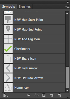
When you create an icon or button, just drag that object into the Symbols panel, and a symbol is created for you. From that point on, you can just drag the symbol onto your artboard.
Why not just copy and paste? Well, when the client asks for a change later, you can change the symbol once and it will update everywhere in your Illustrator file, across all artboards.
If you have created a set of symbols during the wireframe phase, then there’s a good chance that symbol will evolve into a visual element that will need to be part of the style guide for the final product. If it’s reusable, then a visual language can start from your symbols panel.
Speaking of panels, the Appearance panel can be used in a very powerful way to create visual graphics that can also be reused.
This tutorial and others opened my eyes to the power of using multiple fills, strokes and effects within the appearance panel on a single object.
This is an example of just how complex the Appearance panel can become on a single object.
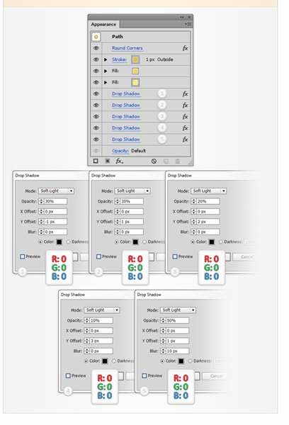
Then, when you’re happy with the appearance, you can drag the object to the Graphic Styles panel and reuse that appearance on other objects. This technique can even be used on typography in really interesting and creative ways.
If you want your designs to be tight and clean on device or on the web, then you’ll want to start your AI documents with these settings.
When you create a new document, make sure you are working in pixel units and have Align New Objects to Pixel Grid checked.
![]()
Then, in your General Settings, make sure your grid and keyboard increments line up to individual pixels.
![]()
I have a gridline every 64 or 8, depending on the project. But make sure that subdivision divides into individual pixels.
![]()
Then if your keyboard increment is every 1px, you can be sure that you’re nudging on the pixel grid.
That’s not all. If you want things to be pixel perfect, you MUST make sure that Snap to Grid is checked. This is very important. If this isn’t checked, you may still get objects that sit on half a pixel (which will cause a fuzzy edge).
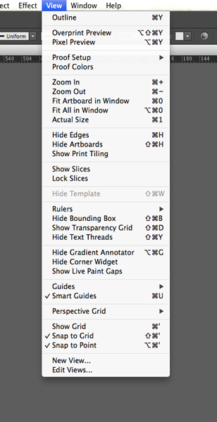
From that point on, use the Pixel Preview option in the same View menu to check your design and see how much anti-aliasing is being applied. It’s possible something is falling off of the pixel grid and could use a little tightening up.
I’ll have more tips and tricks to come in a future post, but if you can’t get enough of learning about design best practices, check out our iOS Mobile Design and Android Mobile Design bootcamps.
Design Thinking is an iterative, five-stage process that puts the focus back on the user, from start to finish. Here are the five steps...

The Design team is responsible for ensuring that the product meets and exceeds the needs of the users. This, in turn, helps our clients...
At Big Nerd Ranch, the Discovery phase of a project is an important step in determining the best path forward for the design and...