The right capabilities. The right time. Real Impact.
Solving the wrong problem costs you time and money. We help you pinpoint what actually drives growth, efficiency & customer loyalty - then design & engineer solutions that deliver measurable results.
Balanced Program Leadership
Ensure successful change implementation by balancing digital maturity with people, processes, platforms, data, and technology, fostering a culture of innovation and adaptability - orchestrating change.
Streamline processes and integrate platforms with cutting-edge tools at the intersection of process optimization, digital transformation, digital engineering, application development management, organizational change, and application modernization services.
Innovation & Product Development
Launch new business lines, capitalize with new services/products and enter new markets with customized solutions designed to win in the market and unlock growth.
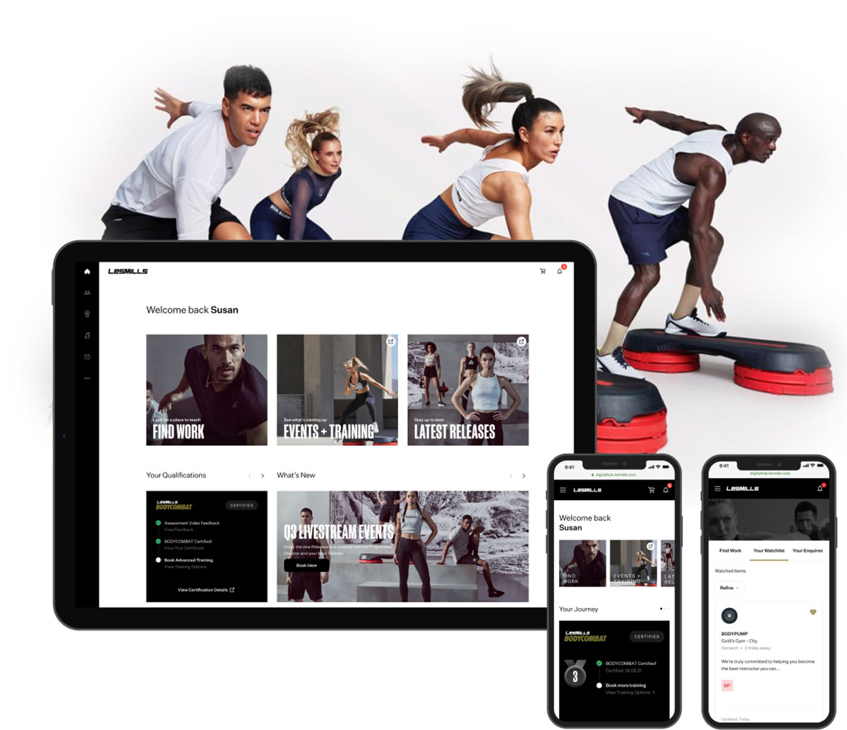
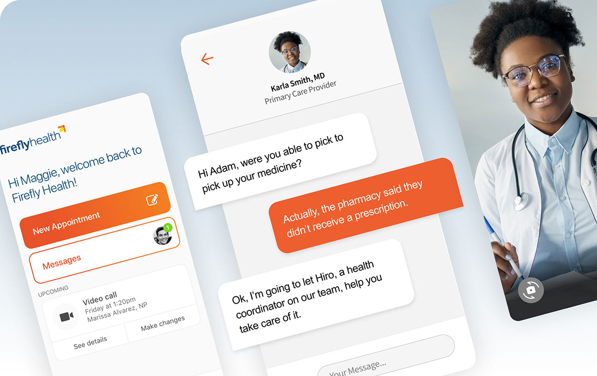
Customer-Centric Experience Design
Develop personalized experiences across all touchpoints to acquire, engage, and retain customers. Elevate customer experiences through unified brand strategy, technology integration, and data-driven insights. Generate differentiation and open new territories for growth.
Data Driven Experience & Decision Making
Harness the power of data to orchestrate anticipatory experiences (NBX), make informed business decisions - drive growth, empower teams with smarter tools.
Cyber Security & Risk Management
Implement robust security measures to protect data, systems, digital assets and maintain customer trust, leveraging the latest cybersecurity practices.
Managed Services & Capabilities Outsourcing
Proactive managed services tailored to optimize operations, boost productivity, and ensure stability with expert 24/7 support.