Designing for iOS used to be simple because previously, there was only one phone size. Fast forward to the present day; we now have an array of iPhone and iPad devices, all with different screen sizes and orientations. Aside from the physical devices, themselves, we also have software features that increase the number of sizes your application can appear in, like Split View and Slider Over. To help designers and developers manage these various permutations, Apple has introduced Size Classes which organize all of these screen sizes for each device and orientation into two categories.
The post Designing for Size Classes in iOS appeared first on Big Nerd Ranch.
]]>Designing for iOS used to be simple because previously, there was only one phone size. Fast forward to the present day; we now have an array of iPhone and iPad devices, all with different screen sizes and orientations. Aside from the physical devices, themselves, we also have software features that increase the number of sizes your application can appear in, like Split View and Slider Over. To help designers and developers manage these various permutations, Apple has introduced Size Classes which organize all of these screen sizes for each device and orientation into two categories.
What are Size Classes?
In iOS, Size Classes are groups of screen sizes that are applied to the width and height of the device screen. The two Size Classes that exist currently are Compact and Regular.
The Compact Size Class refers to a constrained space. It is denoted in Xcode as wC (Compact width) and hC (Compact height).
The Regular Size Class refers to a non-constrained space. It is denoted in Xcode as wR (Regular width) and hR (Regular height).
iPhone
Most iPhone devices will use the Compact width (wC) size class in each orientation with some exceptions.
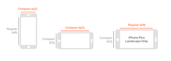
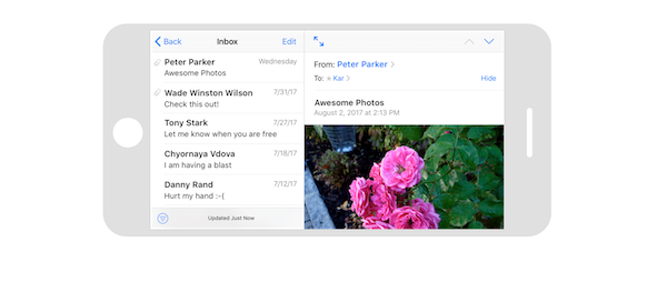
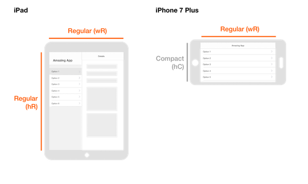
The iPhones 6/7 Plus can inherit the Regular width (wR) size class resulting in the ability to use functionality normally reserved for the iPad, such as the split-view pane. For instance, using the Mail application on an iPhone 7 Plus in horizontal landscape will cause a split-view pane to appear, allowing the user to better utilize the available space rather than just displaying a single table view.
iPad
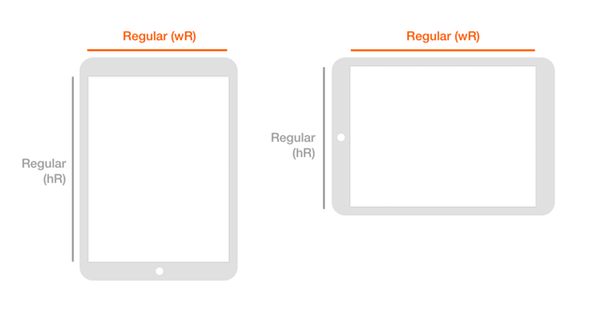
All iPad devices use the Regular width (wR) size class regardless of landscape or portrait orientation. In both horizontal and vertical landscape, the iPad will use a split-view pane to take advantage of the available screen space because it falls within this unconstrained size class.
Learn how a design audit can help you see the most success from your mobile or web application.
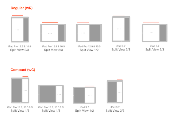
Multitasking on iPad: Split View and Slide Over
Split-View multitasking and Slide Over allow your app can share a screen with another app in a 1/2, 1/3 or 2/3 ratio in either landscape or portrait orientation. Depending on the ratio, the operating system will either display the Compact width (wC) or Regular width (wR) layout.
Controlling the UI with Size Classes
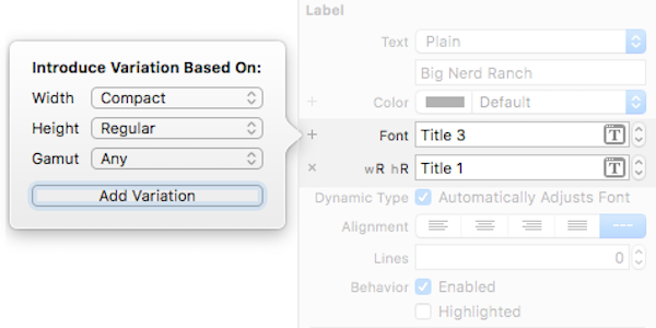
In most cases, specifying the width class is sufficient when laying out your app; however, you can use the height class to customize your app as well. For example, if you use a split-view pane in an iPad app, users will see the same pane on iPhone Plus in landscape orientation because they both inherit the Regular width (wR) size class.
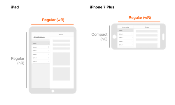
If that is not your intention, you can exclude a split-view pane from appearing on the 7 Plus by specifying both the width and height Size Classes. This works because the height of an iPhone Plus in landscape orientation is compact (hC) while all iPad devices have a regular height (hR).
You can also use Size Classes to target specific UI elements like font colors, font sizes, drop shadows, view colors and more to adapt to users’ device screen. These variations give you added control as to how your UI can adapt to different devices and orientations that your user may be using.
Understanding Size Classes allows you the flexibility to meet your user’s needs regardless of which device they use. I encourage you to explore how Xcode handles Size Classes to understand the possibilities at your disposal. For more information on Size Classes or other design and iOS topics, make sure to check out our blog.
The post Designing for Size Classes in iOS appeared first on Big Nerd Ranch.
]]>Lots of people have been calling Apple’s new iOS 7 design “flat,” but to me, that’s oversimplifying Apple’s intent.
The post Apple Design Goes Flat with iOS 7 appeared first on Big Nerd Ranch.
]]>Lots of people have been calling Apple’s new iOS 7 design “flat,” but to me, that’s oversimplifying Apple’s intent.
First, let’s go back to 2007. There is no iPhone, no one knows what multi-touch means, there’s no swipe left, no pinch to zoom. To help users understand these new concepts, Apple had to make them immediately familiar to users. Therefore, they decided to mimic real-world objects for the basis of their app UI, in an approach known as “skeuomorphic design.”
However, there is a problem with skeuomorphism. In skeuomorphic design, elements may be decorative and non-functional, which can be a major distraction from content and functionality. Look at the interface for the Game Center app, which was designed with a wooden title bar and green felt background. The whole app looks like a felt gaming table. The downside is its lack of scalability: How would a search field or a Facebook share button look on a green felt background, without ruining the illusion that this is a gaming table?
I will say that even with its downsides, the skeuomorphic design is very intuitive, so much so that even a 17-month-old baby can use it! Here is the proof. Ok, it’s a fun video, but I digress.
A little over six years have passed since the first iPhone was introduced, and we’ve all grown accustomed to having multi-touch in our daily life. Every time I come across a screen, I automatically assume it has a multi-touch interface, and I’m disappointed if it does not.
IOS 7 fOCUSES ON THREE MAIN THEMES: Deference, clarity and Depth
Deference
With iOS 7, Apple has decided it’s time to take off our training wheels. They have stripped away the faux UI to expose the app’s core functionality, reaffirm its relevance and build up from there. That means putting content first! Apple has created a UI that helps users understand and interact with the content, but never competes with it.
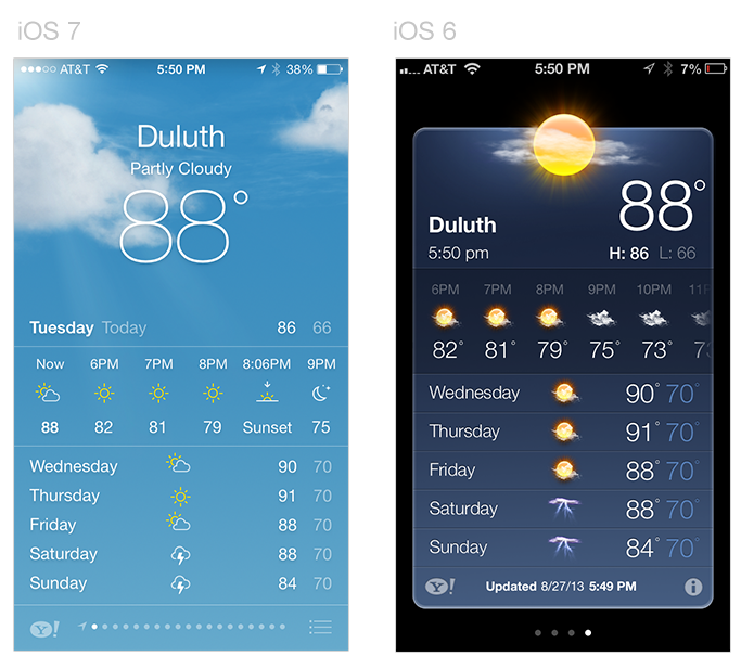
For example, in the new Weather app, current temperature information is featured front and center. The realistic cloud animation plays a secondary role. Gone is the card appearance of the old app, with its unnecessary ornamentation and artificially confined data. The edge-to-edge design gives elements more breathing room, creating a less cluttered feel.
Depth
With the new design, Apple does not rely on skeuomorphism for dimension and realism. That means that iOS 7 has no artificial shadows, no unnecessary ornamental elements and no faux textures. The sense of physical realism and liveliness are instead being conveyed through how things respond to users’ touch interaction, via realistic motion and parallax effects.
Here is an example of parallax effect on iOS 7: an object’s position or direction seems to change depending how your device is tilted.
Another example is the Notification Center’s slide down animation, which bounces back as if it’s rebounding from a fall. The degree of bounce back depends on how forcefully users swipe down.
The use of translucency, combined with animation and motion, further create a sense of depth and vitality.
Clarity
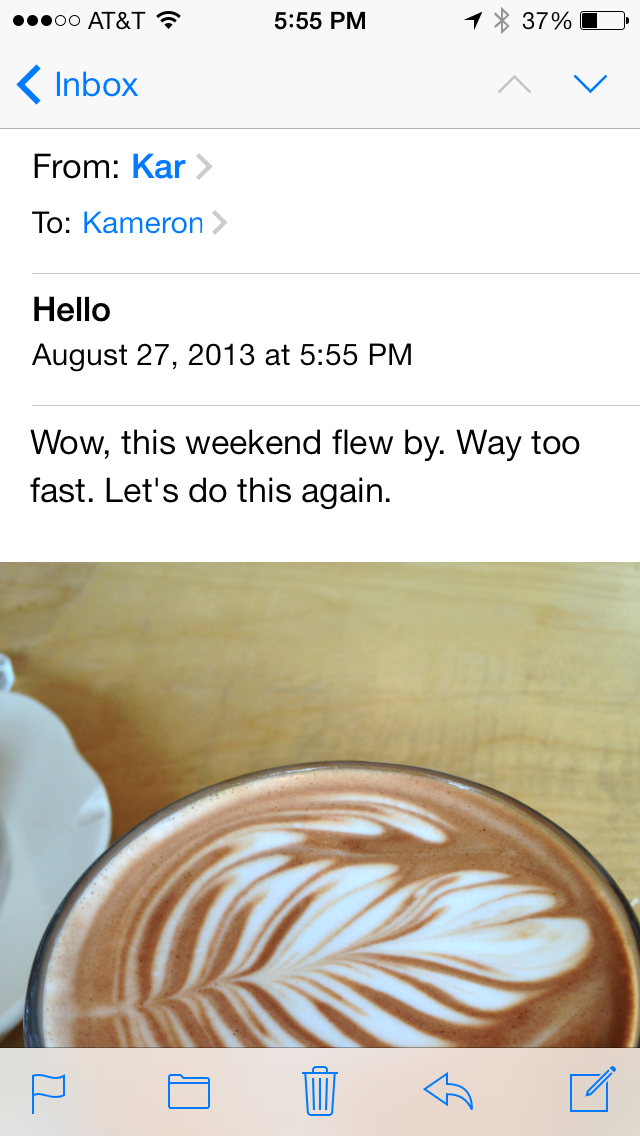
The design of the application should make it clear how the user uses it. In, say, Apple Mail, there is a clear distinction between what is content and what is control, through the use of system blue color to show users what elements are interactive.
This update will be jarring for users who have become used to skeuomorphic design, but trust me: The new design has more realistic animation and realism than skeuomorphic design can ever offer.
Tips for using iOS 7
-
In most native applications, swiping the left edge and right edge takes users to the previous or next page. This is a very useful feature, especially when navigating between pages in Safari or Calendar.
-
Pulling down anywhere on the home screen will display the search box.
-
You can now store significantly more apps within a folder.
-
You can easily disable parallax effects through the accessibility settings.
-
Don’t freak out if you don’t see any app updates. They are updated “automagically.”
-
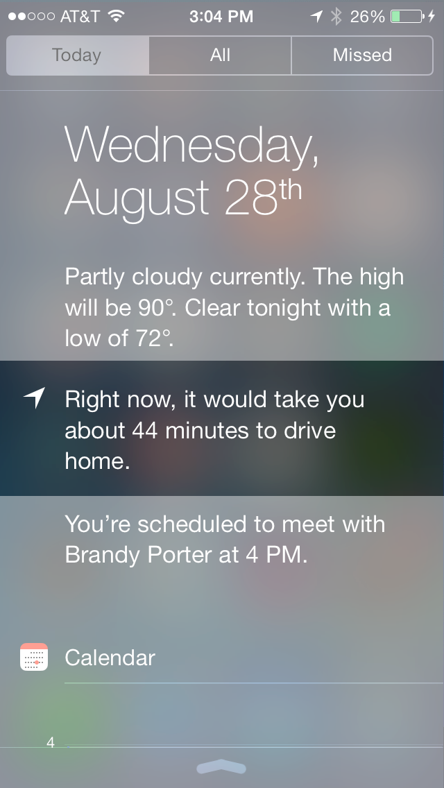
The Notification Center will learn when and where you commute, and it will recommend the best route and tell you how long it will take, based on current
traffic conditions.
-
You can now block pesky calls or texts with a built-in call blocker.
-
A single swipe from the bottom of the screen will bring up a control center that enables you to quickly access airplane mode, the camera, a calculator, bluetooth, wifi and more, even on your locked screen.
-
Most importantly, enjoy the ride!
The post Apple Design Goes Flat with iOS 7 appeared first on Big Nerd Ranch.
]]>