The post My App Design Setup appeared first on Big Nerd Ranch.
]]>
In Kitchen Confidential, Anthony Bourdain harps on the importance of a proper mise-en-place, or setup, for line cooks in a bustling kitchen:
The universe is in order when your station is set up the way you like it: you know where to find everything with your eyes closed, everything you need during the course of the shift is at the ready at arm’s reach, your defenses are deployed… If you let your mise-en-place run down, get dirty and disorganized, you’ll quickly find yourself spinning in place and calling for backup.
While the physical urgency in a professional kitchen is probably higher than most tech offices, the right setup for an interface designer can be the difference between hours of creative flow and hours of fruitless frustration. Everyone’s ideal app design setup is unique, but here is what’s currently working for me.
Vertical Arrangement
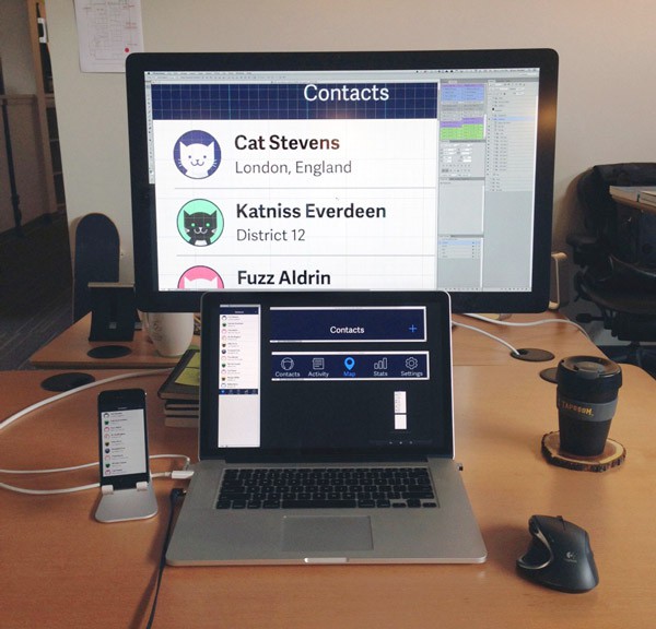
I have a laptop and external monitor at my desk. I seem to be in the minority at the office, but I arrange them vertically instead of side-by-side. I like it because there’s minimal separation between the two displays, the arrangement is symmetrical and I don’t need an external keyboard. As an added bonus, I can make believe that I’m using a giant Nintendo DS for work.
Clean Desktop
There are some beautiful wallpapers out there. Some of them are tasteful and subtle, but even those are a distraction for me. The temptation to cycle wallpapers or search for the next best thing is too much. Now I just set my background to a solid dark blue and be done with it.
Desktop icons can also pile up easily as I save files. I tend to manually file them away when they start taking over the desktop, but if you’re looking for a more elegant solution, I hear that Hazel can take care of these things.
Photoshop
Even though it wasn’t made exclusively for digital interface designers, Photoshop is my design tool of choice. Its vector shape tools are fast enough to let you sketch quickly, and they’re powerful enough that you can layer on high-fidelity visual design later. Illustrator and Sketch are also popular among designers at Big Nerd Ranch, and many of these concepts can be translated to those tools as well.
Shortcuts
Keyboard shortcuts are like having tools inside your fingertips. Yes, like Inspector Gadget. The shortcuts I frequently use include:
-
alt(option)+drag copies whatever you have selected. That can be a single layer or multiple layer groups on either the canvas or the Layers panel. It’s like copy/paste in one motion, with the added bonus of giving you control over where the copy will land. For more precision, try alt(option)+arrow keys to nudge copies.
-
right-click to select a layer. This basically summons the Layers panel to the canvas and shows you just the layers and groups present at the pixel you right-clicked on.
-
command+= & command+- to zoom in and out. Done in quick succession, this will resize a window to show the full canvas.
-
command+` to cycle focus through windows or tabs. Most of the time, I use this to remind myself how many windows I have open and to close (command+w) what I don’t need.
Actions and Workflows
Photoshop Actions and Automator Workflows are the food processors and KitchenAid mixers of the app design world, automating common multi-step tasks for you.
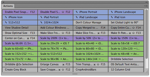
(The Actions Panel in Button Mode)
The patron saint of app design, Bjango’s Marc Edwards, shares and maintains his set of Photoshop Actions and Workflows. These cover most of the things you’ll reach for on a daily basis if you’re designing apps. If you want to create your own Actions, recording new ones from the Actions panel is simple enough. And if you assign hotkeys for Actions, you can even activate them from an iPad with the Actions app.
Automator Workflows are like Actions for Mac OS X. You can create workflows using Automator.app’s visual scripting interface. If you’re creating iOS assets, using Bjango’s Automator Workflows for batch adding or removing “@2x” from filenames is a huge timesaver.
Multiple Contexts
Opening the same PSD in multiple windows can show you multiple perspectives of one document at the same time. It’s like Cubism for the 21st century. Try it by clicking Window > Arrange > New Window for *.psd. You can have one window zoomed in at 3200% with a grid overlay, plus another window at 100% with no grids or guides. This isn’t Picasso-level stuff, but this setup allows you to work at the pixel level and see the whole composition simultaneously.
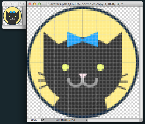
(This is not a glitch in the Matrix.)
The first time you see your design on an actual device shouldn’t be after the developer sends out a build. If you have the phone or tablet you’re designing for, I recommend using a tool like Bjango’s Skala Preview. This can beam your active Photoshop window to an iPhone or Android device in real-time. Testing mockups in context answers important questions like, “Is 9pt type actually readable?”
Layer Comps
If you’re like me and cram lots of screens into a single PSD, Layer Comps help organize those screens and keep your file size low. Be aware that if they’re not created and updated properly, Layer Comps have the potential to wreak havoc on your PSD. To avoid that, I use Layer Comps only to toggle the visibility of different layers. It’s tempting to user Layer Comps to move layers around and apply different Layer Styles, but that’s too much for me to keep track of without all hell breaking loose. Just make new instances of layers to manage different positions and appearances, and rely on Layer Comps to remember which layers to show/hide.
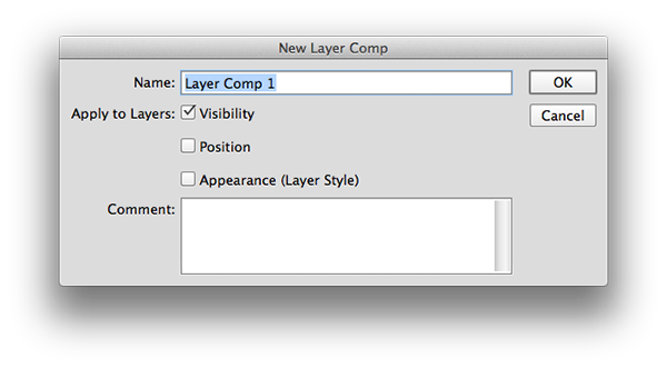
(For sanity’s sake, don’t check Position or Appearance.)
When it comes to exporting Layer Comps, Photoshop ships with a script that will export all of a PSD’s Layer Comps at once. You can find it under File > Scripts > Layer Comps to Files.
Linked Smart Objects
If you’re designing an app, there are probably elements that you want to show up on multiple screens (navigation bars, tab bars, icons, etc.). If you edit a common element on one screen, wouldn’t it be great if you didn’t have to edit it everywhere else? Linked Smart Objects can help with that! Coupled with Layer Comps, Generator and sprite sheets, Linked Smart Objects can really streamline comp design and image asset exports.
Ready, Set up, Go!
Using the right setup makes app design a whole lot easier and more efficient. In my next post, I’ll dive into using Linked Smart Objects, Generator and Dropbox to create and iterate on Flinto prototypes. Cats will be involved.
The post My App Design Setup appeared first on Big Nerd Ranch.
]]>
The post Designers and Code: Why Mobile App Designers Should Learn to Program appeared first on Big Nerd Ranch.
]]>
The idea that everyone can benefit from learning to code has gained mainstream popularity over the past couple years. Politicians, athletes and billionaires support Code.org. Online courses are popping up everywhere. And of course we offer a variety of bootcamps to teach you how to be a better programmer.
Someone even tried to teach a homeless man to make a living by coding and then wrote about it. However, all this buzz has caused backlash in the form of blog posts warning people to hold their horses and think about what they’re getting into. But as a designer interested in learning to code, I still believe that learning more about programming will be key to my success or failure as a mobile app designer in the coming years.
Why Designers should learn to code
The common argument made against learning to code is one of opportunity cost: “Why learn to code when you could spend time on literally anything else?” That argument can be applied to any investment of time, and it doesn’t carry a whole lot of weight for me. The bottom line behind all these counter-opinions is that learning to code is an enormous endeavor that won’t necessarily lead to fame and fortune. That’s a fair point for weeding out the get-rich-quick crowd, but it shouldn’t deter anyone who wants to design and create interactive experiences.
Traditionally, mobile app designers deliver documentation (comps and specs) to developers, who take care of implementation and iteration. This process can work well, but often results in an end product that diverges from the complete vision in a designer’s head. As designers, we can certainly improve our designs by learning more about usability, copywriting, research, marketing and psychology, rather than learning to code.
But no matter how good those initial comps and specs are, they need to be implemented correctly and iterated on continuously in order to be useful to the end user. I think the best way to make sure that happens is by empowering designers to implement and iterate on design decisions alongside developers. That doesn’t necessarily mean writing production-quality code from scratch. Being able to understand the relative costs of different design executions; tweak design parameters like colors, type styles and coordinates; and push changes using version control is enough to empower a designer to take total responsibility for their work.
What’s next
Web design as a discipline seems to be years ahead of native app design in this respect. Most web designers today are expected to implement or edit their designs in HTML/CSS. I think native iOS app designers will be expected to use UIStoryboards/Interface Builder to implement their designs in the very near future.
We don’t need to spend a lifetime learning to code at the expense of getting better at our own discipline, but I think Marc Edwards put it best when he said, “I have never, ever known a designer to be worse off for knowing more about code.”
Editor’s note: Brian Harper is presenting on this topic and more at CocoaConf Atlanta on November 15, 2013. He hopes to see you there or on __Twitter_._
The post Designers and Code: Why Mobile App Designers Should Learn to Program appeared first on Big Nerd Ranch.
]]>The post Closing the Collaboration Gap between Design and Development appeared first on Big Nerd Ranch.
]]>We’ve taught our iOS Mobile Design and Android Mobile Design bootcamps all over the world this year, and one question that we’ve continually heard is, “How can designers and developers collaborate effectively?”
There’s a gap between designers and developers who create mobile apps together, and while I don’t have a simple solution, I do have some thoughts on closing that gap (or at least bridging it).
The Problem
First, let’s start by saying that designers are totally dependent on developers to bring their designs to life. On our own, most of us are skilled at creating static mockups and a mildly-interactive prototype with some animation if we’re lucky. But that’s not a shippable app. Nobody wants to spend their time or money on that. So we need a developer to translate our design ideas into code that mobile devices can understand and execute for users around the world.
How do designers typically communicate those ideas to developers? We send a hairball of wireframes, comps, and documentation over the gap to developers on the other side. As development begins, there are inevitably unforeseen changes that must be made and the hairball is held together with emergency meetings and patchwork documentation. Hopefully by the end of development, it still resembles the designer’s intent.
The process above may seem terrible, but it’s very common. As the gap between designers and developers grows, designs are misinterpreted, compromised or lost. So how do we close the gap? Obviously, if all designers knew how to code and all developers knew how to design, there would be no gap. But that’s not realistic at this point. Instead, I believe effective communication can help.
Know Your Audience
Designers who don’t communicate with developers are asking for their work to be lost in the gap. Additionally, designers should know the constraints of the platform they’re designing for. Knowing what is easy and hard to do from a development perspective is important. You don’t want developers to resent your ideas for being unfeasible or unnecessarily difficult. Basically, demonstrating empathy to your colleagues as well as your users can result in better mobile apps.
Tools That Improve the Process
Effective communication closes the gap to a much more manageable distance, but I think we’ll see some changes to how mobile apps are made in the near future that will help even more. Like web designers, mobile app designers will benefit from being able to directly manipulate the presentation layer of an app without affecting the content. Brent Simmons experimented with a system he calls DB5 while creating Vesper, which gave his designers the ability to tweak and test the design on their own. I imagine it saved countless hours of dreaded documentation creation and redundant work between Photoshop and the actual codebase.
The gap between design and development is still a huge issue in software development. We’ve shared some strategies that we find helpful at Big Nerd Ranch, and our hopes for the future. What are you doing to close the gap?
The post Closing the Collaboration Gap between Design and Development appeared first on Big Nerd Ranch.
]]>The post An Event Apart: Bringing People Together appeared first on Big Nerd Ranch.
]]>Three days full of web design best practices, discussions with fellow designers and delicious southern cooking. That was my experience at An Event Apart in Atlanta last week. When the last session ended, all I wanted to do was curl up, hibernate and let my mind and body digest all the ideas and fried chicken I’d gorged on. So I did just that.
After rising from my slumber, I’m left with this: An Event Apart is about being a decent human being.
Sure, there were plenty of useful technical ideas presented: flexible layouts, compressive images, typography research, mobile usage statistics. These are topics that will change how we designers and developers do our jobs. But it’s not just about us. The underlying assumption behind all these topics is that we are empathetic individuals. We care about the user’s time, their bandwidth and their workflow beyond the screen. It’s not enough if the website works at our own desks. Does it work at everyone’s desk? Does it work for people if they’re not at a desk? Because they’re probably not at a desk.
Mobile first. Responsive design. Adaptive content. Progressive enhancement. Scenario-based design. These are all kind of the same idea at their core, right? They boil down to empathy. Put yourself in the user’s shoes. The mobile-only user with a low-bandwidth connection. Maybe they don’t speak English. Maybe they have poor vision. Do they have access to the content you’re delivering?
Scott Jehl calls this collection of ideas “Responsible Design.” It’s irresponsible to ignore fellow human beings in favor of a giant lossless PNG, a flashy animation or desktop-only content. Karen McGrane took the idea a step further: in a meritocracy built on equality, it’s unacceptable to restrict your content on mobile devices. That’s the baseline. If you can remind people that there are human beings with souls behind the content they’re interacting with, that’s even better.
Empathy doesn’t just apply to the user. It applies to your own team as well. Kim Goodwin expounded on the benefits of “Silo-Busting.” Don’t let the role printed on your business card define who you interact with. The gap between design and development? “That’s where the magic happens,” according to Luke Wroblewski.
As a designer, it’s easy to get caught up in “pixel-perfection,” paint a mockup with fake data that fits nicely in a fixed canvas size and toss it over the wall. I’ll admit, that’s a workflow I’m all too familiar with. But it’s not flexible, sustainable or empathetic to a broad audience. That doesn’t make me a terrible human being, but to the billions of people ignored by a design that doesn’t address their needs, why would they assume anything else?
If that’s overly dramatic and idealistic, I apologize. I’m fired up after going to such an inspirational conference. As a designer, my job is to craft an ideal experience for every user. I may not achieve it, but it’s a noble pursuit.
Photo credit Lou Griffith
The post An Event Apart: Bringing People Together appeared first on Big Nerd Ranch.
]]>2012 was a great year for Big Nerd Ranch. Here’s our take on the year, in numbers.
The post 2012 in Numbers appeared first on Big Nerd Ranch.
]]>2012 was a great year for Big Nerd Ranch. Here’s our take on the year, in numbers.
After hiring several smart, kind folks and our merger in the fall, we grew to 77 employees in 2012. We’re continuing the trend this year. If joining a team of brilliant, hard-working nerds is on your list of things to do in 2013, get in touch with us.
In 2011, we bought an abandoned Iron Works. Last year, we transformed the Iron Works into the Big Nerd Ranch Galactic Headquarters. This year, we’re expanding the Galactic HQ with 8,700 additional square feet to make it the ideal work environment for our quickly growing design, management and development teams.
We shipped more than 50 apps for 40 clients in 2012. We offer end-to-end development services, so whether you need a solid web back-end, a beautiful native app or the whole shebang, we’re set up to deliver the perfect solution for you.
Our open enrollment classes run year-round in Atlanta, Ga., and the Netherlands. Achieve Nerdvana with us in 2013.
We delivered our corporate training in 35 cities across the world last year. Worried about getting your entire team to the Ranch? Fear not! We’ll come to you.
We threw an epic party at WWDC 2012, and we’re going to outdo ourselves again this year. See you in San Francisco!
With roughly a dozen ways of brewing and consuming coffee at our disposal, we go through more than three pounds of freshly roasted coffee beans every week. Our development sprints aren’t exclusively fueled by coffee, though—we’re also partial to Arden’s Garden juices and Twining’s teas.
Our Results-Only Work Environment means that working at the office is not required, as long as your results are met. So it’s nice to catch up with all our fellow nerds face-to-face at our biweekly Bacon Breakfast Bonanza.
In 2012, we made a pledge to revive our blog. Over the last year, we’ve had dozens of contributors sharing their expertise right here. Expect even more posts on design, development and general nerdiness in 2013!
The post 2012 in Numbers appeared first on Big Nerd Ranch.
]]>