The post Make it Spectacular: Choosing the Right Spec’ing Tool appeared first on Big Nerd Ranch.
]]>Once you’ve finished designing your amazing UI, how do you make sure it’s implemented correctly? Handing a design over to development without documentation leaves a lot of details up to interpretation, but spec’ing your document correctly will help eliminate that guesswork.
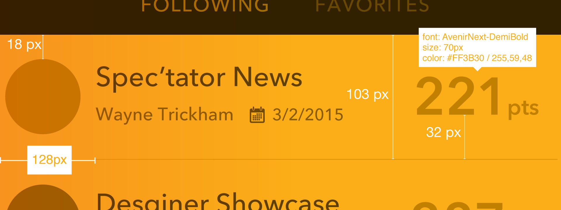
While spec’ing your document eliminates misunderstandings and communication errors with developers, it is also time consuming to spec manually, and your measurements can be subject to errors. Luckily for us, there’s a range of tools that will help you more quickly provide accurate specs.
Which ones are the best? I’ve outlined a few that we use in our design workflow at Big Nerd Ranch.
Specctr
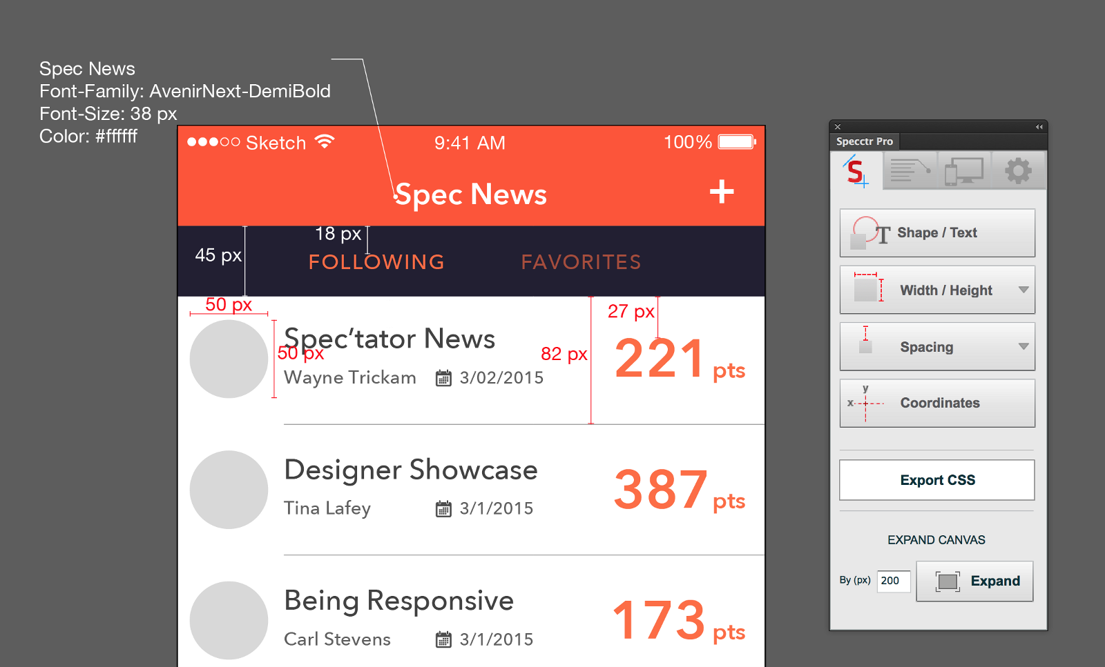
If you use an Adobe product like Photoshop or Illustrator as your UI design tool, Specctr is probably the best choice. It was one of the very first plugin tools available for marking up a design, and it lives within your application.
With Specctr, you can easily spec your file with just a few clicks. By clicking on an object, you can add a dimension, size or placement reference on top of your design. The plugin creates a separate layer that can be hidden or removed as needed. And now that retina-sized images are the norm, the scale feature gives you control over measurements. Our developers prefer to have measurements at 1x to more easily work with Xcode’s Interface Builder.
You can buy a plugin for a specific app for $49, or you can get the bundle for all of the Adobe apps for a total of $99. There’s also a free Lite version that gives you some features with limited preferences.
Sketch Measure
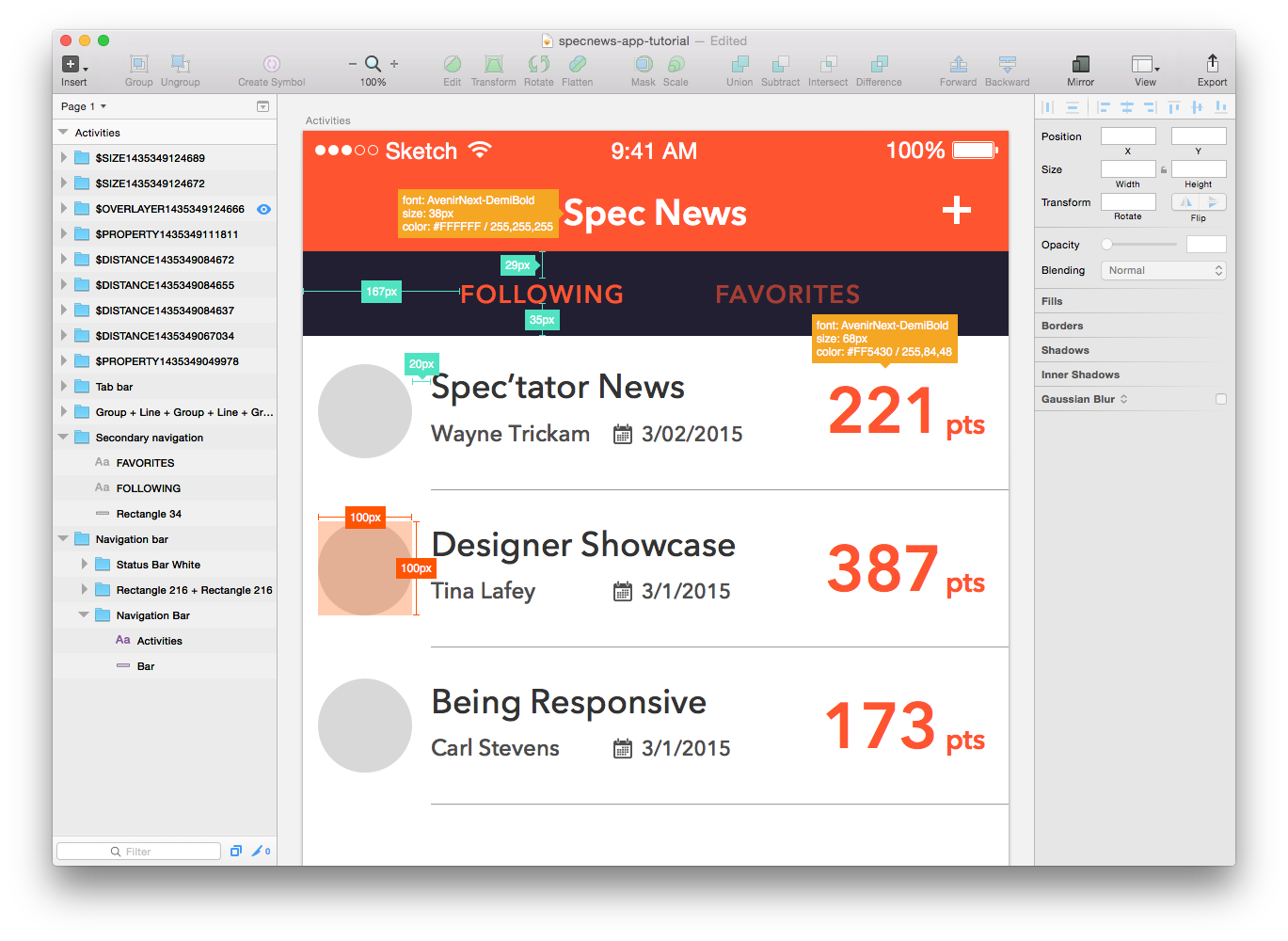
Sketch Measure is a free plugin for Sketch that allows you to add notes, measurements and object properties within the canvas of your design. This plugin is especially useful if you are preparing a file for someone, or when you’re working with other people. With this plugin, you can document sizes, margin or padding, distances, properties and coordinates.
It’s easy to use: just select any element in your design, then go to Sketch Measure in your Plugins menu. Choose which item you want to document, and where you want that information placed in relation to the object. You can also define which properties you want to show for a particular layer.
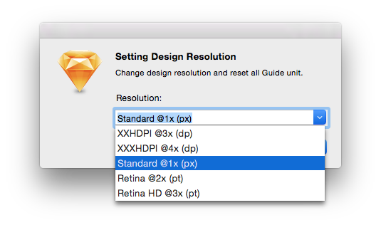
With Sketch Measure, you can also convert your resolution from PX (pixel) to DP (density independent pixel), which is perfect when you’re handing over specs to Android developers.
Zeplin
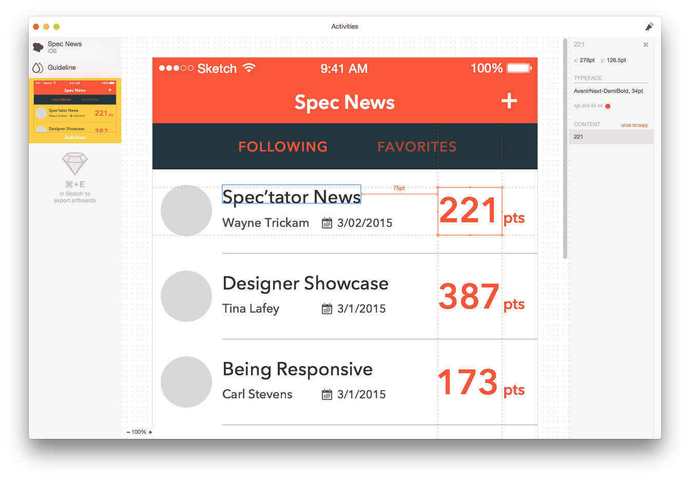
Zeplin is a powerful standalone app that helps you quickly turn your designs into specs and guidelines. Instead of working within your favorite design application (like Specctr and Sketch Measure do), Zeplin works by importing artboards from Sketch.
Zeplin’s biggest shortcoming is that you can’t export assets from the app—you still have to do that within Sketch. That said, there are a lot of advantages, chief among them that you can invite others to your project. A developer could easily join the project and use the app to see guidelines by clicking on the artboard. You can also issue alerts and messages to others if something changes. And if your team is on Slack, you can use it to instantly notify teammates about design changes.
Markly
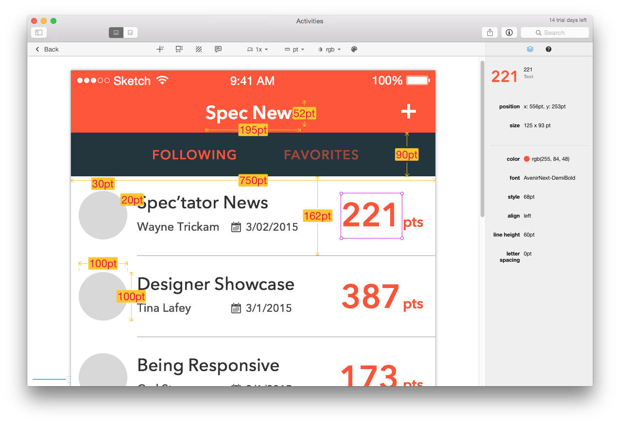
Markly is the newest of the apps we use for design documentation, and it currently works with Photoshop and Sketch. Much like Zeplin, you choose an artboard in Sketch, then import it into a project in Markly via an icon in your main menu bar. From there, you can click on a layer or item in your artboard, and see its details live in the right panel. You can also create a physical documentation by using one of the tools in the Markly toolbar, and add distance specification marks by clicking and dragging between objects.
There are some features that set it apart from the others in this list. One is that specs are updated when your design is modified. This is a tremendous time saver, especially on a rapidly evolving project. Markly can also automatically convert the measurements based on different screen densities—a very useful feature if you are working on an Android app.
Currently the app costs $49.99. There’s a 15-day trial period, so it’s easy to give Markly a shot and return it if it’s not for you. If you’re a power Sketch user, I highly suggest giving Markly a test run.
Future Spec’ulation
There are pros and cons of each of these tools, of course, and the final choice will likely come down to which software you use to create UI designs.
I am excited to see how these types of plugins and apps evolve in the future. With new devices being launched on a frequent basis, apps used for spec’ing will need to evolve to cover adaptive layout designs for various screen sizes: Android already has a wide range of form and size factors, Apple has recently added newer sizes to their product lines, and developers are working with Adaptive UIs. This changing landscape will impact how designers document their designs for developers, and spec’ing tools will have to keep apace with these trends.
Got another spec’ing tool you love? Let us know about it!
The post Make it Spectacular: Choosing the Right Spec’ing Tool appeared first on Big Nerd Ranch.
]]>The post Yes, and: How Improv is Like Working on Client Projects appeared first on Big Nerd Ranch.
]]>![Improve... and improve] Improve... and improve](/assets/img/blog/2016/04/improv-e.png)
I’m a big fan of improv comedy—I love seeing how each troupe works with varying rules, actors and kinds of performances. Here in Atlanta, we’re lucky to have several improv groups to check out. And when I’m traveling, I seek out different groups to visit. In fact, a group of us at Big Nerd Ranch participated in an internal improv workshop. We learned some of the basics of improv, but most importantly, we learned to fail fast—and that’s a good thing, especially when it comes to building and designing projects for clients.
Keeping it Classy
When we work with clients on app development projects, we stress that effective communication and flexibility are key. To help broaden those skills, our group met with a local improv instructor over four weeks to pretend, listen and laugh. As we worked on the challenges, we quickly realized that improv was actually a lot like our client projects: staying on your toes and working together are necessary for success.
One of the key exercises in improv is “Yes, and…”. When presented with a topic or change in scene, the actor is encouraged to use this mantra. Instead of denying the change, you take the change in stride and build upon it. Initially, this was a little hard to swallow, but with practice, our scenes became easier and funnier.
Spaghetti on the Wall
Every week, we built upon our prior lessons. Short scenes turned into longer scenes. Single performances turned into group performances. Actors had to listen to each other in order to keep the scene moving.
Scenes were built upon listening and trusting your team. No ideas were rejected. It was always “Yes, and…”
When you’re working on a project, it’s good to noodle on ideas. As my coworkers can attest, puns are an everyday thing with me (editor’s note: true story). I know that not every idea or joke will work, but I keep trying until something sticks to the wall.
The same thing applies to my work method. There is no wrong answer. I will keep brainstorming, testing ideas and throwing them out until something works. My Sketch files include a ton of artboards, each with a different twist, building upon the last version.
Learning to Fail
My favorite lesson from improv? That it’s ok to fail. And when you do fail, you should fail fast.
During our class, team members would forget to repeat something, or lose a train of thought. We would applaud them and they’d try again. When you apply this method of thinking to your project team and organization, the benefits are limitless. To learn from failure, you have to effectively communicate with your team and your client—talking and listening. In the end, the only wrong answer is “No”.
Fail Yes
I learned a lot about myself and my coworkers during our improv classes. Each member of a project brings a unique perspective to a project. By listening to and trusting your team, you can always be prepared to say “Yes, and…”.
The post Yes, and: How Improv is Like Working on Client Projects appeared first on Big Nerd Ranch.
]]>The post What’s our Vector, Victor? appeared first on Big Nerd Ranch.
]]>Flight 209, you’re clear for takeoff.
Roger.
Huh?
That’s a sequence from Airplane, one of my favorite movies. Are we cleared for takeoff to use vector assets in our iOS projects?

iOS 8 and Xcode 6 have brought about the ability to use vector assets in your applications. In the past, designers had to generate multiple versions of the same asset to satisfy multiple resolutions. Using vector assets can save you time because you only have to generate the asset once—even better, it will prepare your apps for future iOS devices.
Most people think of vectors as images that can scale up and down limitlessly, and still look good. That’s true, but unfortunately, Xcode 6 doesn’t fully support vector assets in iOS yet. Instead, Xcode generates raster images that are based on the @1x PDF image, rather than scaling a vector at runtime. However, you can still create and use vector graphics that are non-destructive and editable in the future. Let’s look at how it can be done.
Getting There
The best way to create vector assets is with an application like Adobe Illustrator. A lot of designers already have Illustrator in their toolset as part of the Adobe Creative Cloud.
In Illustrator, it’s simple to export vector assets from your design files:
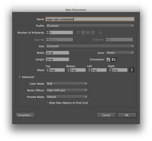
- Create a new document in RGB with the size of the @1x asset you’ll be exporting.
- Place your path in the new document, just as you would normally.
- Save as PDF.
There are other vector-based drawing tools you can use to create your assets. Sketch is a powerful, inexpensive entry point to create vector assets; you can read our review for our thoughts on it. You can also use Inkscape, a free and open-source tool.
Using a Vector Asset
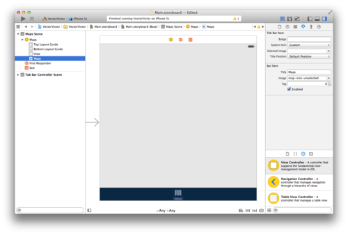
- Save your image as a .pdf file at the proper @1x size
- Drag and drop your pdf file into Images.xcassets.
- In the Attributes Inspector, set the Type to Vectors.
- Pull your image into your file, just like you would any other image.
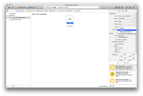
For example, a tab bar button named ‘Maps’ is sized at 25 x 24 in your interface. You simply use your vector asset saved at 25 x 24 in your storyboard. At runtime, Xcode will create three images:
- map-icon-unselected@1x.png at 25 x 24
- map-icon-unselected@2x.png at 50 x 48
- map-icon-unselected@3x.png at 75 x 72
A Round-Trip Ticket?
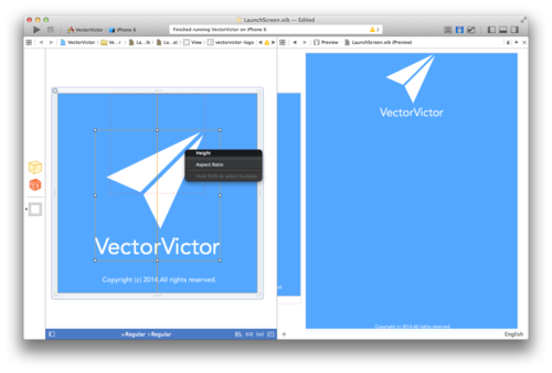
While iOS 8 doesn’t include full vector support, OS X does. In OS X, you can scale your image in code or by using AutoLayout, without any distortion. With some experimenting, I’ve been able to size vector assets while targeting size classes in Xcode without distortion. When you target a compact or regular size class in your Universal Storyboard, you will have to set a height and width constraint on the vector asset to change its size.
Our Final Destination
The ability to use vector assets opens up some questions when designing UI elements. When we work with .png files, we usually design at @2x resolution. Developers build in interface builder at @1x. It would seem logical for us to create our interfaces at @1x. I think this would make specifying quicker for designers, and is easier for developers to dissect.

Do we have clearance, Clarence? With the new advances, developers will be giving us the Roger, Roger to start using vector assets in our apps.
The post What’s our Vector, Victor? appeared first on Big Nerd Ranch.
]]>With the addition of two new iPhone sizes, designers and developers will have to be more flexible in their layouts. In this demo, I give a quick overview of Universal Storyboards and Adaptive UI in iOS 8, and how they impact design and development.
The post iOS 8 Demo: Universal Storyboards and Adaptive UI appeared first on Big Nerd Ranch.
]]>With the addition of two new iPhone sizes, designers and developers will have to be more flexible in their layouts. In this demo, I give a quick overview of Universal Storyboards and Adaptive UI in iOS 8, and how they impact design and development.
Want more? UX/UI Designer Zack Simon has written a great post on what iOS 8 means for app design.
The post iOS 8 Demo: Universal Storyboards and Adaptive UI appeared first on Big Nerd Ranch.
]]>On your mark. Get set. Whoa! The act of running and completing a marathon is no small feat. Neither is the process of designing an app. Both events require weeks of preparation and work. And sprints are only a small part of the story.
The post When a Sprint Isn’t a Sprint: Running and Design appeared first on Big Nerd Ranch.
]]>On your mark. Get set. Whoa! The act of running and completing a marathon is no small feat. Neither is the process of designing an app. Both events require weeks of preparation and work. And sprints are only a small part of the story.
Getting up to Speed
I love running, and I love design. I recently completed my sixth marathon in New Orleans, my third since joining Big Nerd Ranch as a UX and UI Designer just under a year ago, and I’m currently training for my first Half Ironman.
Every Wednesday, a running group leaves from our Intergalactic Headquarters to flex their legs and lungs after a day of flexing our minds. (Seems like I found the right spot to merge my favorite things.) We’ve heard about development and triathlons, but how does one cross the finish line in both running and design? As silly as it might sound, the two have a lot of similarities.
The Starting Line
If only we could lace up our shoes and run without preparation. However, a lot of planning has to happen if you want the race to be a delightful experience. You have to ask, Where is the race? How many weeks away is it? Is it a hilly race? How many miles will I be running?
Similar questions must be answered in the design process. Who is the user? What is the budget? When is the launch? Which devices will an app be used on? If you don’t answer these questions in the beginning, your experience might not go well, and the preparation and solutions for one design problem will not work for others. You have to plan for specific experiences.
Building Your Base
Much like training, good design takes time. When training for a marathon, you don’t start with a 26.2 mile run. You have to build up your mileage over many weeks before making that final run. Each week is scheduled and has goals, much like our iterative process. Run iterations are based on your race goal and what type of race you are running. The design process works in in a similar way.
With user experience design, you have to include continual feedback in the process. This is where sprinting comes into play. You test your design each week instead of testing on race day. Did that form work? Was the user confused? Did it solve the client’s problem? You have to interpret what worked and see how to improve it.
As a designer, you have to remain aware of the user throughout the process. With running, I usually test new shoes, clothes and nutrition on my shorter runs. Did the shoes cause a blister? Did that gel make my stomach hurt? Waiting until launch day can lead to disaster. Training and design both take time, and the biggest challenge is to not lose focus.
Race Day
It’s go time. Your planning and training has put you on the path to a good experience. You have all the right tools at your disposal. Now it’s time to trust the process and preparation. It’s your chance to test the experience.
But even once you cross that finish line, the race isn’t over. There may be a celebratory beer and a bunch of high fives. But there is also a retrospective evaluation that must be completed. How did it feel? Would I do anything different?
And then, of course, you go and sign up for another one. If you’re ready to have Big Nerd Ranch bring an app of your own to life, let’s get started.
The post When a Sprint Isn’t a Sprint: Running and Design appeared first on Big Nerd Ranch.
]]>