From Punched Cards to Prompts
AndroidIntroduction When computer programming was young, code was punched into cards. That is, holes were punched into a piece of cardboard in a format...
With the introduction of the Android O preview, we’ve now got a good look at some of the changes Google is planning to bring to the soon-to-be-named OS update. From a visual design standpoint, one thing that stands out in particular is the introduction of adaptive launcher icons that allow for a more unified look on the homescreen. What does this mean for you? Well, OEMs (or original equipment manufacturers like Samsung and LG) can now control the mask shape of the launcher icon on each device resulting in a uniform shape for all app icons on the home screen. For instance, your icon might be a rounded rectangle on an LG device and may be circular on a Pixel. Of course, with this change comes a change in getting launcher icons ready for production. To help with this, I’ll be going through the process of creating an adaptive icon and highlighting considerations to make while creating your own.

Before we dig in, make sure that you’re designing your launcher icon at 108 dp by 108 dp for MDPI resolution. In order for Android to use both layers separately, you’ll need to export both the foreground and the background as two, separate 108 dp layers with transparency. Just like with all Android assets, both of these layers still need to be provided at all density buckets, so plan for this also.
Start by figuring out how you’re going to lay out your icon. The foreground layer should be reserved for a branded icon and will move on top of the background layer. Keep in mind that even though there’s 108 dp of glorious space to sprawl, your foreground layer art should only really be taking up 48 dp to 60 dp since everything outside of the middle 72×72 dp has the opportunity to be masked in a variety of different shapes. Android will now reserve 36 dp from all sides for animations, so expect that some of the masked background will become briefly visible during animations.
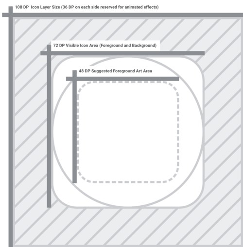
Use your brand colors or a simple pattern in the background layer, so that your foreground layer is pronounced. Even with edge masking, you should ensure that your background art extends the entire width and height of the 108 dp icon as it can become briefly visible during certain animations. Be sure that your background art extends throughout the entire 108 dp area so that it will mask and animate properly without any weird visual hiccups.
Once you’ve created a foreground and background layer, try testing out a few different masks to make sure that your design is flexible. In the animation below, Google has hinted at a few different masks that OEMs will have the ability to select from including circles, squircles, and rounded rectangles.

Finally, make sure that you’re exporting both of these layers (foreground and background) separately. Like I mentioned, you’ll need to export these at all density buckets so that the icon will appear at the correct resolution on any screen. Even though your foreground layer art isn’t using the full 108 dp space, it needs to be saved out at the same size as the background layer in order to layer properly. Currently, O Developer Preview 1 image is only available for Nexus 5S, Nexus 6P, Nexus Player, Pixel C, Pixel, and Pixel XL, but if you have these devices for testing, consider creating a build with your new launcher icon to see how it behaves on Android O on various devices.
To help in your adaptive icon endeavors, I’ve created a template in which both foreground and background layers are saved as symbols with some example masks to try out on your designs.
![]()
For more information on Adaptive Icons, check out Google’s Android O preview documentation. With more changes on the horizon, we’ll be watching Android O and Google I/O closely, so make sure to stay tuned to this blog. In the meantime, check out our post on refining custom typography in your Android app or our recent work on securing your Android apps.

Introduction When computer programming was young, code was punched into cards. That is, holes were punched into a piece of cardboard in a format...

Jetpack Compose is a declarative framework for building native Android UI recommended by Google. To simplify and accelerate UI development, the framework turns the...
Big Nerd Ranch is chock-full of incredibly talented people. Today, we’re starting a series, Tell Our BNR Story, where folks within our industry share...