


How to Effectively Manage Your Client-Partner Relationships
Clients Project StrategyClients leave when they feel that their needs aren’t being met. The strength of your client-partner relationship relies on a deep understanding of your client’s...
WWDC 2017’s Design for Everyone challenges developers to work for all our users. This post will teach you to rise to the challenge through concrete examples of accessible design. The examples I list are iOS-specific, but the ideas aren’t—developers across all platforms should keep accessibility in mind.
Long-time macOS users think of this icon when they hear “accessibility”:

The icon shows an abstraction of a person, not unlike wheelchair signs, just as we conceive of “accessibility” as something we tack on for “the other”—at the end of the project, if there’s time, and budget, and “market need”.
This makes sense in a world of ones and zeros, of the happy path and everything else. Folks are either in the “abled” or “disabled” camp:
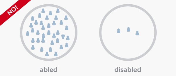
This is a false dichotomy. Ability is a gradient; your app can be utterly inaccessible, a quarter-accessible or fully accessible. We all have different accessibility needs from our devices, even throughout the day:
The take-away here is perspective. The question isn’t, for example, “Can we afford to spend time supporting our fully blind customers?” Take it back a step: “Can we afford to support all our users?” or even “Can we afford not to support all our users?”
We have the ability to define an experience that broadens the range for more people, through the tools that the platforms provide. Rather than considering specific technologies for accessibility, we’re going to walk through how to take a day-to-day approach.
All software has a task to perform. The approaches your app takes to this task are what makes it special. This can be a trap: differentiating your app can go too far and lead to breaking from platform standards that users rely on.
There’s power in familiarity. Writers tell stories by repeating words and tropes readers already know; there’s a common language. This is also true for software. With our multi-purpose and multi-modal devices, the kind of effortlessness that comes from repetition helps make our apps stand out from the crowd.
As we’re building out, for instance, custom UI, it is important to balance how easy it is to learn with what a user may already know. Let’s say I had to build a styled text editor, like the kind one would find in the Notes app. The glitzy approach involves clever arrangements of buttons or fly-out menus. But it’s important to think about what the user already knows. An iOS user is going to have dealt with the text caret before, and that naturally leads to copy-and-paste:
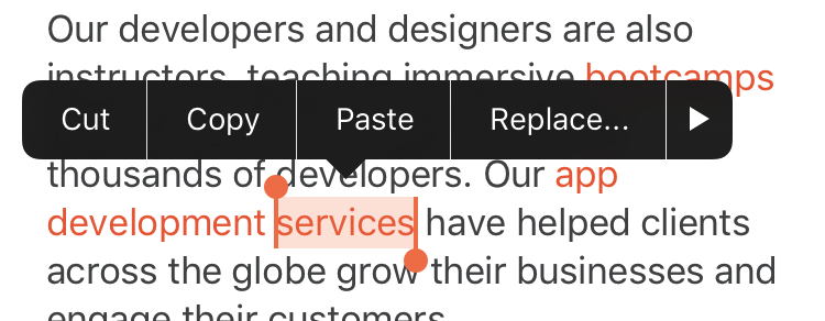
The text editing callout is a common pattern that a user will be comfortable with, but it’s not very flexible. What if I want my user to change the size of the text? To change the font size multiple times, I’d have to repeatedly show the callout. So we do need some custom UI, but let’s not throw out the baby with the bath water. How can someone complete this common task with minimal effort, in a way that they’re comfortable with?

Enter the popover menu. By applying a pattern in a familiar context, not only do I get to build out the extra functionality I want, but I give the user a path to reusing what they already know about using apps.
When you build an app, you’re synthesizing a new thing from many components, like system controls. These components naturally form a hierarchy. A user’s attention flows from one target to the next, so it makes sense for information to flow in the same way. Ideally, the order makes intrinsic sense, like steps in a recipe. Unclear hierarchies strongly correlate with clutter. UIs that consider clarity simply feel more like they understand the user’s needs. Consider a message in Mail:

This compact—but not cluttered—layout has been a mainstay of iOS since 1.0. The headlines are focus points, allowing a user to scan through a large list quickly. The reduced importance of the details are made explicit by varying size and color.
This kind of design is very clear, but it’s not always accessible. I frequently work with designs that strive for this same lack of clutter. In the perfect design, only single lines of text are needed. But a user may have trouble focusing on small text. Consider the same design when the font size is increased:

This is all but useless. The user loses most ability to triage messages using the subject and body text because there’s just too little there. Letting all the text break onto multiple lines is the bare minimum to improve it, but it’s a band-aid. There is a middle ground to be had, though.

By carefully selecting a maximum number of lines, a user can still see a balance of information without getting lost in the list. Notice that line spacing between different text even scales, so we maintain high legibility. We didn’t lose the core of our original design as we improved its clarity.
Strong information hierarchy isn’t the only measure of an accessible design. Interaction design is equally important. Every action, every tap, every swipe should have a predictable result. A button lights up when you press it. Sounds and haptics tell us when something is ready. Affordances like these help form expectations in the digital world that would be self-evident if they existed in the real-world, like the ticking of a clock.
In short, it’s important that our apps maintain a sense of integrity. We want our experiences to be magical and exciting, but not surprising. Developers work for their users, not the other way around. And the more ways you can use this expectation to delight, the better job you’ve done.
Consider one last example, of a horizontal strip of action buttons:
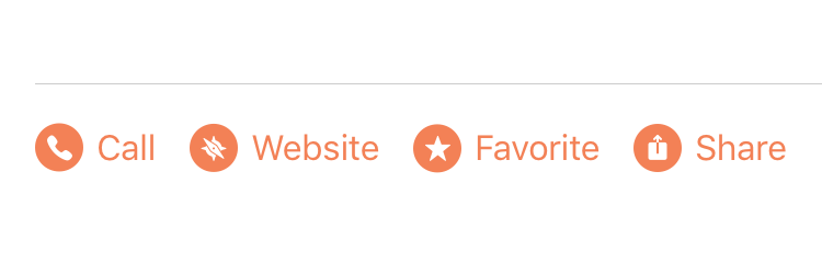
There’s a lot here done to establish patterns. The order establishes importance. Icons provide scannability. Spacing between items signals that they are separate. But, as above with the Mail example, even with all these considerations it still doesn’t behave in all contexts, like language or text size. What about a long translation of one of the actions? Not all of the buttons may fit in the button strip, so even after all that design consideration, you still end up with truncated, unhelpful text.
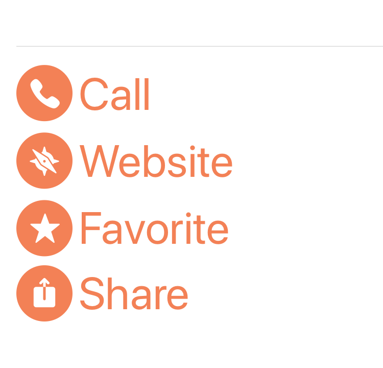
Thus, you introduce a variation: arrange them vertically if they can’t fit. This is the essence of adaptivity: we know what context the of the user is, so we can meaningfully adapt to that. When we set expectations and adapt to the user’s needs, they almost can’t help but get into a state of flow.
Developing accessible apps doesn’t have to be a hardship, or a separate, difficult task. It’s a change in perspective, with which you can do better work from the start. Likewise, accessible design isn’t a special subset of the field: it’s just good design.
By keeping a few of these ideas in mind, you can supercharge your app development workflow. Balancing your unique ideas with easily learned, familiar concepts takes less time in overall development, allowing you to spend more time on refinement, optimization, and the things that differentiate your product in the market.
You can find code for all the examples in this post on GitHub. They are designed to take advantage of what’s new in iOS 11 and Xcode 9.
If you have questions or want to get started making your app more accessible for all, our designers would love to hear from you. Our engineers can even do an audit of your existing work to help you find where to go next. Check out our work to get started.
Clients leave when they feel that their needs aren’t being met. The strength of your client-partner relationship relies on a deep understanding of your client’s...

Responding to change is a key tenant of Agile Software Development. Predicting change is difficult, but software can be developed in a manner that...

A lot of this confusion surfaces around the scope of machine learning. While there is a lot of hype around deep learning, it is...