As the number of HTML5 web apps has grown in the last couple of years, so too has the number of people with disabilities that impair their use of the Internet. In fact, as many as 314 million people are visually impaired worldwide, and the number of Americans with visual impairment is expected to double by 2030.
Because of this, it’s important that your web sites and apps be as usable and accessible as possible, regardless of your users’ tools or limitations.
Skip Navigation
One of the most common techniques in web accessibility is the “Skip Navigation” link, sometimes referred to as “Skip to Content.” There are a couple of reasons why this feature is used on most accessible websites.
First, a screen reader will always try to read aloud any navigation it comes across, on every page load, no matter what. This can become annoying to those users. Providing a mechanism with which to quickly bypass it can greatly improve their experience. With as little as two keystrokes, they can jump right to the relevant content.
The other benefit is that sighted users who rely on only a keyboard for navigation (those with motor disabilities like paralysis or conditions like Parkinson’s disease) can also quickly bypass navigation containing many links.
For a working example, visit the WebAIM.org homepage, and without doing anything else, hit the tab key. You should see a red button appear in the upper left corner that says “Skip to Main Content.” Hitting the enter key will drop you past the top navigation and search field to where the page’s actual content begins. This is the “Skip Navigation” link in its simplest form.

The Basics
To start building skip functionality of our own, we’ll add a simple hyperlink at the very beginning of our HTML:
<a href="#content" class="skip">Skip to content</a>
But we don’t want sighted users to see that link at all times at the top of the page. So we’ll hide it offscreen with CSS:
    .skip {
        position: absolute;
        top: -1000px;
        left: -1000px;
        height: 1px;
        width: 1px;
        text-align: left;
        overflow: hidden;
    }
    a.skip:active,
    a.skip:focus,
    a.skip:hover {
        left: 0;
        top: 0;
        width: auto;
        height: auto;
        overflow: visible;
    }
This will position the link 1000px off the screen for sighted users, without hiding it from screen readers. When you hit the tab key the first time, the link will receive focus, making the :focus pseudo class kick in, and the link will be visible at the top left of the page.
Then, at some point below the navigation links and other items in the page’s header, we’ll add the ID of content to the div containing the main text of the page:
<div id="content"> … </div>
That’s it! Well, this is the extent to which most tutorials go, anyway. However, look at this live example. When you hit tab, the “Skip Navigation” link appears, and when you hit enter, you jump down the page to the content block (you may need to narrow your browser window to get the full effect). All good, right?
Well, we’re only half working. Yes, the page did scroll the content area into view in the browser window. But it did not change focus, which doesn’t really qualify for skipping navigation. If you hit tab again, you’ll focus on the first link in the navigation list, which is clearly not what we wanted.
I’ve been doing some research on this and found that a lot of sites that include this feature have implemented it in this way. Even sites like the A11Y Accessibility Project stop here.
Take the BBC site for example. Hit tab once, and you focus on the logo. Hit tab again, and you’ll see the “Skip to content” link. Hit enter, and you’ll be taken to the #blq-content content ID. But what actually happened? If you hit tab again, you’ll simply continue tabbing through navigation, which was what we’re trying to skip.
Why is this? According to WebAIM.org:
“Some browsers do not fully support in-page links. While they may visually shift focus to the location of the target or named anchor for the “skip” link, they do not actually set keyboard focus to this location. These bugs can potentially be addressed by using JavaScript to set focus (using JavaScript focus()) to the target element.”
So let’s add a little JavaScript to patch in some added functionality (jQuery, with comments).
    $( document ).ready(function() {
        // bind a click event to the 'skip' link
        $(".skip").click(function(event){
            // strip the leading hash and declare
            // the content we're skipping to
            var skipTo="#"+this.href.split('#')[1];
            // Setting 'tabindex' to -1 takes an element out of normal
            // tab flow but allows it to be focused via javascript
            $(skipTo).attr('tabindex', -1).on('blur focusout', function () {
                // when focus leaves this element,
                // remove the tabindex attribute
                $(this).removeAttr('tabindex');
            }).focus(); // focus on the content container
        });
    });
Now, when we hit enter on the Skip link (see working example), we’re using JavaScript to force focus from it to the content block. Because the Skip link itself has lost focus (i.e., blurred), it’s once again hidden with CSS. When you start hitting tab again, you’ll be starting off within the main content of the page. The header and page navigation have been truly “skipped.”
Super-Awesome Bonus Tip
Depending on the browser you used to view any of the above demos and sample sites, you might have either a) seen them all working fine, or b) not gotten any of them to work at all. If you’re on a Mac, there are a couple of quirks you should know about.
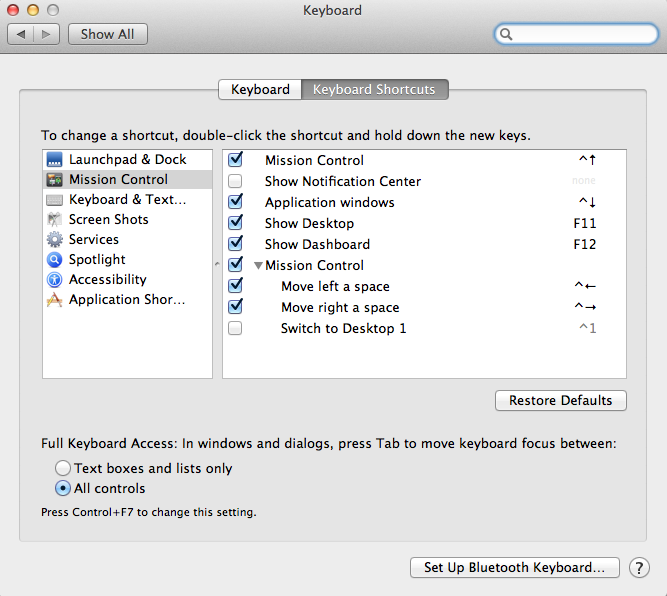
For example, in Firefox and Safari, you might notice that you can’t use the tab key to focus on anything but links and form inputs. The “Skip Navigation” links may not even show up at all. In Firefox, this is solved with a system-level preference. Go to the Apple menu, then to System Preferences -> Keyboard. Toward the bottom of the window you should see options for “Full Keyboard Access.” Check the option that says “All controls.” This makes it possible for potentially anything to gain keyboard focus. Special thanks to WebAIM via Twitter for this valuable tip.

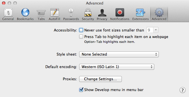
Safari has similar options in its own preferences pane. Open Safari Preferences and click on the Advanced tab. In the Accessibility options, check the box for “Press Tab to highlight each item on a webpage,” and you should be good to go.

I have some concerns as to whether the average user would know to dig deep into preferences to enable those options. WebAIM agreed it was a little obscure, but seemed to think that anyone who relies on keyboard-only navigation would be more likely to come across the fix.
Wrapping Up
This is just one technique to aid in making your site more friendly to keyboard and screen reader users. There’s much more to do, but you’re on your way to making your users with disabilities very happy. We’ll go over more web accessibility techniques in future articles!


